Mr. Celery, the Montgomery Biscuit, and now Mr. Hop Cone.
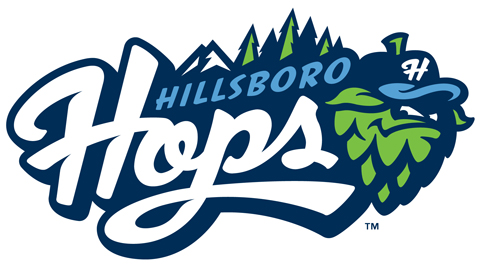
The Hillsboro Hops yesterday unveiled their new name and logo via their Facebook page, immediately adding themselves to the list of the best of the best in terms of branding and logos in Minor League Baseball.

A member of the Single-A Northwest League, the Hops are the relocated Yakima Bears who had been based out of Yakima, Wa. since 1990. Hillsboro will inherit the Bears’ Major League affiliation with the Arizona Diamondbacks.
“We are excited to announce that our team name is the Hillsboro Hops! The name pays homage to Hillsboro’s proud agricultural heritage, recognizes a leading Oregon crop and tips its hat to a popular baseball term.” – Hillsboro Hops Facebook page
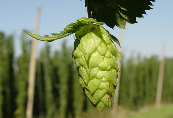
According to Wikipedia, a hop is a flower cluster used primarily as flavour agent in the production of that ever-so-popular (and synonymous with baseball) drink known as beer. Oregon is one of the world’s leading producers of hops – coincidentally, so is Yakima, the former home city of the Hops.

The club says they were aware of Yakima being a hop hub but it did not play a factor in the choosing of their name.
Studio Simon designed the logo, previously responsible for several Super Bowl and other popular Minor League logos such as the Toledo Mud Hens and Cedar Rapids Kernals.
Have your say on how you feel about what’s instantly one of my new favourite Minor League looks by giving it a rating on the Hillsboro Hops logo page. The rest of the identity will be unveiled in the coming weeks.


