It just keeps on happening!
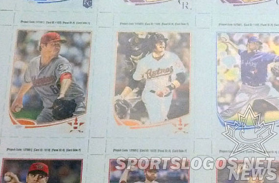
This time Topps is the culprit, tweeting out a photo of their new 2013 MLB baseball card set under construction apparently completely unaware that the new Houston Astros logo is right there on about three of the cards shown.
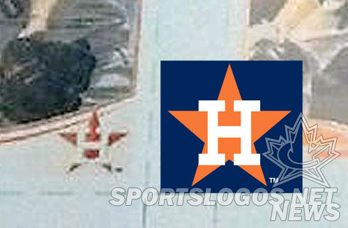
The logo matches up with what we’ve been seeing and saying in the past, that old H-star logo from the 1970s and 1980s. It’s the same logo we saw on that leaked image the Houston Astros themselves put out on their invitation to the unveiling.

My initial reports did suggest the new cap logo would feature a modernized ‘H’ on the logo but that doesn’t appear to be the case here.
Unfortunately the people at Topps didn’t Photoshop the new uniform onto the players, so we don’t get another look at that here. Still unseen is the new primary logo which I’ve been told is the H-Star logo in a circle, similar to the logos of the Washington Nationals and San Diego Padres.

The Astros will officially unveil their new logo and uniform at a ceremony on November 2nd.
UPDATE (1:13pm ET): Friend of the site Braden Leibovitch sees the logo a little differently than I do, namely in the beveled vs. flat department, offering up this clean mockup of what he sees:

Not bad at all, in my opinion.
Special thanks to Twitter user @atlas1226 for the heads up!


