Major League Baseball was the first major sport to market its biggest brand event on the uniforms of the participants, a couple of years ahead of the NHL, and almost a decade ahead of the NBA and believe it or not, the NFL.
Back in 1987, the St. Louis Cardinals wore the first World Series uniform patch, small and practically unnoticeable on their right sleeves. The eventual series champion Minnesota Twins did not wear the patch and the exact reason was not publicized at the time.

The 1988 W.S. patch was the exact same size and design as the year before, except for “1988” replacing “1987.” One of the most famous post-season homeruns of all time was hit with this patch featured on the Dodger uniform of Kirk Gibson, the game one hero.
Illustrating just how fast and flexible MLB’s marketing folks were, the execution of the 1989 W.S. patch only took five days to design and manufacture, the time between the end of the NLCS with the Giants beating the Cubs (Oakland had clinched the American League the day before against Toronto), and game one of what would be a Bay Area series.
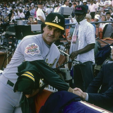
By taking the original, simplistic design used the previous two years and customizing it with a bridge and the wording “Battle of the Bay,” the Bay Area series was celebrated on the uniforms with the only modification made to a W.S. patch specific to the two participants.
The 1990 and ’91 W.S. patches returned to the original design, but slightly bigger.
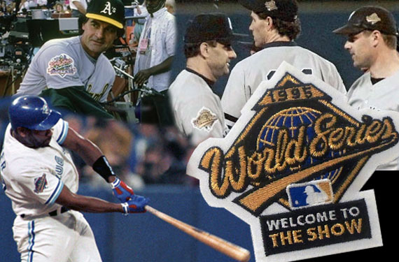
From 1992-97, the designs for the patches featured a globe in the middle of the baseball infield in a couple of different color combinations, with similar type and logo for the words “World Series” which were underlined extending from the last “s.”

One difference in 1995 was adding the words “Welcome to the Show” at the bottom of the patch. Following the strike season of 1994 when there was no World Series played, baseball was looking to capitalize on anything positive from a marketing standpoint to welcome fans back to the ballparks and TV screens.
In the 1988 movie “Bull Durham,” longtime minor league catcher ‘Crash’ Davis (played by Kevin Costner) spoke endearingly to his teammates on long bus rides during road trips about his one brief appearance (“the 21 greatest days of my life”) in the bigs, but he finally had made it to “The Show”, the term caught on in the baseball lexicon as a hip reference to Major League Baseball.
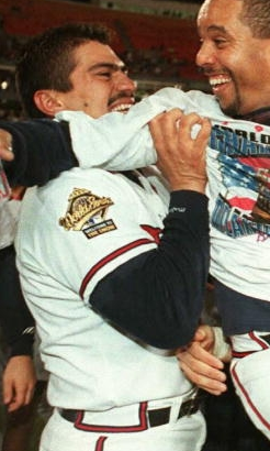
The Baseball Network was formed in 1994 as a collaboration of NBC and ABC televising games. After the ’94 strike debacle, for the 1995 season TBN used the slogan “Welcome to the Show” in its game broadcasts and other marketing avenues, and that ended up being included in that season’s W.S. patch.
Besides a jersey patch, the 1996 World Series marked the (unfortunate) debut of the cap patch, usually a shrunken-down version of the jersey patch, worn on the left side of the hat where the space seems far too small for a patch.
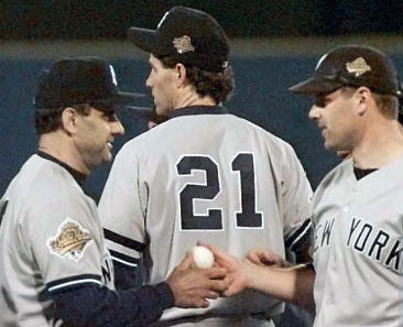
The 1997 W.S. patch was not worn by either participants Florida or Cleveland (but it was worn by the series umpires and appeared on some player’s jackets), instead the teams opted to wear their respective regular season commemorative patches.
For the champion Marlins that was their team-colored customized version of the Jackie Robinson patch, for the Indians it was their ’97 second-half of the season patch combination in which they wore a standard Jackie Robinson patch on their home white jerseys, and the ’97 All Star Game patch on their road grays and blue alternate top.

A new look for 1998 and 1999 saw the design from 1992-97 turned on its side in sort of a 3D fashion, this was the last design to span multiple seasons.
By 2000 World Series marks were in the works many months before the annual October series start. When the Yankees and Mets met in a 2000 version of the “Subway Series,” the patch logo was already heavily marketed preventing a special “Battle of the Bay-esque” patch on team uniforms from happening (a separate was available for sale to the public).
The next three patches from 2001-03 featured a ball circling the globe in different shapes and colors, with the ’03 patch adding the “100th Anniversary” (of the series) moniker during the Marlins stunning win over the favored Yankees.

The 2004 patch was the first not to have the complete year, simply stating “04” along with a seemingly misplaced set a flags representing each league. Ironically, Boston finally won its long sought after championship that season beating St. Louis, and again in 2007 with a similar horizontal patch that also had two flags and the year abbreviation “07” in a sweep of Colorado.

The 2005 patch was the only one among the first 25 that didn’t have the words “World Series” on it, opting instead for the abbreviated “WS” as the White Sox swept Houston.

By 2008, MLB had officially taken its trademarked phrase “Fall Classic” and built it directly into its World Series branding with more classic looking patches that make the event stand out, and it’s been on every patch, along with assorted autumn colors and a pair of leaves (except 2011), up until this year’s patch which reverted back to more traditional MLB colors of red, white, and blue.
You can check out SportsLogos.Net’s collection of the history of World Series logos here

