Best and Worst of College Uniforms 2012
Welcome, ladies and gentlemen to the first annual awards ceremony for the sartorial-minded among us sports fans. We asked you, the readers, to give us your input on what teams, with new uniforms for the 2012 season, looked sharp and who came out of the tunnel in uniform train wrecks. You responded in a big way. This is truly an award of the people.
We received emails from all across the globe; Canada, all across the US, several from Europe, South America, Australia, and even a writer in Bangladesh. He may have been trying to sell us database programming, but still. Ages ranged from the teens to the late 80s. Alumni voted for and against their schools, and rivals even voted for their most hated. Those particular names we will keep secret for their school-pride’s sake. Votes were tabulated, every comment read, and here we present the winners of the 2012 SportsLogos.Net Best and Worst of 2012 in College Football.
Worst Uniform
This category was a run away. Two uniforms broke away from the pack early, and garnered a vast percentage of votes. Numbers one and two were so far ahead, that a third place cannot be accurately awarded. There were several teams, however, who will be recognized for their failures.
Dis-Honorable Mentions
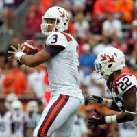 Virginia Tech. Several readers, Jaimie Fox included, mentioned the “terrible turkey print helmets” and the “awful alt white helmets with the severed turkey feet.” The symbolism was lost on these sports fans, perhaps better understood by the hardcore fan base.
The real issue might perhaps be that the imagery was fully detailed, so they weren’t “prints” at all, but rather the feet themselves. Very strange decision.
Though, it does help us understand what a “Hokie” is really supposed to be.
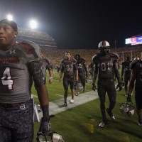 South Carolina Wounded Warrior. The plain grey on digital camo grey was a loser among our membership. Joey Sparks joined us in feeling that Wounded Warrior is a great foundation to support, then added, “But is it really a “tribute” if it looks horrible?” We think not.
Digital camo is a neat look, but we aren’t sure how it really fits on the football field. We haven’t seen it yet.
 Kentucky. Reader “Joey” (no relation to Mr. Sparks earlier) spoke for the voters against the Wildcats by saying, “Their white and blue jersey and black pants combination makes me want to vomit. Black pants are normally very nice, but when paired with no other black they look awful.” Mismatching is never cool, Kentucky. Step up your game. And since your school doesn’t use black, it would be an easy call to drop black from the uniforms. White and blue is a gorgeous combo, and you can rock it.
Readers were emphatic about the addition of black when it isn’t a team color: They hate it. Exceptions are rare, so it’s an easy call to avoid it altogether.
Boy, North Carolina just missed getting mentioned here with their mirror-ball, giant blue foot helmets that they wore with all navy, for some reason.
Runner up
Notre Dame.
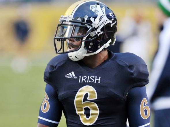
Email flooded in, calling out the terrible number font that “looked like it was stolen from an Irish bar’s clip art collection” the “ridiculous leprechaun everywhere” and the “stupid glove writing.” But the subject of most reader’s ire was the helmets. Oh, Notre Dame, you and your goofy, awkward, unbalanced, uneven helmets.
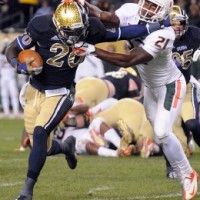
You even received a vote for “Best” for the uniforms, but that vote specifically excluded the helmet “disaster.” With a textured gold pattern, an uneven stripe, a huge leprechaun, and a navy side… you only neglected making the navy flat or you would have hit the “terrible design” grandslam.
People despised your uniform and called for a return to the “gold helmet with shamrock, and matching green jerseys,” if you feel a special uniform is absolutely nessesary. Even a self-confirmed “Irish-hater for life” said those looked classy, but your SHAME-rock Shenanigans this year were bad.
But, there was no stopping the run-away train that was our winner, with votes totaling almost three-to-one compared to the Irish.
Your 2012 SportsLogos.Net Worst College Uniform Design “Winner” Goes to:
Georgia Tech Yellow Jackets
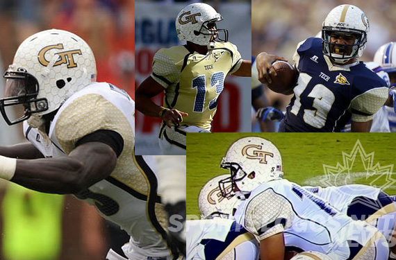
Universally panned, with exactly zero votes for Best and a run-away winner for Worst, the sports logo and design world absolutely abhors the Yellow Jackets look for 2012. “The template on the uniform is full of hilarity, and the pattern usage by Russell is displayed at its worst here. The Yellow Jackets look like they are wearing bubble wrap around their uniforms. The number font is awful” offered board member BraveBird08. Not just bad for one game like the special edition uniforms, this one is for all year long. And not limited to one awful look, there were mix-and-match possibilities that made eyes across the world bleed, unique for each and every game.
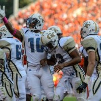 “Maybe while playing the Gamecocks, a chicken-wire helmet would make sense, but they don’t play them. And even still that doesn’t excuse the off-white and metallic gold on the helmet not matching the colors on the jersey even a little bit.” The honeycomb pattern doesn’t resonate with Yellow Jacket fans. Especially plastered all over their traditionally-gold helmet.
Sports design fans are intolerant of mismatching colors, and Tech was horrendous at the match game. “How many versions of this puke do they have to trot out?” asked a Tech alumnus who wished to remain unnamed. He continued, “I’m only recently graduated, so I should be inside this phantom ‘youth market’ they keep talking about, but I couldn’t possibly be more embarrassed with these monstrosities.”
Even rival fans concurred, “I hate Tech, but I always respect their history and their classy looks. Well, I only have to respect their history from now on. They look like the clowns that we make them every November.” Easy there, Dog fan. I hate the jerseys too, but at least my team isn’t the most over-rated team, year after year, in all of college football. But, they do have the worst uniforms. Officially.
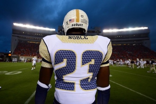
All pieces of the uniform were equal to offend the observers.
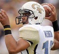 While not a comprehensive list, many of those delivering their input spoke of the following issues; The “terrible textured nameplate” and “number font so illegible I couldn’t tell who was who.” The panning was universal on the number texture; “it doesn’t even look like navy or a honeycomb, its royal blue bubble wrap.” “How did those numbers get past even ONE critical observer, one designer, one person WHO CARED AT ALL HOW THE TEAM LOOKED?!” People wondered about the sides, “What on earth is up with that twisting stripe on the side? Is it sponsored by Fruit Roll-ups? Is it DNA?” and “why does anyone feel is necessary to put so much gimmicky design in the sides of the jerseys. It never works, when players flex, bend, and stretch, it invariably looks bad, and GT showed this on every play.”
People worried about today’s youth as a whole, “If this is what the kids think looks good these days, they should be put-down as an entire generation.” “This uniform should be a litmus test. Do you like it? If yes, go directly to jail.” “Kids are morons if they think they look good in the Yellow Jacket uniforms.” They even expressed doubt that this whole experiment was for real. “It is said that Russell was founded by a Tech grad, which is why GT sticks with them [the company] despite abortions such as these jerseys, but after seeing these, I think he is actually a Bulldog, pulling a terrible prank on this team.” “I only hope I wake up and the team is wearing their jerseys from 2001 again.”
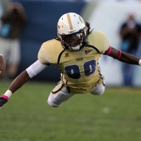
Some bonus nuggets from the letters on the Georgia Tech Uniforms.
“…the worst thing worn on college campuses all decade…”
“…uniform needs to be burned.”
“…make[s] me nauseous.”
“Entire departments of people should lose their jobs for letting these hit the field.”
“Just no.”
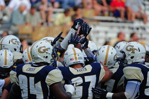
So, there you have it. Your “winner.” From alumni, rivals, unassociated fans of college football, from Brazil to New York, to California, to Toronto, to Ireland. Everyone hates the Georgia Tech uniforms. You have failed spectacularly, Yellow Jackets. If it is true that any press is good press, then you have certainly received more press over these uniforms than any others.
Even this very website proclaimed our hate for these catastrophes.
Want help fixing them? See our friend at Sports Design Blog write about the way Georgia Tech Football, and the athletics department should look as a whole here:
http://www.thesportsdesignblog.com/2012/03/30/an-open-letter-to-the-georgia-tech-athletic-department/
One only hopes that someone from the athletic department will hear these cries. Forward them the news of their award-winning performance here:
Wayne Hogan Associate Director of Athletics – Public Relations whogan@athletics.gatech.edu 894-6265
Dean Buchan Assistant Director of Athletics – Media Relations dbuchan@athletics.gatech.edu 894.5445
Paul Griffin Senior Associate Director of Athletics pgriffin@athletics.gatech.edu 404-385-1598
Dan Radakovich Director of Athletics njameson@athletics.gatech.edu 894-5411
Or, if you prefer, share the link to them on twitter: @GTdrad @DeanBuchan
Best Uniform
Less of a clear favorite on this side of the awards show. That is to be expected, however, as bad design inflames passions to a far greater degree than great design does. However, after the votes were counted, (yes, I used a spreadsheet. My fine higher-education partner taught me to use the tools I have available to me,) we do have a winner.
Honorable Mentions
There were many uniforms that achieved “mentioned” status, but only a couple were mentioned enough to achieve the level of “honorable.”
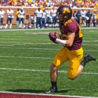
Minnesota. They were brought up several times, all for the same type of reasons that Tom Bauer mentioned in his email, “Compared to all the school going super modern, it’s nice to see the Gophers look good on the field.”
One of the few teams with a matte helmet that received good feedback. I think the supporters of this uniform were quite relieved the team didn’t go crazy.
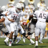
Maryland. In a split decision, as quite a few wrote just to ask us to allow the Terrapins to win a “Worst” trophy with last year’s two-faced, rook, flag debacle, Maryland earns an honorable mention with their “White Ops” uniforms from the 2012 season. Joey Sparks said it well, “The ‘White Ops’ look worked so well because it was a great balance of flashy with faint chrome flag pattern and grounded with black & red on jerseys. It looked great as a concept and even better during game action.”
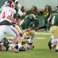
Colorado State. The Rams got a lot of votes that were made in conjunction with our Worst winner, Georgia Tech, as “proof that Russell isn’t incapable of making a great uniform.”
“ In an age when teams are trying to become more “snazzy” and creative with their uniforms in order to attract recruits and popularity, Colorado State defies the norm and creates a simplified set of their classic uniforms.” – Ethan Ausburn, San Antonio, TX
Runner Up
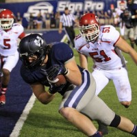
Utah State. The Aggies came with a new look, starting with their clean, classy, bold logo and carried that look over into their uniform design. “What football SHOULD look like. Bigger schools should take a lesson from [Utah State.]” The deep blue jerseys, the all-white look, and the subtly textured helmets were all big winners according to our readers. “You just can’t do better than Utah State did this year. I can’t believe these are from Nike.”
Utah State did a fantastic job, but couldn’t quite pull off the victory against the eventual winner.
Your 2012 SportsLogos.Net Best College Uniform Design Winner Goes to:
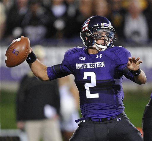
Northwestern Wildcats
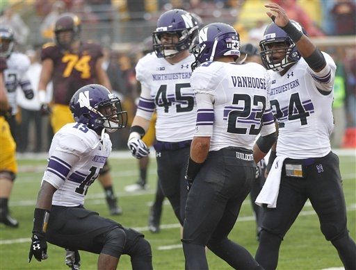
Proof that distinctive design doesn’t have to be ugly and hated, the Wildcats “Reclaimed the Stripe” a call that was enjoyed by many, including reader Tina Horner. The uniforms were simple, clean, but still had a unique design element that was strongly associated with the university, even being called “the Northwestern Stripe.” This won over even the harshest critics, such as Craig Barker; “As much as I am a traditionalist, the incorporation of the Northwestern stripe through the jersey is subtle, crisp, and clean.”
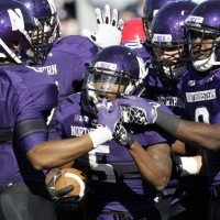 While filled with love for the look, our readers were not quite satisfied, “if only they would figure out how to get the stripe to go all the way around instead of stopping on the sides, this would be the perfect look.”
These are quite simple uniforms, lacking the goofy piping, textures, or silly tricks other teams employ. They would almost be described as boring, if not for the distinctive stripe and its unique placement. “I never thought I’d like a stripe across the middle like a rugby shirt on a football jersey. But these pull it off nicely.”
Some readers were even caught off guard. “As much as I despise adding black to a uniforms when there isn’t any in the logo, Northwestern makes it work very well. They probably could have done as well by adding a darker purple, but attempting to do it with just their normal purple and white wouldn’t have worked at all.”
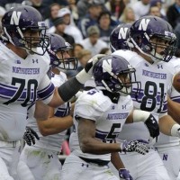
Overall, even readers who didn’t WANT to like the uniforms, do. “As an Illini die-hard, I’m conditioned to despise all that is the Wildcats. But it’s impossible not to recognize that their new uniforms are great. But officially, I still hate everyone in them.”
“They added black AND strangely-placed stripes? I’ll hate them! Ooops. They look really cool.”
Want to brag about the win? Send this article link to the school:
Mike Polisky Deputy Director of Athletics (External Affairs) polisky@northwestern.edu 491-7880
Anne Marie Adams Administrative Assistant to the AD Jim Phillips annemarie.adams@northwestern.edu 491-8880
Paul Kennedy Assistant A.D. (Athletic Communications, FB) pkennedy@northwestern.edu 467-2028
Ryan Chenault Assistant A.D. (Marketing) r-chenault@northwestern.edu 491-7327
Officially the game of the year versus the best and worst of college football uniforms would be Georgia Tech versus Northwestern. Interestingly enough, their colors palates would clash almost completely. A shame they don’t play.
Apparently not everyone hates purple.
What do you think? Did your favorites make the list?
(Edited to correct quote attribution)

