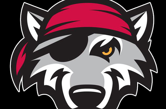
The Erie SeaWolves, Double-A affiliate of the Detroit Tigers and a member of the Eastern League, unveiled their new logo set yesterday at a press conference in Erie, Pa.
A much needed upgrade over their previous set, the new logos continue the SeaWolves “Pirate Wolf” theme but in a much more modern and clean way.
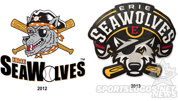
“We are proud to start a new chapter in SeaWolves history… Our new logos, colors and uniforms will enhance the ballpark experience and give fans a new reason to cheer. We’re really excited to share our new look with the fans of Erie.” – SeaWolves Team President Greg Coleman
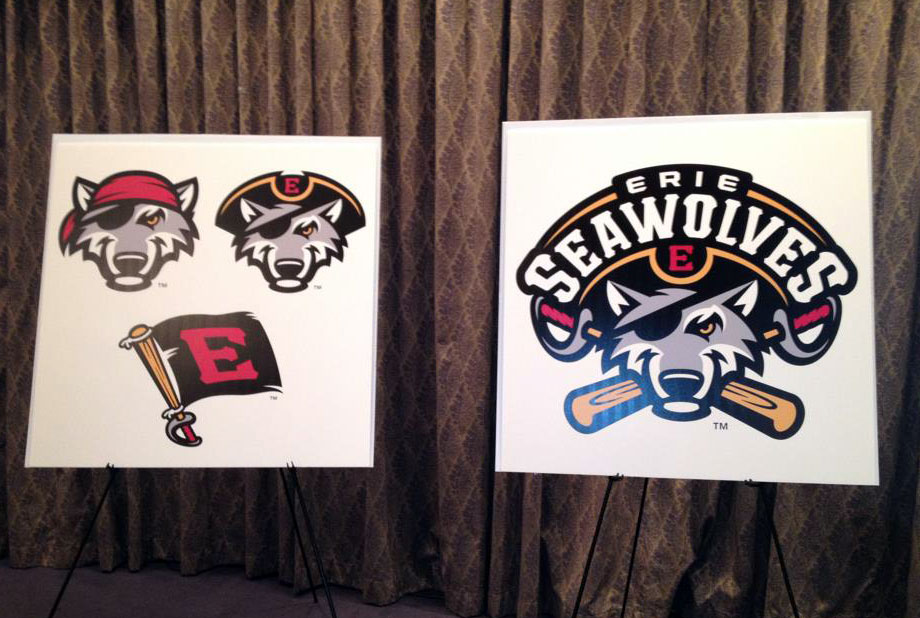
The new logo set was designed by Studio Simon, a design studio responsible for a large amount of solid Minor League Baseball identities including two other Tigers affiliates – the Toledo MudHens and Connecticut Tigers.
“Studio Simon did a tremendous job creating a new look that fans and players will wear with pride,” added Coleman.

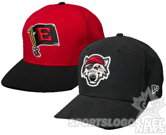
Erie will wear three in-game uniforms in 2013, a white home, road grey, and a red alternate. Accompanying these three jerseys are two caps.
New to the identity is an alternate logo paying tribute to Erie’s role in the War of 1812 – a flag with a red ‘E’ on it flying from a baseball bat. Also a nod to Erie’s nickname “Flag City”.
New merchandise is already available for purchase courtesy the Erie SeaWolves online shop.


