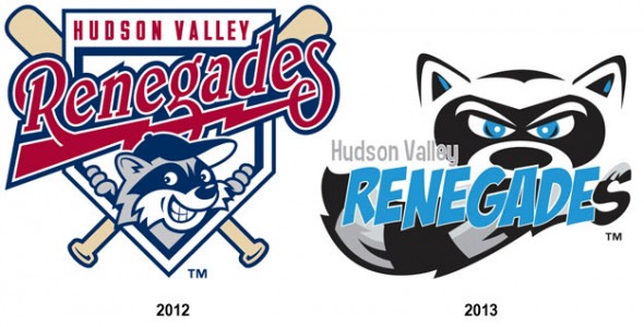
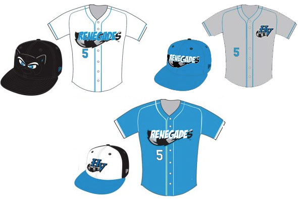
As a part of their 20th anniversary celebrations, the Hudson Valley Renegades, Single-A New York-Penn League affiliate of the Tampa Bay Rays today unveiled their new colour scheme, logos, and uniforms for the 2013 season at a private press conference in Fishkill, NY.
Out is the old colour scheme of red, navy, and grey in it’s place is dutchess blue, silver, and black. I love the new colour scheme, and the way the Renegades utilize it is more the way I would have liked to seen the Toronto Blue Jays use the colours back in their days using the similar scheme.
While the design has changed, the life behind it has not. It’s still a minor league design, with an obvious appeal towards children.
What stands out, in terms of uniqueness, among the set is the home cap design, which features the two white eyes of the raccoon from the primary logo and a thin outline of its ears peeking up above the bill. While in a bit of a bizarre move, the road cap design includes the jersey wordmark that appears across the front of the alternate jersey.
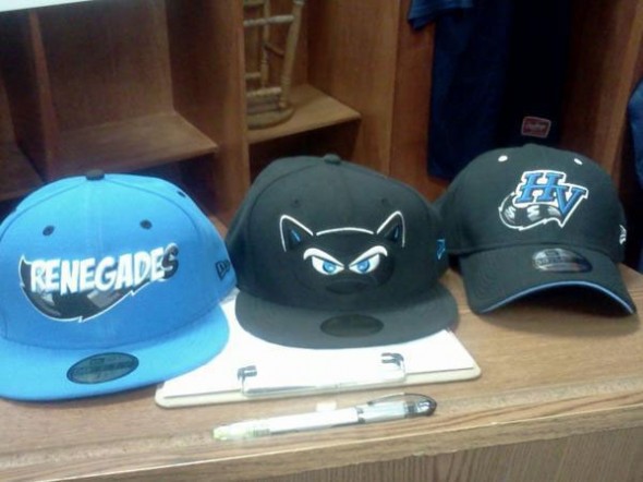
All four uniforms (three in-game, and BP) each have their own cap, so consistency is out with this set but on the other hand you do have your pick of the litter when it comes to purchasing your favourite cap.
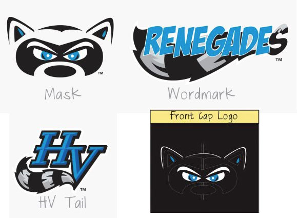
That “HV Tail” logo really sticks out like a sore thumb, or more accurately, a thumb amongst sore fingers. It’s the only logo that’s been carried over from the previous set just recoloured to match the new look.

