Farewell Yankees, Hello Porcupines on Rails!
At a fan event held earlier tonight the International League’s Scranton/Wilkes-Barre Yankees officially announced they would be now known as the Scranton/Wilkes-Barre RailRiders.
This change is the third name and identity change for the Triple-A franchise in the past five years, prior to re-naming themselves the Yankees for 2007 the team had been known as the Red Barons.
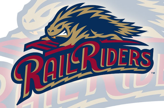
The name won convincingly in a name-the-team contest according to the club, going up against other finalists Blast, Black Diamond Bears, Porcupines, Trolley Frogs, and Fireflies. It was mentioned that “Porcupines” appeared on the most ballots but not as the top choice on the most ballots hence the use of that there porcupine on the logo.
New colours are electric gold, rich maroon, and Yankee navy (despite changing their name, the team retains their affiliation with the New York Yankees). The “rich maroon” meant as a nod to the Red Barons.
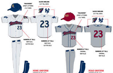
Photos and details are unfortunately scarce at this moment, but here’s what we know about the uniforms… sorry about the poor quality, all I’ve seen so far are cell phone pics:
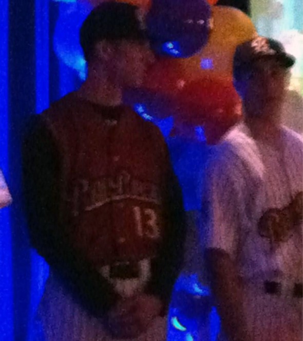
There’s three, a home, road, and alternate.
The home uniform is white with navy pinstripes (remember, this is a Yankees farm team) and features the “RailRiders” wordmark in red with gold and navy accents arched across the front, a navy cap will be worn with this uniform.
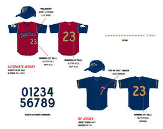
Alternate jersey is a red vest with navy sleeves, same “RailRiders” wordmark as on the home uniform appears across the front and it looks like red-on-red, which is a pet-peeve of mine. Navy cap also worn.
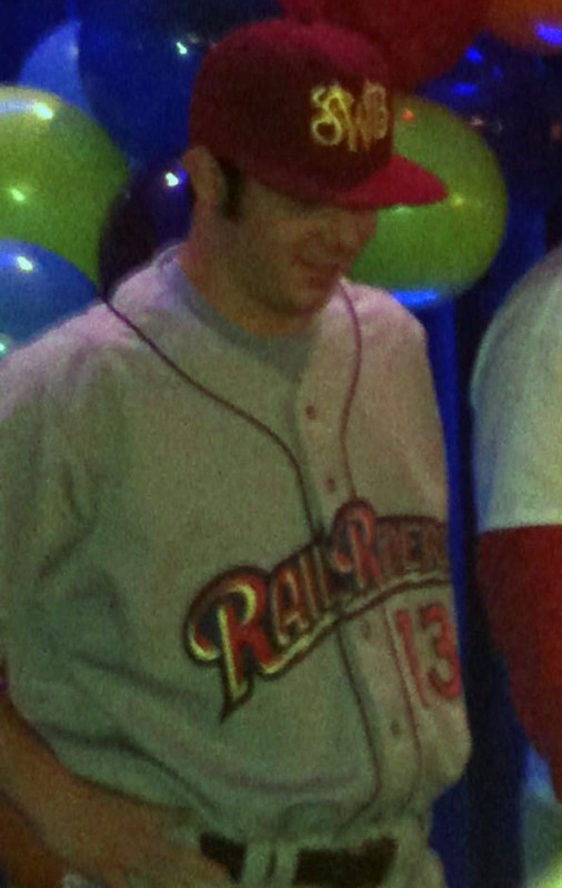
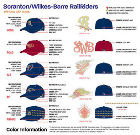
On the road we have that same wordmark across the front, and thankfully no road pinstripes. The cap is a beaut and is meant to be a call back to the days of the Red Barons who wore a scripted SWB logo somewhat similar to this one on their uniforms for many years.
The new logos were designed by Brandiose, previously responsible for the classic Richmond Flying Squirrels logo. Brandiose is also the designer of the new Reading Phillies logos to be unveiled this weekend.
UPDATE:
We got ourselves a somewhat better look at the new uniforms, and what appears to be a pillbox “special event” cap… pics below, again, sorry for the low quality.

