The Adirondack Phantoms are scheduled to move for the 2014 season and will keep their mascot and primary logo. The team name changes to reflect the change of location, though again to an “area” name, rather than the city of location.
Originally an expansion team bought by the owners of the Philadelphia Flyers to play in the Spectrum after the Flyers moved into their new venue, the Phantoms were originally named after their city. They sported their NHL team’s orange and black, and added purple to serve as a mark of differentiation.

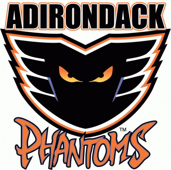
When the Spectrum was scheduled for demolition, the team was sold, and moved to its current location of Glens Falls, NY. They kept the mascot, logo, and colors intact, and changed to an area name: The Adirondack Phantoms.

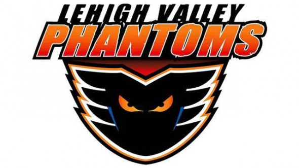
The plan, apparently, all along was to build a new arena and move the team to Allentown. The Allentown Arena is under construction, set to open for the Phantons 2014-2015 season but rather than take the name of their city and arena, they are going with Lehigh Valley.

The team is also changing the “accent” color of the team from purple to blue. Ordinarily a small color tweak wouldn’t be a big deal, but in this case, the blue now goes with the orange to create a look far too reminiscent of the New York sports teams, in many fans opinions.
The script had changed as well, from a custom, frantic font to what looks a lot like Arial Italic.
Strange choices by the team, and not so popular with some folks. What do you think? Should they have changed the logo to something else? Should they leave the purple alone? Is this a completely different team, so a full rebranding should have taken place? Or should they have simply hired a sports designer to give them a clean, professional look?


