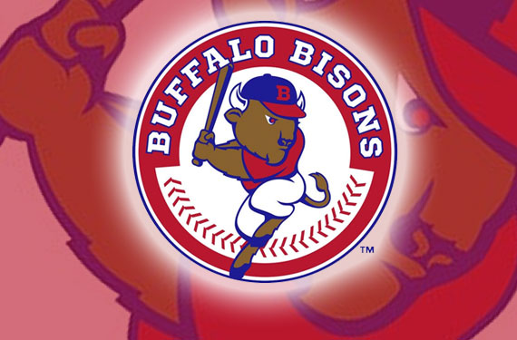
The Buffalo Bisons, Triple-A affiliate of the Toronto Blue Jays and member of the International League, today released their new logo via their Facebook Fan page.
Buffalo had recently changed their Major League affiliation from the Mets to the Jays and took the opportunity to re-brand themselves with their own imagery and own colour scheme, not dependant on whomever they’re affiliated with.
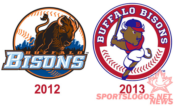
The new logo brings back both the classic red, white, and blue colour scheme and the use of their mascot (Buster) in the hitting pose. Red is the dominant colour in this new scheme.
“It was important for us to reestablish our own team identity with our new logo. Our fans have continued to express their fondness of the red, white and blue logo from the late ’80s and early ’90s at the ballpark. We feel this new logo not only pays tribute to that history but gives the team an exciting new look for the future.” – Bisons GM Mike Buczkowski to MILB.com
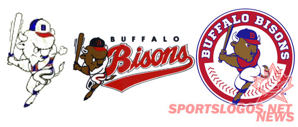
Local Buffalo-area merchandise distributor ADPRO Sports were responsible for the design of the new logo.
New uniforms won’t be unveiled until January but will reportedly feature block lettering.
The new Buffalo Bisons logo has already been added to SportsLogos.Net, you can check it out and rate it here

