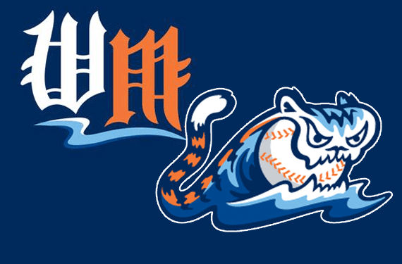
The Single-A Midwest League affiliate of the Detroit Tigers, the West Michigan Whitecaps, unveiled two new logos on Wednesday which pay tribute to their parent Major League club.
“I’m excited about these new logos, they strengthen the Whitecaps’ identity with the Detroit Tigers in a very literal way for our fans, who are also Tigers fans. I think the logos are a little more edgy and youthful and will appeal to the younger generation of fans.” – Whitecaps President Scott Lane
With an existing logo set which made no reference to their affiliation with the Tigers whatsoever the Whitecaps sought to fix that but still be able to maintain their own identity.

A new road cap logo was introduced, featuring a “WM” in the style of the olde-English “D” the Tigers wear on their home and road caps; as a nod to both the white and orange letters the Tigers use the “W” is white, and the “M” is orange. This is currently the only use of orange anywhere in the Whitecaps uniforms and (unless a road jersey change is planned) will stick out like a sore thumb.
A “retail-only” alternate logo was also unveiled which is, well, kinda creative, I mean it’s not normal to just think up “hey, let’s take a wave and turn it into a tiger”.

Admittedly geared toward their younger fans the new Whitecaps alternate logo will not be worn on any uniform (although I imagine we will see it on there one day), it’s simply the existing primary logo with a tiger tail, teeth, and ears added.
The Whitecaps and Tigers have been partnered up since 1997, their current affiliation agreement is in place through the 2018 season.


