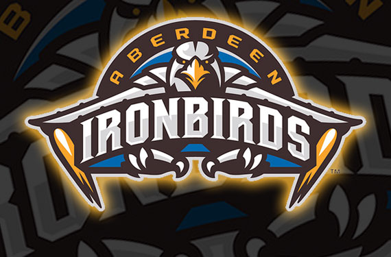
The Aberdeen Ironbirds, owned by the Brothers Ripken – Cal and Billy, the Single-A affiliate of the Baltimore Orioles, unveiled their new primary logo yesterday, their first logo change in team history.
According to Billy the new logo is combination of the old “Angry Orioles” logo of the late 1960s as well as “Iron Man”, a slightly more subtle nod to brother Cal than the previous logo which slapped his old #8 right on the vertical stabilizer.
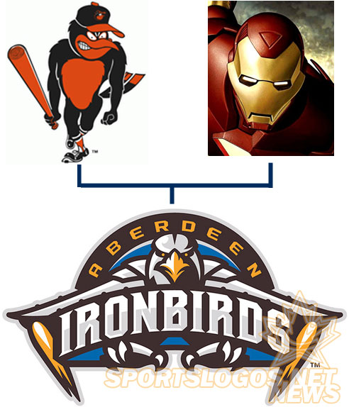
“He was mean-looking,” Billy Ripken said recalling the Orioles logo which inspired this new design in an interview with the Baltimore Sun, “He had a bat in his hand and a had a little lean forward.”
“The IronBirds are evolving to continue to remain on baseball’s leading edge, this is why we wanted a fresh new look and feel to connect with families, and resonate with fans of all ages”, Billy added relying heavily on the marketing buzzword handbook.

“You do want to appeal to the younger fans,” Cal also told the Sun in that same article, apparently failing to notice the logo they were replacing was about as “appeal to the younger fans” as you could get with a graphic, “”This logo represents a new era of IronBirds baseball in Aberdeen.”
Personally, I don’t see any of that old 60s logo Billy’s describing in the new logo and Cal’s logic doesn’t make a lick of sense to me but still, regardless of what the Ripkens are saying, I really do like the new logo – it is an obvious upgrade on what they were using since 2002.
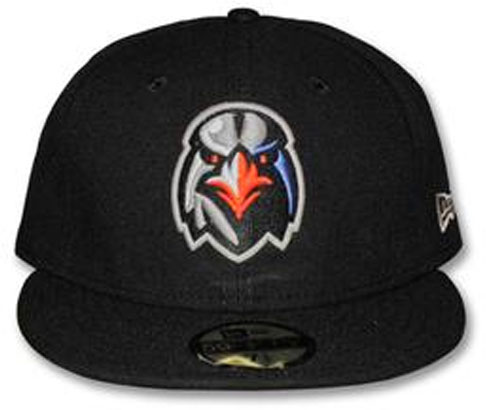
What’s nice and refreshing to see here is a real, professionally designed, quality, modern minor league baseball logo – something we had yet to see this off-season. Don’t get me wrong, I love the cartoon mascots, but sometimes you just want a little variety out there.
The IronBirds have some of the new logo gear on sale now on their online shop, a t-shirt and a couple of caps, no sign of new uniforms.

