Continuing what has been a very busy week in Minor League Baseball re-brandings, the Eugene Emeralds (San Diego Padres Single-A Northwest League) yesterday unveiled their new logos and colour scheme.
The new look gives the Emeralds something they desperately needed, a true identity. Having used logos in the past that showed off nothing more than the landscape of the Eugene area, it hardly gave fans anything to get excited about. You can only do so much with mountains and clouds.
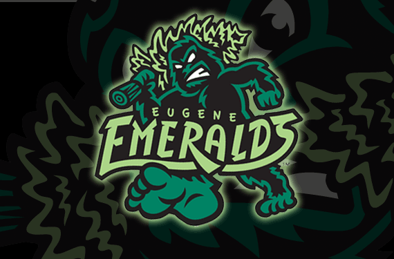
Enter Brandiose, fresh off of re-designing the new looks of the Scranton/Wilkes-Barre RailRiders and the Reading Fightin’ Phils. The San Diego based design company came back with professional sports’ first primary logo to feature a Sasquatch.
“Eugene is a hotbed of countercultural ideas, from Sasquatch sightings to hippy culture, the ‘Ems’ are honoring Eugene’s eccentricities with a few of their own.” – Jason Klein of Brandiose
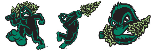
The new set features a Sasquatch or “Bigfoot” in a variety of poses, the primary logo shows him carrying an uprooted tree over his shoulder, the alternate logo has him swinging said tree like a baseball bat, and the home cap logo has him enjoying it as a tasty snack.
A sasquatch foot logo (not unlike the Colorado Avalanche secondary logo) is also used in multiple marks, on two caps a foot in the shape of an “E” is used, one on it’s own and another forming the Emeralds nickname “Ems” with an S-Sasquatch foot design at the end and a mountain in the shape of an “M” in the middle. This E-Foot design is also used on the road uniform wordmark which sees it being used as the first and last letter in “Eugene”.
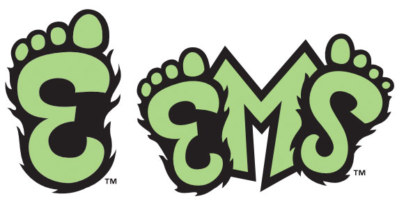
In total, four cap logos were introduced, in addition to the three already mentioned (Sasquatch eating a tree, “E”-Foot, and “EMS”) a fourth cap logo, which I’m presuming will be the batting practice cap, is simply the primary logo of Sasquatch carrying a tree minus the team name.
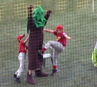
One has to think with the new Sasquatch mascot that’s sure to come with this set next season, the Emeralds bat boy won’t do what he did to the Ems’ poor old “Doug Fir” during the 2011 season…
Youch!
Hey! Have an opinion about this logo? Please share it by rating the logo on SportsLogos.Net by clicking here and clicking the stars with your score to the left. As of the publishing of this article it’s received an absolutely dismal 2.8/10 score, which seems quite low to me… Vote here!

