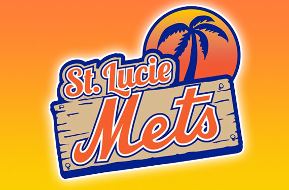
They could have been the St. Lucie Squid, Sand Sharks, or even Salamanders but in the end the St. Lucie Mets (New York Mets Single-A, Florida State League) decided to stick with the Mets and simply upgrade the team logos and uniforms.
In a move to get more in-line with the parent club’s recent changes, St. Lucie dropped black from their colour scheme to put more of an emphasis on the orange and blue.
“We thought it was a good time with our 25th anniversary coming up in 2013. We wanted to stay with what the big club was doing and also add our own touches to it” – Paul Taglieri, NY Mets Director of Florida Operations to MiLB.com
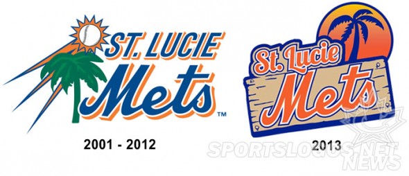
The new logo continues on the theme that this is a Florida-based club, but does it give a much needed update. A tilted wooden sign with a silhouetted palm tree in front of a setting sun gives the viewer a much greater sense that this team is going with a beach-like brand than the previous logo which featured not much more than a baseball/sun streaking over a green blob of a palm tree.
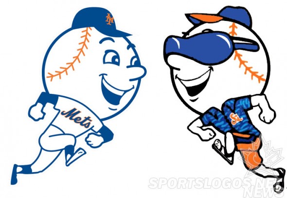
Other changes include giving Mr. Met the old retired New Yorker treatment by dressing him up in sunglasses and a Hawaiian shirt. He’ll be on the sleeves of each of the new uniforms.
“I love the orange. We moved the black away from the uniform, and it really has a Florida look to it. And I love Florida Mr. Met — it gives us our own identity as our own team.” – Taglieri
Despite the use of Mr. Florida Met on their new uniforms the team says they have no plans to introduce him as their new mascot, although a new team mascot may be announced in January to replace their previous mascot “Slider”.
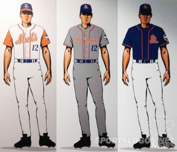
Speaking of the uniforms, there’s three of them – a home, road, and alternate. Two caps for in-game use, 1 home and 1 for the road/alternate jersey; a batting practice cap was also unveiled.
While the uniforms share some elements of the big-league Mets the pinstripes are missing from the home uniform, and we’re also thankful that the St Lucie Mets are the only Mets team to wear a white vest with an orange undershirt and orange piping… this is a look that should not be called up from the Minors no matter how much help the club may need come September.
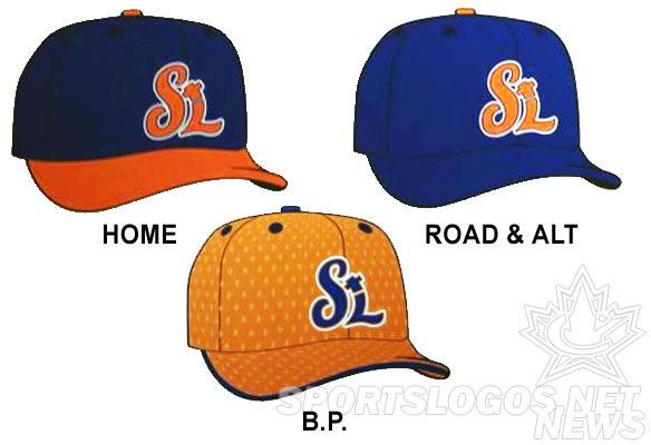
The previously mentioned caps are fairly straight-forward, they all have the “StL” logo (also on the front of the alternate jersey) in orange. The home cap with a blue crown and orange brim, while on the road it’s an all-blue cap with that same orange “StL” logo. The BP cap is a straight reversed colour version of the road/alt cap, what was orange is now blue and vise-versa.
“I like the orange, I like the palm tree with the sun — it really gives it a Florida effect. And being a New York Mets fan for years, Mr. Met has always been my favorite. Having a St. Lucie Mr. Met is good. If you’re a huge Met fan, Mr. Met has always been the main mascot. It should be good.” – St Lucie Mets Fan Club president Jim Fertitta to the TC Palm
St. Lucie’s 2013 schedule gets underway at home on April 4th against the Jupiter Hammerheads.

