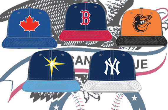
Major League Baseball and New Era are set to unveil their latest league-wide batting practice cap re-design in the coming weeks and we’re taking an in-depth look at the new batting practice caps for each team in 2013 here at SportsLogos.Net going through one division at a time.
In this piece we’re taking a look at the American League East.
BALTIMORE ORIOLES
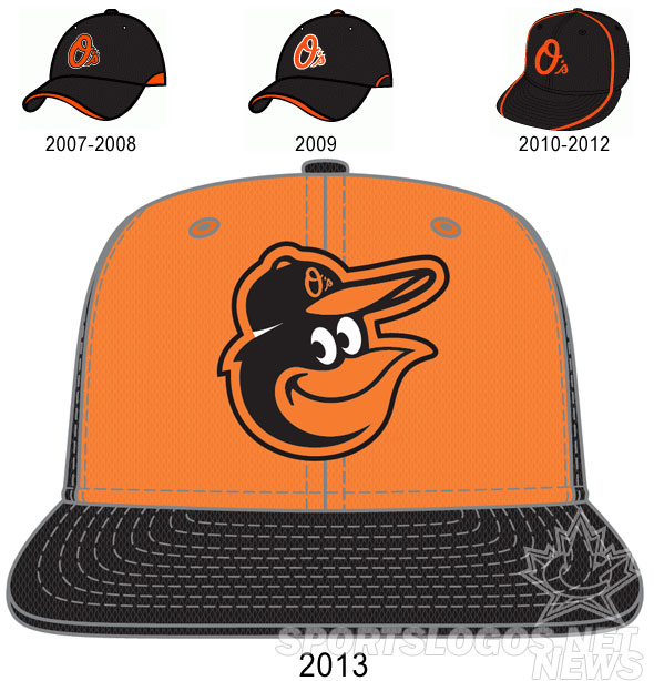
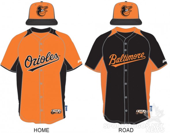
A throwback of sorts, the new Baltimore Orioles batting practice cap for 2013 is a fairly direct homage to their caps worn during Reggie Jackson’s one season as an Oriole in 1976, the only difference being the logo itself has been modernized since the ’76 season. Of note, it might be hard to tell on the graphic, but that’s actually an orange front-panel with black covering the rest of the crown (and bill), again, just like the 1976 cap.
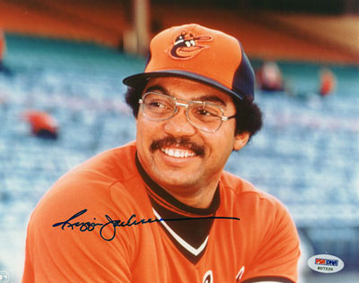
The Orioles are also moving away from what they’d been using the past few seasons by getting rid of the “O’s” logo – now, this change is only happening on their batting practice/Spring Training cap, they’re still expected to be wearing the “O’s” caps they normally wear for Friday night games during the 2013 season.
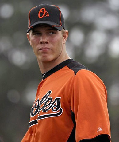
Like the rest of Major League Baseball (except for Houston), the jerseys are identical to what they wore in 2012, but a look at how the new cap matches up with the home and road BP jerseys and that’s a whole lotta orange on the homes. A little more balanced on the road uniforms.
Since the introduction of the special BP cap in baseball in 1999 Baltimore has only previously worn black caps, this will be their first deviation away from that.
BOSTON RED SOX
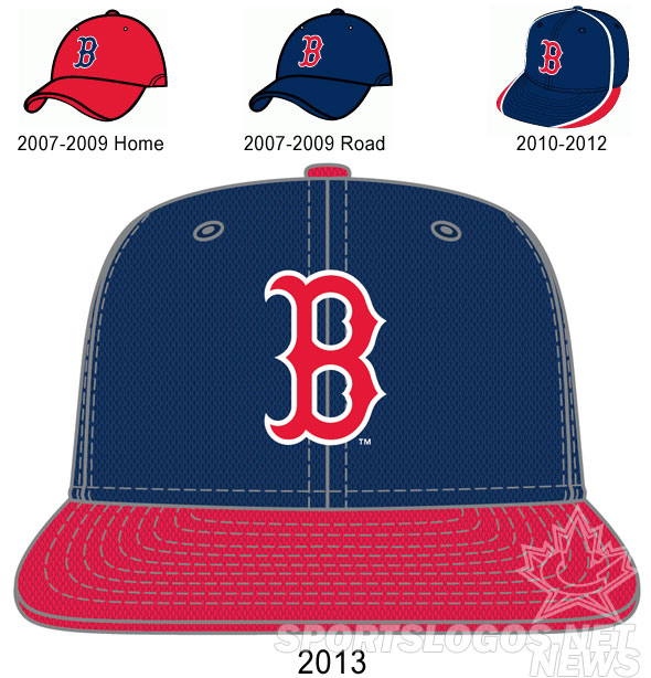
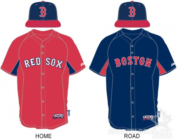
A very conservative design for the Boston Red Sox this time around, especially when compared to their 2010-12 lid shown in the graphic above. For 2013 it’s a cap design the team has never worn on-field in a regular season game (they’ve done the opposite, red crown with blue brim many times), but it is the same BP cap design the team used from 2003-2006, just a blue crown with a red bill.
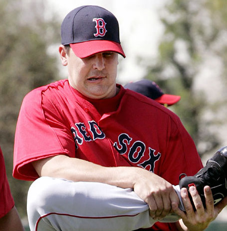
But then again, does it really matter what the Red Sox designate as their batting practice cap? I’m not sure the club *ever* wore their official design from the last three seasons, I mean, I can’t say that I blame them, but as you can see from the photo below during Spring Training 2012 they just wore their regular game caps throughout:

And again, like in 2012 the team will have a home and road jersey, this same new cap will be worn with both jerseys and actually looks quite snappy when you wear ’em together:
NEW YORK YANKEES
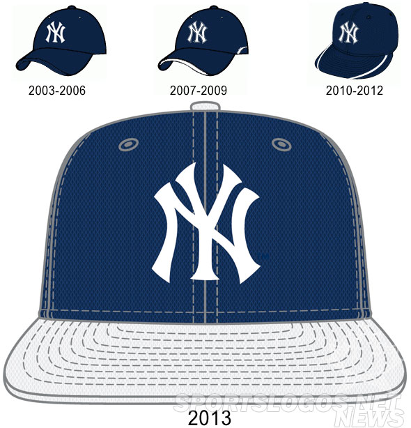
Here’s something new for the New York Yankees (how often do you get to say that?!) a white bill on their cap! What you’re seeing above is just the new home cap, there’s also a new road cap which uses a grey bill instead of white:
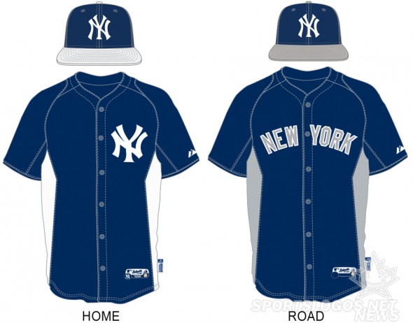
If this was ANY other team in the world, this wouldn’t be much of anything, but it’s the New York Yankees, you don’t give ’em a different coloured bill! You just don’t!
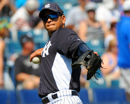
Positives from this new lid, the unnecessary outline that surrounded the Yankees “NY” BP cap logo on both their 2007-09 and 2010-12 designs is gone, as is the silly piping running all over the place. Why they couldn’t go back to the 2003-06 design will forever remain a mystery (*cough*more things for fans to buy*cough*) but at least that piping is outta here:
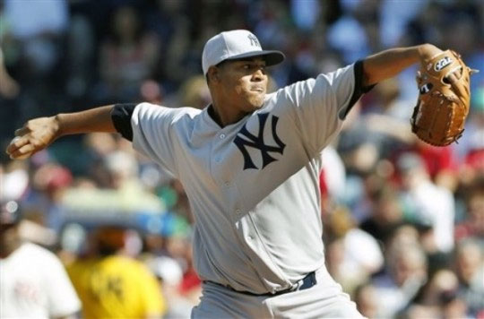
This is the first time the Yankees have played with the colour of their bill since they adopted this style of cap back in the 1930s, last year’s turn back the clock game to 1912 gave us something vaguely similar to what we’ll see in the Spring next season, just reversed, grey crown with a blue bill:
TAMPA BAY RAYS
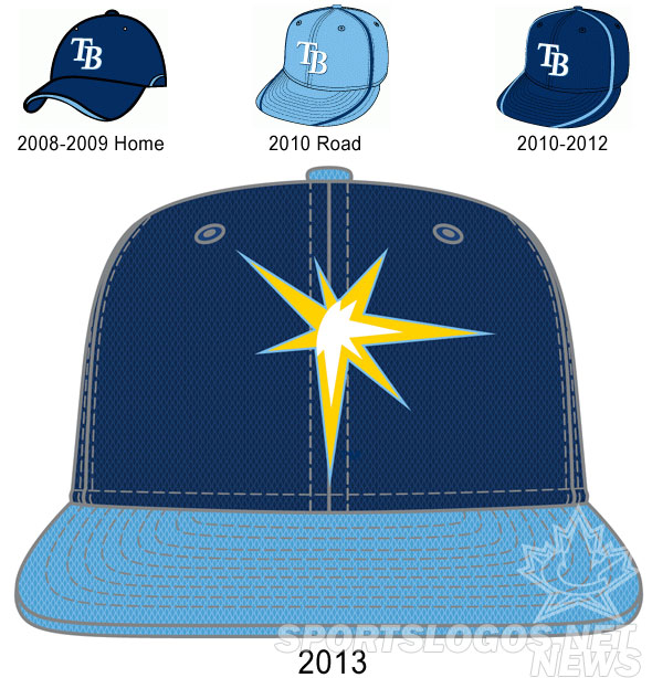
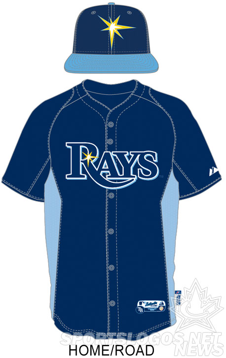
Tampa Bay is one of a few teams that will be going with a partial uniform design element on their BP cap (you’ll see another one for Toronto on here next), featuring the glint of light seen on the “R” of “RAYS” on all of their uniforms and logos front and centre. Powder blue is also getting a starring role, moving on up from random piping to bill and button.
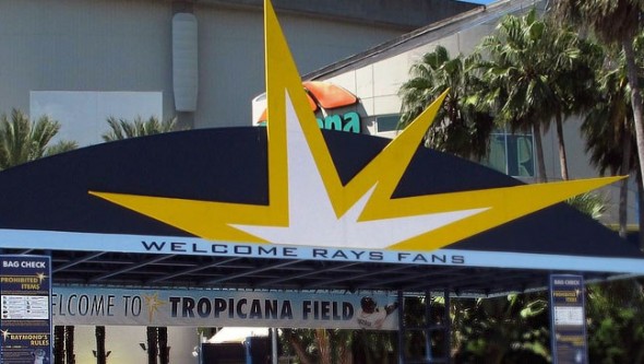
The Rays use the “glint logo” (why does it feel like I’m swearing when I say that?) on signage all around Tropicana Field, as well as actually designed into the outfield AstroTurf at the stadium, so it’s no stretch nor much of a surprise to see it finally featured as the main element on the new cap.
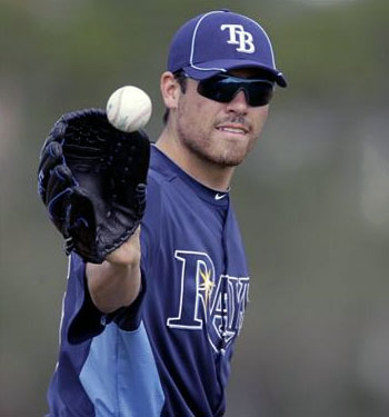
This will be the first time Tampa Bay goes without the “TB” initials on their caps, in Spring or in regular season game, since their very seldom used devil ray alternate cap from their inaugural 1998 season.
Only one uniform and cap for both home and road for the Rays.
TORONTO BLUE JAYS
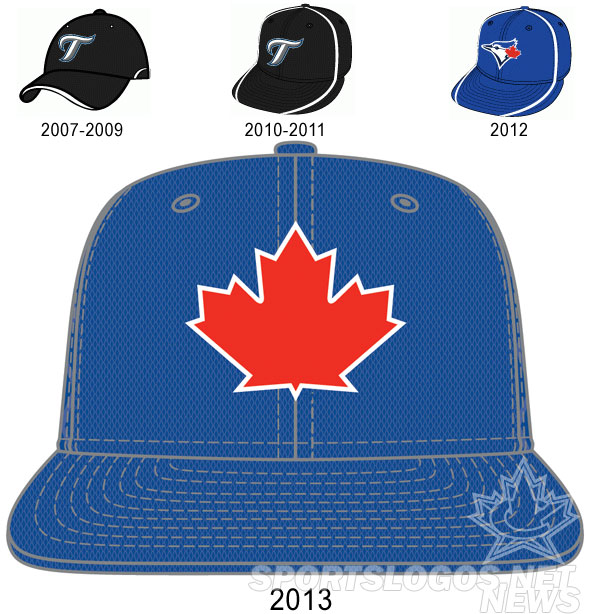
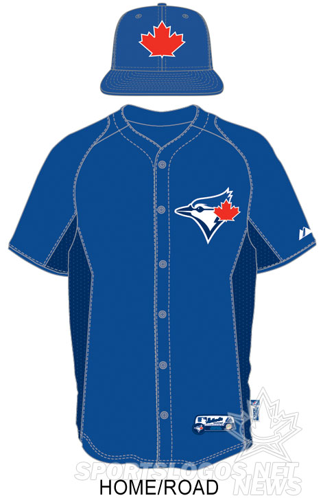
Here’s the Toronto Blue Jays, did you know they played in Canada? ‘Cause I sure forgot. But thankfully their new batting practice cap reminds us all about that without actually giving any hint as to the name of the team or the city in which they play in. The only positive? You guessed it… no more piping.
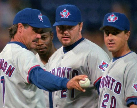
While at first reaction I thought it was the most ridiculous cap the club has ever worn (even more than the T-Bird) on repeated view it reminds me more and more of their cap logo used from 1997-2002, just with everything that identifies the club as the Blue Jays stripped away, and if I pretend it’s a shout-out to that old cap it does take some of the sting away, because I loved that cap:
But on the other hand, as you’ll see in the other division articles, the 2013 MLB BP cap re-brand will likely be remembered for the influx of new white front-panel caps being introduced, when I think of white front-panel caps, I think of the Toronto Blue Jays yet they opted to pass on what could have been the best BP cap of the bunch. Imagine the new Jays logo on a white front-panel cap? Cha-ching! Maybe for the next re-design, eh?
Like the Rays, just one BP uniform for the Jays, in my opinion the cap doesn’t really work well with it since there’s so much more red on it than on the actual uniform but I’ll let you be the judge:
That’s the AL East for ya, we’ll be finishing off the rest of Major League Baseball division-by-division over the next couple of days so stay tuned for that.
2013 MLB Batting Practice Cap and Uniform Guides:
AL EAST • AL CENTRAL • AL WEST • NL EAST • NL CENTRAL • NL WEST

