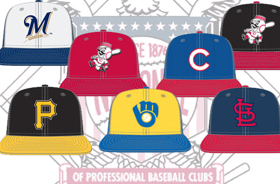
Major League Baseball and New Era are set to unveil their latest league-wide batting practice cap re-design in the coming weeks and we’re taking an in-depth look at the new batting practice caps for each team in 2013 here at SportsLogos.Net going through one division at a time.
In this piece we’re taking a look at the National League Central.
CHICAGO CUBS
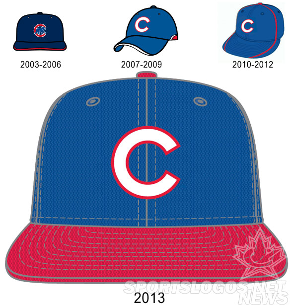
The Chicago Cubs keep their white C with red trim that they’ve been using exclusively for batting practice and Spring Training games since the 2007 season. What returns to the field for the field is the red bill, which was a part of both the regular season road and alternate jerseys from 1994 right up until 2008.
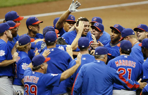
An example of one of the safer, simpler BP cap designs for the new season, the Cubs didn’t do anything crazy, which was nice to see from such a traditional club after the cap piping that ruined an otherwise clean look from 2010-12:
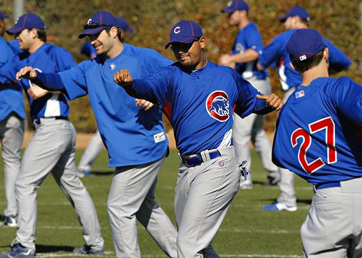
Like several other teams (Red Sox, White Sox, Cardinals) the Cubs rarely actually wore their BP cap during the Spring opting to go with their regular season cap instead. I have a feeling we’ll see this new design far more often in the coming year.
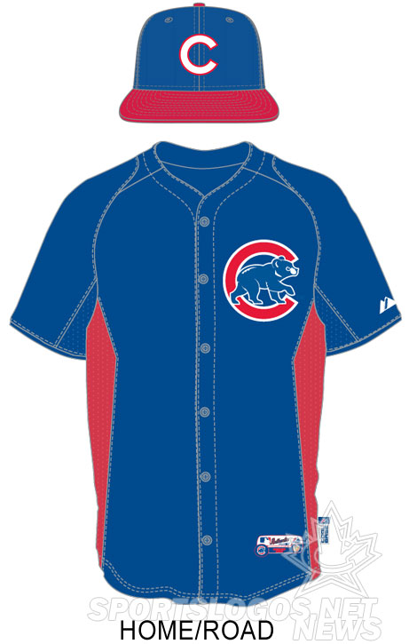
Uniforms remain the same, lookin’ good with the new cap too!
CINCINNATI REDS
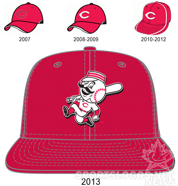
Mr. Redlegs makes his on-cap debut!
Cincinnati will be one of three teams (others New York Mets, Oakland Athletics) to put their mascot on their new BP cap – the Reds will have two, the home red one shown above and a black version worn with the road uniforms shown below:
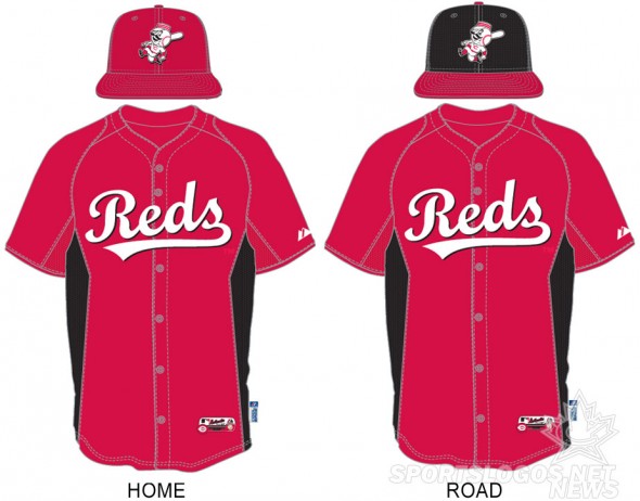
The black cap for the road uniform is the first time the Reds have welcomed back black as more than just a secondary trim colour since their days abusing and overusing it in the early-to-mid 2000’s:

Going all-black never really looked right on the Cincinnati Reds, but it looks great as an accent colour, pretty much the way they’ve been using it since 2007. Hopefully this is as far as they go with the black.
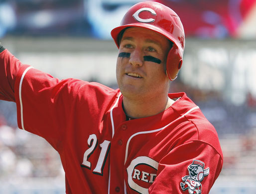
Mr. Redlegs, the new BP cap logo has been gracing the sleeve of their alternate jersey for the past six seasons and was previously the club’s primary logo in the 1950s:
MILWAUKEE BREWERS
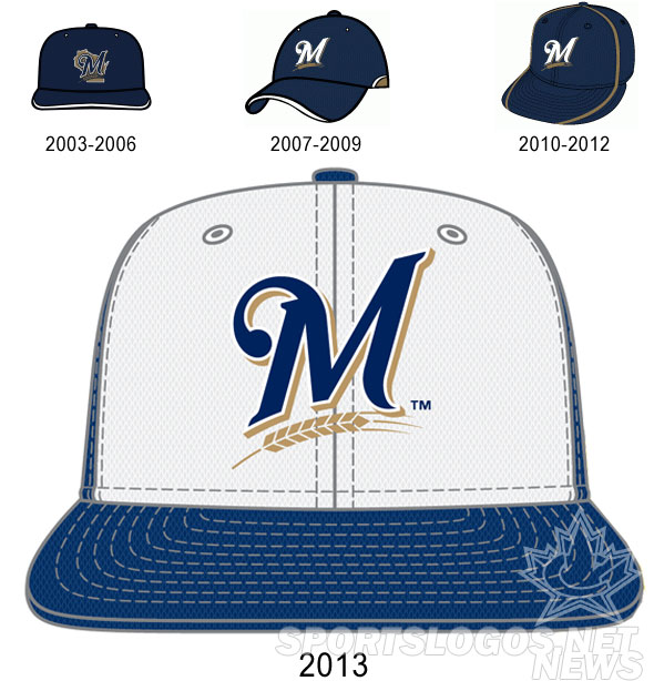
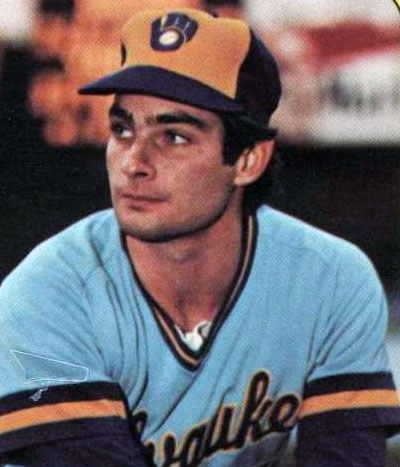
Another white front-panel cap on the field this upcoming Spring. The Milwaukee Brewers have used different coloured front panels during their franchise history before but never with the logo set they’ve been using since the 2000 season. The blue and white one above could possibly be an homage to their old blue and white batting helmet from the early 1980s, which was then used with the ball-in-glove logo:
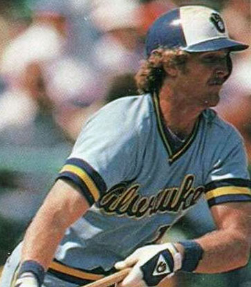
Speaking of ball-in-glove, the cap we show up at the top for the Brewers is only their home BP cap, they will be going retro for the road using their old blue and yellow cap (previously their road cap from 1974-1985, including during their AL championship run in 1982):
While the use of the old ball-in-glove cap sounds like an interesting idea, look at the uniform it’s scheduled to be worn with… clashing of eras much? The styles don’t even share the same colour scheme. Here’s hoping a retro road BP comes along to save this set:
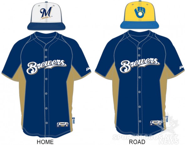
UPDATE (12/29/12 10am ET): I have received a second stylesheet, this time from NewEra which identifies the Brewers retro BP cap as an “Alternate” instead of “Road”. This designation makes far more sense. My guess is the Brewers will either come out with a retro BP jersey or simply wear these caps before games in which they’re wearing the retro uniforms.
Milwaukee of course will also be doing a one-off next March when they wear a uniform designed by a fan for a Spring Training game, the winning design has yet to be unveiled.
PITTSBURGH PIRATES
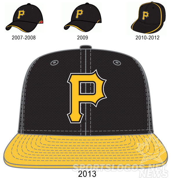
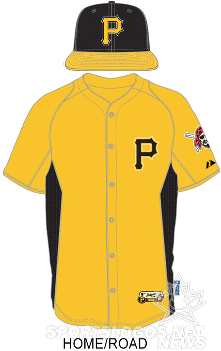
The only team to actually officially unveil their new batting practice cap is the Pittsburgh Pirates who shared an image of the cap during their new alternate uniform unveiling earlier this month. This is also how we know the BP caps will be 59Fifty’s instead of the 39Thirty style used since 2003.
A relatively basic design, the Pirates retain the white outline around the P logo they’ve used with their BP caps since 2007, but as with all other teams have removed the silly piping creating an overall nicer looking cap:

The new cap is also the first time the Pirates will wear a yellow bill on their cap since their 2006 BP cap (which featured the Pirate logo you see on the sleeve of the above photo on the crown), they previously wore a black cap with yellow bill and yellow “P” logo with their alternate uniforms up until 2005:

Jerseys stay the same, unlike the Brewers the new cap looks pretty sweet with their BP jersey:
ST. LOUIS CARDINALS
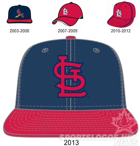
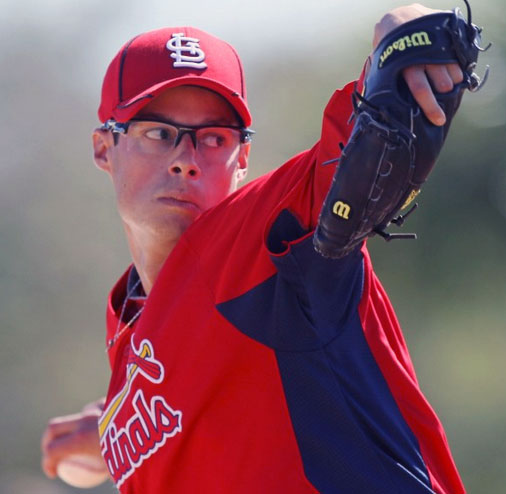
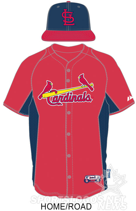
The always classy St Louis Cardinals don’t disappoint with their newest BP cap design, after killing off their old navy blue STL road cap for the upcoming season (note: it will still exist as an alternate cap) the club comes right back with a brand new navy blue cap for the Spring. Well done Cards!
It isn’t exactly the same as the old navy blue road cap used from 1992-2012, that cap was all navy (no red bill) and had a white outline around the “STL” design on the crown. This version is more based off of the old road cap worn in the 1940s and 1950s, the one of Stan Musial and the ’45 World Series champs:

St. Louis is another one of those teams that rarely wears it’s BP cap, they even usually wear their regular season jerseys during Spring Training games, but I’m still sure we’ll get a look at this new cap now and then, it’s just too beautiful to hide away on some locker room shelf.
That’s it for the NL Central, we’ve got reviews for the other divisions too… give ’em a look through via the links below:
2013 MLB Batting Practice Cap and Uniform Guides:
AL EAST • AL CENTRAL • AL WEST • NL EAST • NL CENTRAL • NL WEST

