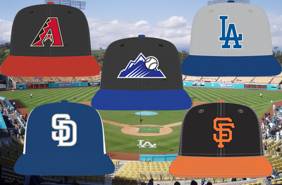
Major League Baseball and New Era are set to unveil their latest league-wide batting practice cap re-design in the coming weeks and we’re taking an in-depth look at the new batting practice caps for each team in 2013 here at SportsLogos.Net going through one division at a time.
Up next, we look at the NL West.
ARIZONA DIAMONDBACKS
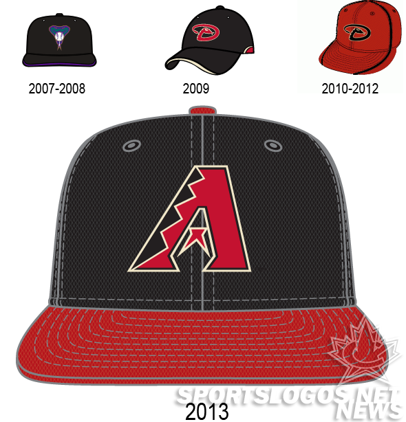
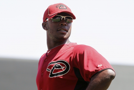
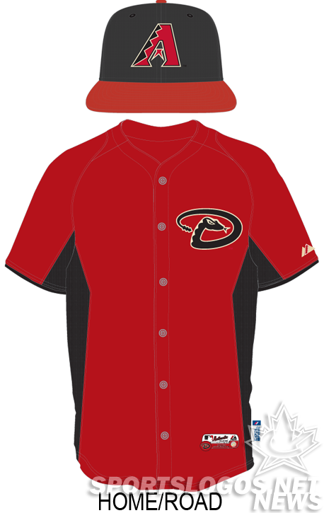
The Diamondbacks hats feature the team’s A logo, the only thing that still stands from the team’s initial season in 1998. The black crown and red brim are very evocative of the team’s early looks, where they would wear the logo with an alternate color on the brim. Black with a teal brim, white with a purple brim, teal with a purple brim. It’s a welcome change from their previous BP look, which featured the red at the expense of the rest of the palette.
Is the team embracing it’s history? Should the team revert to purple and teal? Personally, now that they are the only team wearing black, sand, and brick red, I think they should own the look, and this great looking BP hat is a great way to start.
COLORADO ROCKIES
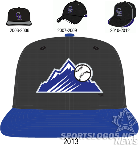
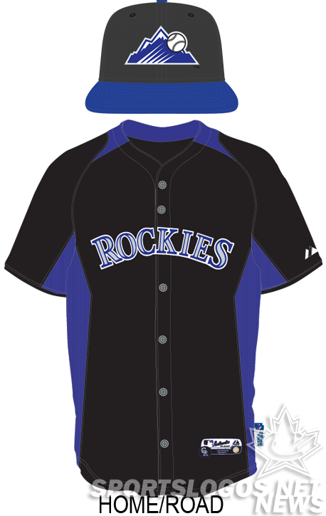
The stand alone baseball flying over the Rocky Mountains logo has been worn exactly one time in Colorado team history, and that was on the jersey of the “Turn Ahead the Clock” duds.
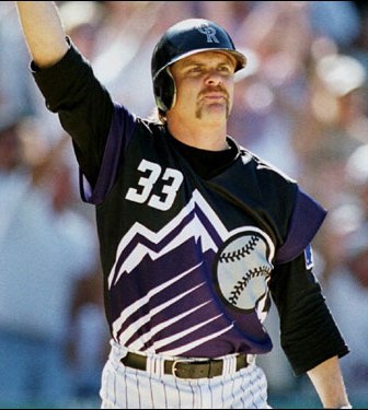
This is the first time in team history something besides the CR has been worn on a team cap.

Is this a sign of the team making changes, perhaps in the font? Or is it just an attempt to leverage an underused logo into the team’s identity?
LOS ANGELES DODGERS
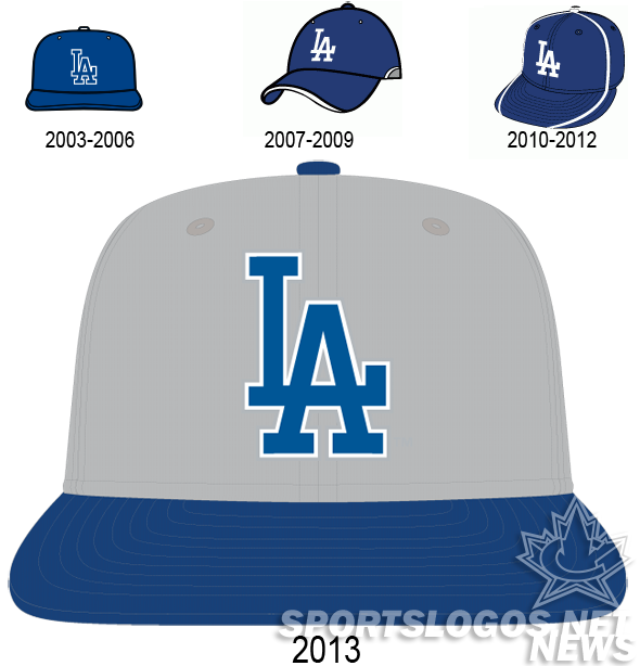
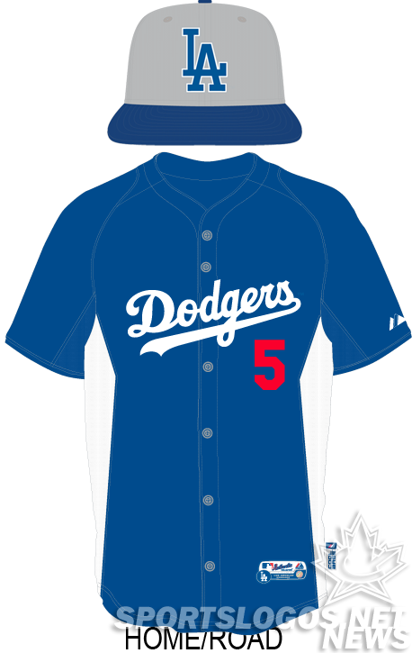
The Dodgers make the most dramatic change to their look since the 2006 BP’s, wearing grey crowns with a royal blue LA, squatchee, and bill. In past seasons, they have worn their regular hats with the spring training/batting practice uniforms, so it is unknown if this change will be noticed much, except for at the fan shop.
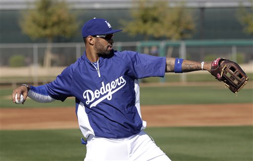
If they do get worn together, it will be unique to see how well the jersey, with no gray, goes with the grey crowned hat.
SAN DIEGO PADRES
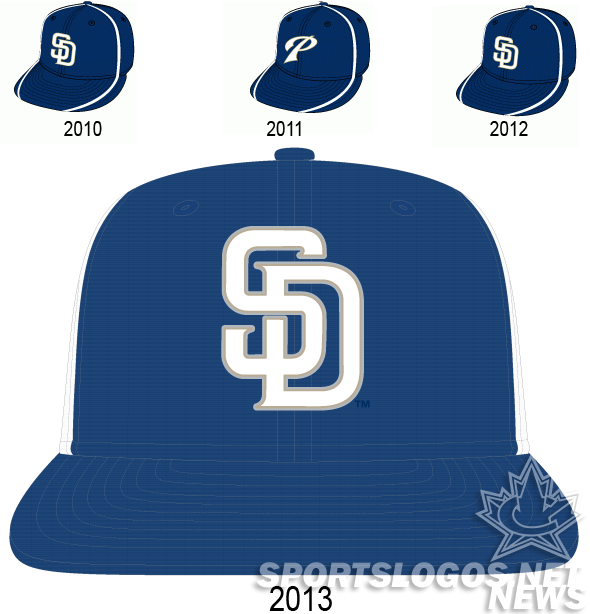
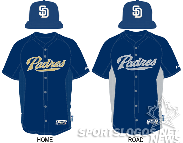
The Padres in large part appear to be a team without an identity. At home, they’re a navy blue and beige team. On the road, they’re grey and navy, and when they wear their alts? They’re navy and white. The new BP cap really does nothing to address any of those concerns. The hat, as far as I can remember, the first hat in MLB history to be a front paneled cap with a dark front panel while the rest of the crown is white, features their trademark SD on grey.
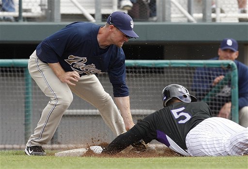
Just give us back the brown and gold, San Diego. That’s what the people really want. That, and to stop the camo.
SAN FRANCISCO GIANTS
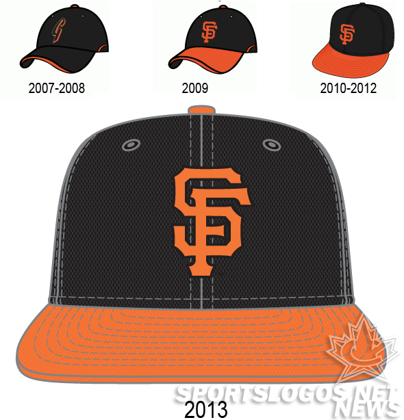
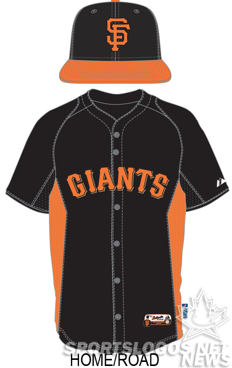
The Giants big change for 2013 is an orange scquatchee, compared to black for last year’s. The design, with the change, now exactly matches the team’s alternate hat.

Will the difference in material be enough for Giants fans to buy these new lids?
2013 MLB Batting Practice Cap and Uniform Guides:
AL EAST • AL CENTRAL • AL WEST • NL EAST • NL CENTRAL • NL WEST

