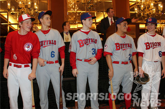
The Buffalo Bisons unveiled their new home, road, and alternate uniforms before a crowd of about 400 fans and media at their annual Hot Stove Luncheon today at the Adam’s Mark Hotel in downtown Buffalo, NY.
Buffalo’s new uniforms help the club “get back to their roots” by returning to the red, white, and blue colour scheme the club had used during their first seasons in the presently coined Coca-Cola Field some 25 years ago.
“These new uniforms are the perfect compliment to our new look and will not only energize our fans, but also make them proud of our long-standing tradition in Buffalo”, Bisons VP/GM Mike Buczkowski
The whole idea of coming out with a new look was spurred entirely by their new affiliation agreement with the Toronto Blue Jays, in other words if the team had remain affiliated with the Mets then no change would have taken place.
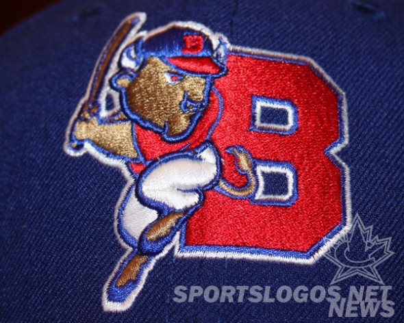
Designed by AdPro, the agency who had also designed their new team logo unveiled late last year, the new uniforms pay special attention to the more popular team jerseys from the history of the Bisons, while the shades of the red and blue have changed slightly (now called “Scarlet Red”, “Reflex Blue”, and “Ice White), you can certainly feel the connection to those Bisons clubs of the late 1980s and early 1990s.
Due to the late season switch in affiliations the club had to work fast to get their new identity completed, the only fan feedback they were able to utilize was how well the retro merchandise sold at a “Turn Back the Clock” promotion held during the 2012 season.
“The shops were cleared of that merchandise, that told us how popular the old look was”
HOME UNIFORM
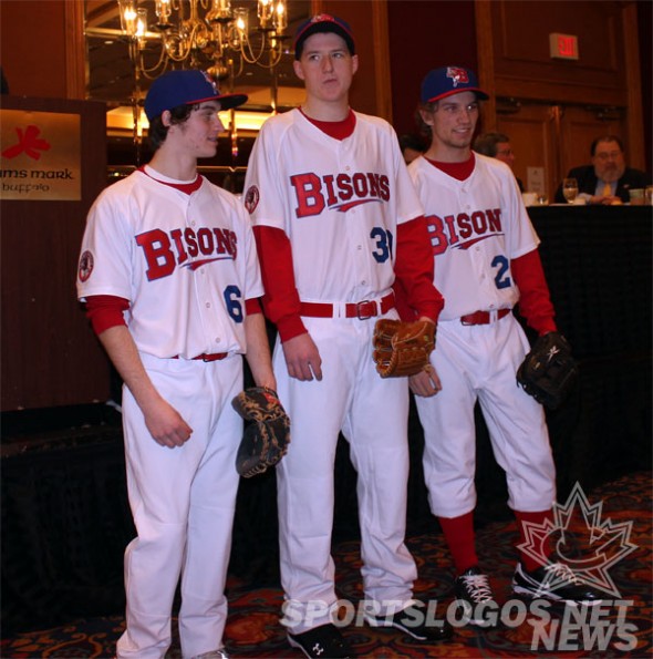
The new home uniform is white with the updated “BISONS” wordmark across the chest in red with blue trim, a red and blue underscore below the name. A player number in basic blue block font appears to the lower left of the lettering, the primary logo appears as a patch on the sleeve – layered (sorta like the Blue Jays patch on the front of their new uniforms) to give a 3D effect similar to logos on authentic caps.
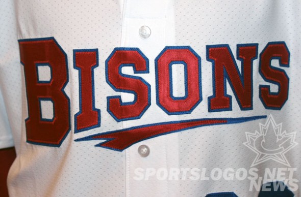
The pants feature no piping, belts are red. The new blue and red cap with the “Buster-B” logo is worn with this uniform.
ROAD UNIFORM
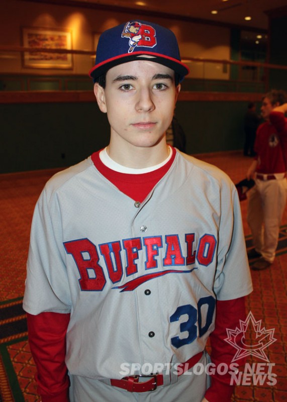
On the road it’s an all-grey uniform worn with the same cap as worn at home. The wordmark on the front of the jersey is in the same colour scheme as the home but reads “Buffalo” instead, player number remains the same colour as the home and in the same position. Player names are single-colour red.
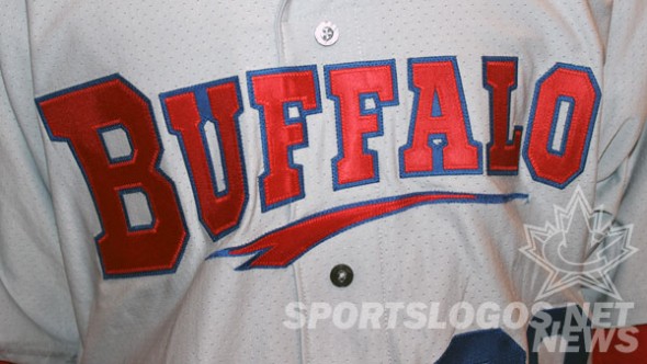
As with the home uniform, pants have no piping or stripes, and the belt is red.
And is it just me, or does that “Buffalo” logo above have an old AHL Buffalo Bisons feel to it?
ALTERNATE UNIFORM
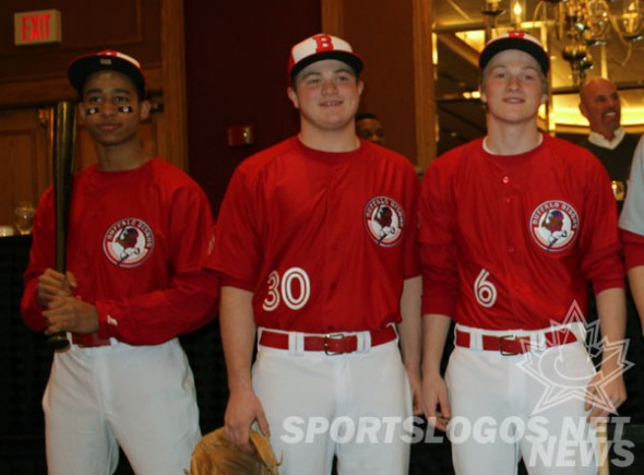
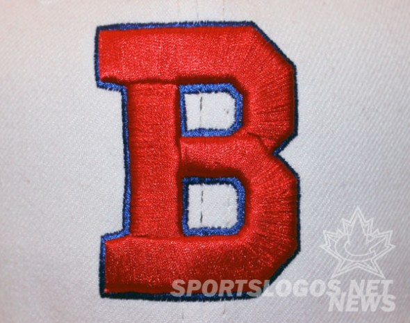
The new alternate jersey is where you’ll see hints of an affiliation with the Toronto Blue Jays, starting off with the new alternate cap which is red with a white front-panel “like the Blue Jays original cap” and a simple red “B” logo with blue trim.
The jersey itself has the new Bisons primary logo on the top left of the chest with the players number in the opposite corner in white. The player number on both the front and back of the alternate jersey is the exact same font used by the Blue Jays.
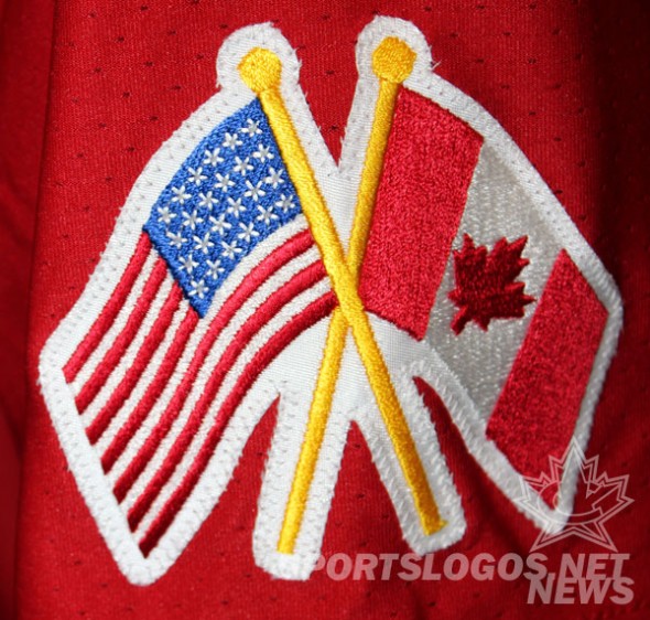
To try to win fans from over the border a “bi-national” flag patch is on the right sleeve featuring crossed American and Canadian flags with yellow poles. The alternate jersey will be worn for both home and road games.
“We really wanted to have our own identity”, said Buczkowski when asked about considering a Blue Jays themed set, “but still wanted at least an alternate jersey that tied in with the parent club.”
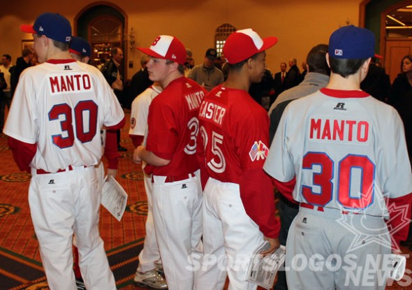
There are two new caps with the set, one used for home and road games, and one used exclusively with the alternate uniform.
First pitch is on April 4th at Coca-Cola Field in Buffalo.

