Ladies and gentlemen, your New Orleans Pelicans!
The New Orleans Hornets will be changing their name to the New Orleans Pelicans effective the beginning of the 2013-14 NBA season. Ending months of speculation and all sorts of leaks the club sorta finally made it all official via a leaked video making the rounds on Twitter.
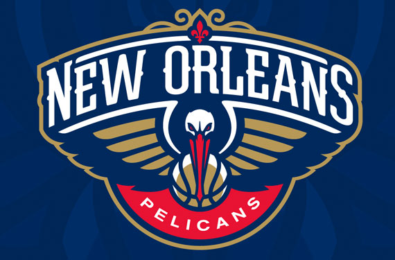
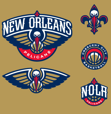
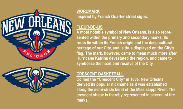
The new logo is what we posted here on SportsLogos.Net last night, with the team name and extra elements added as described in our article. It features a pelican facing the viewer with wings spread and a basketball under its beak, the city name prominently arched (and much larger than the team nickname, showing a lot of pride in the city with this one!) above the bird with a red fleur-de-lis at the very top. “Pelicans” on a red semi-circle in white rounds out the logo at the bottom. The new logo package was designed by RARE Design, previously responsible for rebrands such as the Houston Texans and Portland Trail-Blazers “ripcity” identity.
As for the uniforms, “Details regarding the uniform will be relayed in the coming months” so says the official press release. Sorry folks.
A state symbol of Louisiana since the 19th Century, the switch finally allows the City of New Orleans to put their mark on the franchise they inherited from Charlotte a decade ago.
“It was important to me, to our staff, to get something that represented Louisiana”, said Hornets/Pelicans owner Tom Benson via the video. “We worked on this for a long period of time, this didn’t happen overnight”.
The new colour scheme was explained as such, red because it inspires passion, blue for loyalty, and the gold is the many championships the club hopes to bring to New Orleans in the coming seasons.
Benson also added why the pelican is a perfect representative for the team:
“It’s a symbol of the state and a symbol of our resolve too, to come back. I mean, we’ve done it you know? That’s what’s great”
The new uniforms are also expected to be unveiled today, a press conference is expected to take place at around 4pm ET or 3pm New Orleans time.
The name “Pelicans” isn’t new to the city, the first pro franchise in town, a baseball team, was known as the Pelicans and existed for nearly seven decades from the late 19th Century through the mid 20th Century, Shoeless Joe Jackson even suited up for the New Orleans Pelicans in the 1910’s.
With the arrival of the Pelicans comes the departure of the Hornets, their classic logo, and colour scheme which changed the way sports teams designed during the ’90s.
The Charlotte Hornets, as they were originally known, introduced the colour teal to sports, it spread fast to hockey with the San Jose Sharks, baseball with the Florida Marlins, and to other basketball teams even changing the classic red, white, and blue of the Detroit Pistons to teal, black, and red. The teal became the identifying factor in this franchise surviving a move to New Orleans and a temporary shift to Oklahoma City, surviving several new owners and uniform modernizing.

In all, it lasted 25 years before NOLA wanted to put their own stamp on the franchise (and you can’t really blame them), freeing up the name for a potential return to Charlotte where the Bobcats are reportedly already polling their season ticket holders about a switch back to the Hornets identity. So there’s that to look forward to as well.
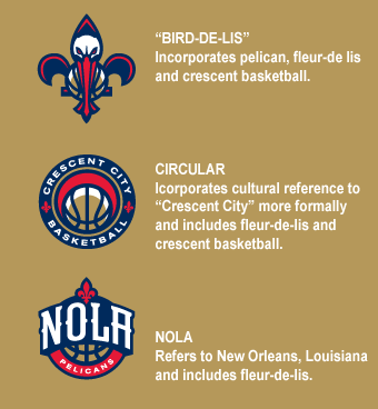
We have added the new logos to our site, you can check ’em out and give them a rating here.

