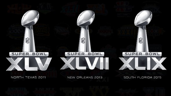
It is rarely a wise idea to speak for other people. However, in this case it seems acceptable; the authors and visitors of this site love design. We enjoy the craft, the study, the research that goes into design. We pour over the lines, the curves, the individual elements. We linger on the colors, the palate selection, the main versus accent colors. We hold the logo in our hands, examine the balance, the depth, the weight.
But the NFL doesn’t care about personality, distinction, city pride, timeliness, or design. At all. They have stolen one of the most interesting pieces of their game that occurs off the field; the Super Bowl Logos.
This is not new. We are on our third straight boring templated logo for this Sunday’s “big game.” Its a shame, a design crime, that the masters of their craft are not allowed to apply their incredible talents to represent a year, a city, a venue, a worldwide phenomenon of a game.
Dan Simon, designer of the Super Bowl XXXVI and XXXVII logos, likened being the designer of the Super Bowl logo to being awarded an Oscar. Once you’ve been awarded the honor, you are forever known as a “Super Bowl logo designer.”
The NFL has killed the design community’s Academy Awards. And its time to change.

In the beginning years of the Super Bowl, it didn’t even have its iconic name. During the AFL/NFL merger talks which began in earnest in 1966, Kansas City Chiefs owner Lamar Hunt had jokingly referred to the game as the “Super Bowl,” combining the college year-end games term of bowls (originally named after the Rose Bowl, itself named after the bowl-shaped stadium,) and his daughter’s new toy, the Super Ball. (One can now see that Super Ball in the pro football hall of fame.) Despite being called the “World Championship Game” for the first event, fans and players alike stuck with the catchier Super Bowl.
In the first 8 years, the logo for the game was simply a special font. Some very late-60’s and 70s looking, but just fonts nonetheless.
Beginning with the January 12th, 1975 game in Tulane Stadium, the logo began to take on hints of its location.

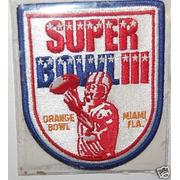
This began a grand tradition of including the destination city in the design, which would continue to be more and more involved over the years that followed. A trend that continued as long as the NFL would allow it.
1982 started an 11 year run of logos that were all red and navy. Hooray, America.
The 1985 game, played in Stanford Stadium, started truly taking into design consideration the fact that the logos were being used as uniform patches. As you can see, the patches needed entirely new designs, incorporating the wordmark with extraneous graphics to make a patch design. This diluted the brand, and that’s something the league certainly would not stand for. So, the designs began to take on more of a shield look

Location influences went from hinted at to really overt beginning with the logo for the Pasedena game in 1987. The rose was very prominent in the logo, in honor of the stadium, the Rose Bowl.

Super Bowl XXVI was the first to actually include a football, of all things. Funny thing is, NFL art director Brad Jansen originally included the Lombardi Trophy in the logo, not an actual football. He was told not to use the trophy “in any commercial way,” so it was changed into a football with speed lines. Funny how times change.

The 1994 game in Atlanta was the first logo in 14 years without any red in the logo. It featured a large peach, despite the fact that the state of Georgia is only the 3rd leading producer of peaches. But that’s an association state of Georgia promoters have chosen to promote regardless. It was the first in a get of logos that all had a similar look. Large connection to their host city, details dancing around the outside of the logo, bold bright, distinctive colors.
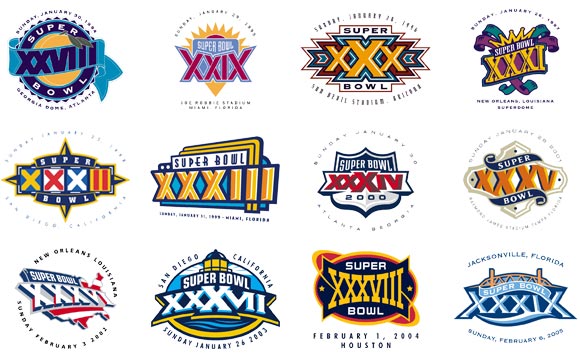
Little did we know, but the 2005 game logo was the beginning of the end. All the following, before the chrome logos started, had a blue and a red star incorporated as a nod to the NFC and AFC. Otherwise, all the logos essentially featured the roman numerals and had very little other than a hint of the location in the design. The prime exception is the February 10, 2007 game in Arizona which had a shape that vaguely resembled the state and had distinctively Arizonian colors.
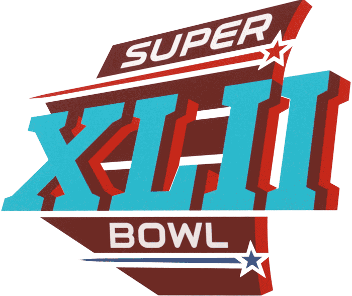
The last real logo for the big game was for the February 7, 2010 game played in Sun Life Stadium in Florida; Super Bowl XLIV. When released, feedback wasn’t overwhelmingly positive, but we in the design community didn’t realize it was the last we’d ever see. It should have been a time of celebration, to embrace the creativity, the greenfield possibilities, and the fun that was anticipating then seeing the logo.

Then the templatey, repetitive crap began. It isn’t that the logo itself is bad, its a well rendered logo, it does a good job of showing the metallic shiny goodness that is the Lombardi trophy. But why the same logo every year? The NFL has said that they wanted to stabilize their brand, provide consistency, and have one image represent each of their playoff rounds.
We discussed these reasons over the rich mahogany conference room table at the Worldwide Sports Logo Headquarters over this morning’s weekly meeting, and we’ve decided they are all garbage. They have killed the design, the personality, and the interest in the Super Bowl logo. In what way is that positive? Is what way does standardizing, boringifying, lamerificalizing the logo do anything other than make people completely forget each year, forget each logo, forget that each event should and does have its own personality?
Why continue to change city locations? Why not build a Super Bowl stadium in the center of the country, in an empty field you can call Super Bowl City? Why not change all of the franchises to NFL Franchise 1 through 32, all in red, white, and blue, and wearing the NFL shield on all their shoulders? Why not? Because it would be lame. Just like these new ridiculous chrome template Super Bowl logos are.
I realize this rejection is three years late from the announcement that the logos were going templated. But the three years have made the sting hurt even more deeply. The bland look is boring us past sleep almost on to death. Its been grating on us for years now. The experiment is over. Its time to go back to the beauty that is a new, distinctive logo. Hire the best out there in the design world. Give an unknown their deserved design Oscar.
You’d think with how litigious the NFL is, similar to the Olympics officials, they should easily staunchly defend whatever design they came up with. You might think that they could defend the brand, defend a unique logo as easily as they defend the shiny phallic shaped template.
But you might also think that the movie Idiocracy is fiction. I say its a frighteningly accurate crystal ball of where the country is headed.

