
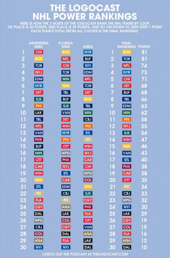
These are the official NHL Visual Power Rankings, as done by the official podcast of sportslogos.net, The Logocast. Obviously, this is our list of their visual identities, and NOT of their play on the ice. Let us know what you think of our averaged rankings. The total score, as well as each host’s individual rankings, are listed in the chart. We have also included some thoughts as to why we voted the teams where they are.
| RANK | TEAM | POINTS | MIKE W | MIKE T | GREG |
1 |  | 81 | 3 | 1 | 8 |
MIKE T: Best in the league in my opinion. The striping is perfect, and the alternate logo is great. I hate the team, but I can admit I love their look.
| RANK | TEAM | POINTS | MIKE W | MIKE T | GREG |
1 | 81 | 2 | 4 | 6 |

MIKE W: The Maple Leafs combine classic striping, a clean logo, and one of the best alternates in sports for a great overall identity.
| RANK | TEAM | POINTS | MIKE W | MIKE T | GREG |
3 | 74 | 12 | 2 | 5 |

GREG: One of my favorite road uniforms in the NHL. The fact that the red and blue fight with each other on their home jerseys is all that keeps them from a higher ranking. They really need to bring back the 40’s alternate that they wore in ’03-’04 and ’05-06.
| RANK | TEAM | POINTS | MIKE W | MIKE T | GREG |
4 | 73 | 6 | 13 | 1 |

GREG: Admittedly a homer pick. Their road jersey is simply the best in the NHL. The colors really pop off the white with the red pants and the stripes are perfect. A fantastic third and the fact that I’m a Rangers fan puts them at #1 for me.
| RANK | TEAM | POINTS | MIKE W | MIKE T | GREG |
5 | 71 | 1 | 3 | 18 |

MIKE W: The Blackhawks were the #1 team on my list. In my opinion, no team balances color better, and you combine that with an excellent logo set, striping that just looks timeless and amazing, and you have the league’s best looking team.
| RANK | TEAM | POINTS | MIKE W | MIKE T | GREG |
6 | 68 | 7 | 11 | 7 |

MIKE T: Classic original six look. The thing that sets them apart from the Habs is that their logo could use a refreshing, but other than that a good look.
| RANK | TEAM | POINTS | MIKE W | MIKE T | GREG |
6 | 68 | 15 | 8 | 2 |

GREG: I love their logo and their colors work well. The logo doesn’t try to look “fierce” or “show motion”, it simply represents the name of the team – and it does it very well. Why they ever abandoned this look for the red & black and then the Buffaslug is an enduring mystery.
| RANK | TEAM | POINTS | MIKE W | MIKE T | GREG |
8 | 66 | 11 | 7 | 9 |

MIKE T: The newest logo is the best in franchise history, and this comes from a Lightning fan. The alt is still out of place, but the simplicity of the regulars makes the set.
| RANK | TEAM | POINTS | MIKE W | MIKE T | GREG |
9 | 63 | 5 | 21 | 4 |

MIKE W: After a step in the wrong direction, playing with a navy, red, and copper that was altogether too dark and muddled, the Oilers re-embraced the look they won five Stanley Cups in, and now they look great.
| RANK | TEAM | POINTS | MIKE W | MIKE T | GREG |
10 | 62 | 16 | 5 | 10 |

MIKE T: Their home is absolutely perfect. If they had consistency over their 3 jerseys, and added red to the alternate it would be higher.
| RANK | TEAM | POINTS | MIKE W | MIKE T | GREG |
11 | 58 | 9 | 14 | 12 |

GREG: My favorite thing about the Flyers look is the name plates. Especially the black nameplate on the road jerseys. Overall, they have a clean, classic look.
| RANK | TEAM | POINTS | MIKE W | MIKE T | GREG |
12 |  | 55 | 4 | 18 | 16 |
MIKE W: Although a relatively new team, the Devils absolutely got their logo right the first time, and in their entire history, have only changed the green they original wore to their current black. There’s a reason for that, and that’s there’s no need to change.
| RANK | TEAM | POINTS | MIKE W | MIKE T | GREG |
13 | 54 | 8 | 9 | 22 |

MIKE W: One of the few teams that really benefitted from the RBK Edge redesign. The orange really pops in the jersey, and the logo was updated brilliantly.
| RANK | TEAM | POINTS | MIKE W | MIKE T | GREG |
14 | 47 | 19 | 12 | 15 |

GREG: A decent attempt at updating their old look and a major improvement over the old blue, black and gold. Go to the third jersey full time and we’ve got a winner. Not bad, but could be so much better.
| RANK | TEAM | POINTS | MIKE W | MIKE T | GREG |
15 | 46 | 20 | 6 | 21 |

MIKE T: I LOVE the yellow home uniforms. I think one of the best rebrands in league history was ditching the old set for the updated Nashville theme
| RANK | TEAM | POINTS | MIKE W | MIKE T | GREG |
16 | 43 | 13 | 10 | 27 |

MIKE T: The blue and green is a great look. I don’t mind the script as much as the whale/rink logos on the chest. Give me some Johnny Canuck!
| RANK | TEAM | POINTS | MIKE W | MIKE T | GREG |
17 | 40 | 21 | 19 | 13 |
GREG: Great primary logo. Awesome third jersey. They need to lose the piping on the primaries.
| RANK | TEAM | POINTS | MIKE W | MIKE T | GREG |
18 | 38 | 14 | 17 | 24 |

MIKE W: While they may not be long for the Copper State, the Coyotes have a clean primary uniform set, with the brick and cream really looking beautiful together. A third jersey that tries a little too hard moves them down a little in the rankings.
| RANK | TEAM | POINTS | MIKE W | MIKE T | GREG |
18 | 38 | 18 | 20 | 17 |

MIKE W: While the Hurricanes will never look as good as the team they replaced, the franchise formerly known as the Whalers has a fine color scheme and ingeniously uses the storm warning flag as striping.
| RANK | TEAM | POINTS | MIKE W | MIKE T | GREG |
20 | 35 | 17 | 15 | 26 |

MIKE T: The best logo set in the league, brought down slightly by the modern edge template, but the alternate still rocks.
| RANK | TEAM | POINTS | MIKE W | MIKE T | GREG |
21 | 34 | 22 | 23 | 14 |

GREG: Love the logo. Like their third. Hate the gold on the primaries. Bring back the old yellow and this one shoots right into the top ten.
| RANK | TEAM | POINTS | MIKE W | MIKE T | GREG |
22 | 33 | 27 | 22 | 11 |

GREG: Great primary logo. Their third jersey is one of the best in the NHL.
| RANK | TEAM | POINTS | MIKE W | MIKE T | GREG |
23 | 32 | 26 | 16 | 19 |

MIKE W: The people of Winnipeg waited 15 years for the a team to return to the city and take the mantle, they deserved more than double blue, a clipart jet over an overdesigned maple leaf, and road uniforms stripes in every possible direction.
| RANK | TEAM | POINTS | MIKE W | MIKE T | GREG |
24 | 30 | 30 | 30 | 3 |

MIKE T: Like the Oilers, the choice to throw back to old colors is a downgrade. The blue is too bright, the logo sucks, and the alternate is the worst in the league
| RANK | TEAM | POINTS | MIKE W | MIKE T | GREG |
25 | 29 | 10 | 25 | 29 |

MIKE W: A hemstripe away from being one of the best looks in hockey, the Kings absolutely upgraded over their prior black, purple, and silver mess.
| RANK | TEAM | POINTS | MIKE W | MIKE T | GREG |
26 | 19 | 24 | 27 | 23 |

MIKE T: too busy. The Flaming C is a great logo, but random piping and design brings it down. No problem with the black, they just need to make sense of their sweater.
| RANK | TEAM | POINTS | MIKE W | MIKE T | GREG |
26 | 19 | 28 | 26 | 20 |

GREG: Good color scheme but their logo looks like something that belongs on a drink cup at a truck stop.
| RANK | TEAM | POINTS | MIKE W | MIKE T | GREG |
28 | 16 | 23 | 29 | 25 |

MIKE T: In my opinion, the Navy sweater they replaced with the red was better. The logo screams outdated and from the 90s, and the alternate matches nothing.
| RANK | TEAM | POINTS | MIKE W | MIKE T | GREG |
29 | 12 | 29 | 24 | 28 |

MIKE W: Ugly color scheme, a wordmark in lieu of a logo, the Ducks set out to destroy any remnants of their Disney owned days with this redesign, but there was no Phoenix to arise from that fire, just one of the ugliest looks in all of hockey. With a shoulder patch on their thirds, the team has already backed off of their complete disavowing of the Disney era, and we can only hope this look is not long for this world.
| RANK | TEAM | POINTS | MIKE W | MIKE T | GREG |
30 | 10 | 25 | 28 | 30 |

GREG: You can’t do any better than throwing Dallas on the front of your jerseys and calling it a day?
Agree with our list? Disagree? Let us know! Respond here on sportslogos.net! Send us an email to podcast@thelogocast.com! Tweet to us at @thelogocast! Write a note on our facebook!
Next week, on the show, we will talk about our rankings and the feedback, and we will be reading samples by fans like you on the air!
To wrap things up, here is an awesome infographic done by Mike T. Tumble this, shoot it around via email, whether you like or loathe it, let’s talk about it!
Related stories:
 Over a Dozen NHL Teams Getting New Uniforms in 2017-18
  Opening Night 2016-17 NHL Team Logo Power Rankings
  Top Selling NHL Player Jerseys of 2015
  New York Rangers Phantom Stanley Cup Champs
  The 7 Best-Dressed Stanley Cup Finals of the Past 25 Years
  Photo Gallery: Fancy NHL Red Line Designs for 2013
  NHL Logo and Uniform Preview 2012 NHL Draf… New Jerseys Day 2011!