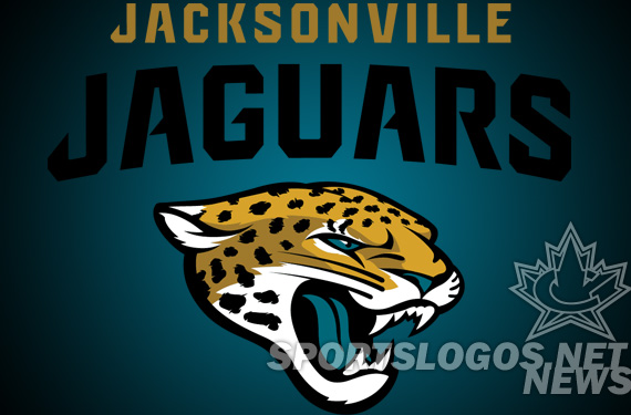
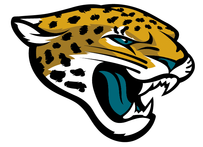
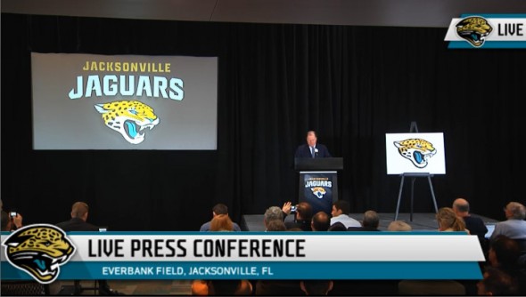
Today at a “State of the Jaguars” event, also streamed live on jaguars.com the Jacksonville Jaguars announced their new logo.
The Jags did a phenomenal job of keeping the new logo release under wraps. The logo community didn’t even hear about the new logo being an option until late yesterday, when CBS Sports’ Pete Prisco tweeted that he had “heard” about it.
Hear Jacksonville Jaguars new uniforms will have a Nike edge with a lot more gold and a new Jaguars logo on the helmet. For those who care
– Pete Prisco
Very little was out in the world about the new logo, and no leaks availed themselves. Congrats to the Jags organization at keeping the wraps on these.
For reference this was the logo the Jags had from their inception in 1995 till yesterday (leaving the Houston Texans as the only NFL franchise with the same logo they used at launch.)

As you can see, the new logo is almost cartoony, less logo-ish like their old. Initial response on Twitter hasn’t been overwhelmingly positive, but that is to be expected. The colors remain the same (similar?), the 3/4 view is the same,. Bigger ears, more accurate spotting for the Jaguar.
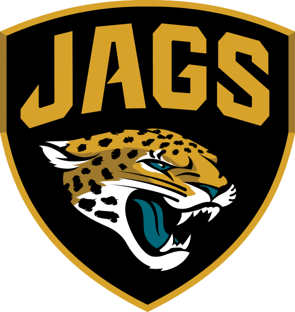
Also released were a new secondary logo, a military inspired badge with the “Jags” nickname
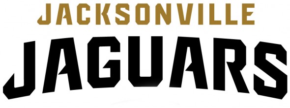
As well, a new wordmark was announced. Very similar to last year’s but now without the motion lines. Cleaner.
The Jaguars Foundation also adopted the new look.
The teal has dropped to a very tertiary color with gold becoming more prominent, almost their primary.
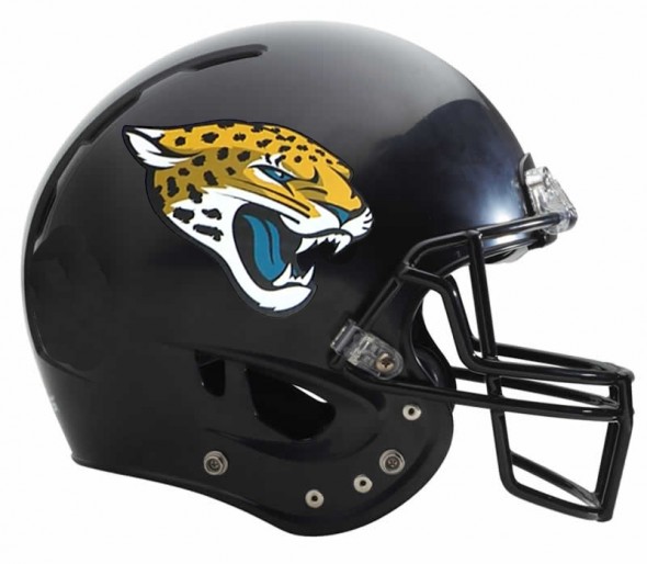
So, what do you dear readers think about the logo? We don’t get to see a new NFL logo release very often. Does this one strike you?
Let’s hear form designers, too. What would YOU have done differently? Get us YOUR Jaguars redesigns, and we will post them! Email them to jrfrancis@sportslogos.net

