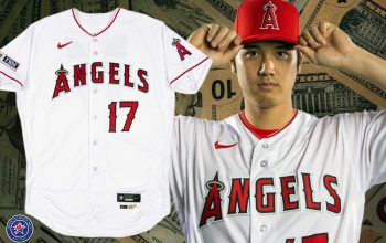
Pitchers and catchers will be reporting to all thirty Major League Baseball camps over the next three days which means we’ll FINALLY get a real-life look at all these new batting practice caps.
In the meantime, some photos are trickling in as well as some important (to us anyways) news items regarding the caps.
ATLANTA BRAVES FLIP-FLOP CONTROVERSIAL CAP
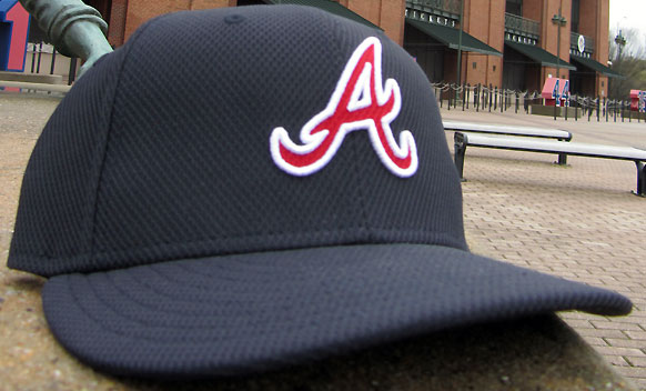
The Atlanta Braves stirred up some controversy when their cap design was first leaked back in December… and apparently also designed by MLB if the Blue Jays story is consistent. Well, that controversy is no more now that the team has gone and taken out the Native American warrior logo and replaced it with the standard “A”.
While the Braves maintain that controversial cap logo was just a proposed design, eh, we ain’t buying it. Stylesheets produced by NewEra and Major League Baseball show that cap and that cap alone, catalogue images also back up that story. A proposed cap just doesn’t make it that far unless it’s been approved.
We’ll have a lot more on this Braves switch tomorrow in an article courtesy JR Francis, please check it out when it’s posted!
LOGOS ON THE REAR
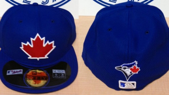
Remember that logo we saw on the back of the Toronto Blue Jays BP cap? Believe it or not, that’s actually exclusive to the Blue Jays. I know right? I heard reports about this last week but actually dismissed it due to the fact that a non-template feature on a BP cap seemed extremely unlikely to me. Lesson learned.
According to Jays fan blog Bluebird Banter the Jays were presented their maple leaf cap by Major League Baseball but were not happy about the inclusion of anything, you know, Blue Jays related:
“The compromise was to tack on the Blue Jays cap crest on the back of the cap, just above the MLB logo. Blue Jays president Paul Beeston confirmed that the Blue Jays’ new batting practice cap will be the only one in baseball to have the team’s regular crest on the back.”
Incredible on two fronts, one that MLB just flung these designs on every team with seemingly no input from the team, and two that they actually allowed this patch on the back of the cap.
GIANT WHITE OUTLINES
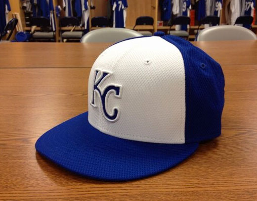
It was hard to tell on our computer designed versions of all the caps just how these white outlines would show on the white front-panel caps, but… thanks to the Kansas City Royals, we now know. It ain’t pretty, it ain’t necessary.
Several teams will be going with a similar giant-white outline style on their BP caps this year, apologies in advance to fans of the Detroit Tigers, Kansas City Royals, Milwaukee Brewers, and Minnesota Twins… bleh.
REGULAR SEASON USE?
According to NewEra brand president Pete Augustine, in an interview at ESPN, some teams will be wearing these caps for more than just batting practice or spring training games:
“It will soft launch on Opening Day and it won’t just be used for batting practice. We’re really getting away from the BP model because we don’t want to pigeonhole in just that. Some teams might want to wear it more frequently than others.”
We were promised an interview with NewEra to get more information on this… still waiting. Back in November, as part of their new logo launch, the Houston Astros played a video which advertised their BP uniform as their “Sunday” jerseys. This just adds more fuel to that fire.
RAYS ADD SECOND CAP
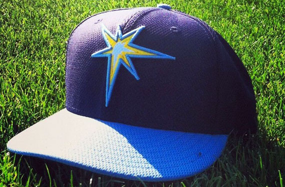
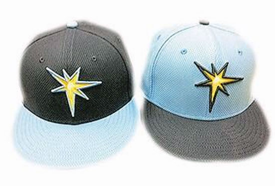
Absent from all our stylesheets, the Tampa Bay Rays have added a second batting practice cap, no information on it yet, but its design is similar to the one we had already seen except with the powder blue being the prominent colour in place of navy blue.
PHOTOS!
And now to finish this update off our collection of real-life photos of the new BP caps we have seen so far…
If you’d like to check out all the designs for all the teams, our handy division-by-division preview is available here:
AL EAST • AL CENTRAL • AL WEST • NL EAST • NL CENTRAL • NL WEST

