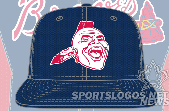
The Atlanta Braves have cowered in the corner, yielding to a tiny minority of voices and have made a last-minute change to their BP cap design. But they don’t even have the nerve to issue a press release saying that they chickened out and didn’t want to step on anyone’s toes. They didn’t say that they decided that honoring their past wasn’t worth offending the white guilt of some writers. They didn’t say that they wanted to be in the news one more time for bowing the the infinitesimal pressure they might have read in the comments section of some article about their new BP hats.
No, they have decided to pretend that they had several designs, and the choice hadn’t yet been made, and they were going to go with the most boring BP hat design in the entire history of BP caps (at least in the history of having separate designs.) The Braves PR department apparently thinks you, their fans, are idiots. They must think you will accept this falsehood, this fabrication, hook, line, and sinker. They apparently believe you will ignore the multiple style guides that show the former design. They obviously intend for you to choose to forget the New Era catalog with photographs of the BP caps with their Laughing Native American design.
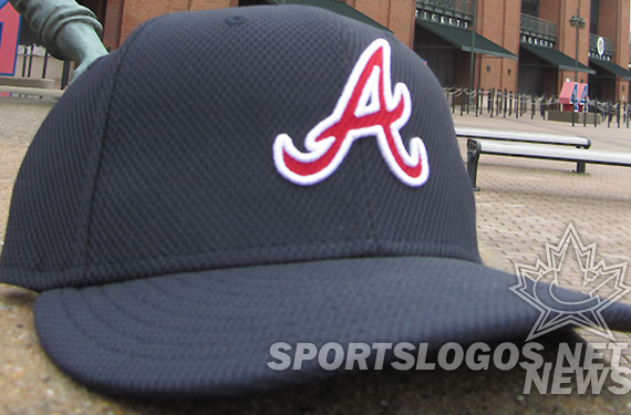
John Schuerholz, GM of the Atlanta Braves, seems to think you are too stupid to catch on. Too stupid to realize he heard rumor that some article somewhere had dismissed the use of their historic logo, so he decided to change it. One could assume he thinks you lack the mental capacity to calculate that he was too afraid of someone’s delicate little feelings getting hurt, that he rushed a replacement design into production. He said the “potential design” that was shown everywhere, including on this news site, was never the choice.
“I like the selection we made this year,” Braves president John Schuerholz said. “We had a variety of choices that we looked at, some more thoroughly than others. But at the end, we liked this one.”
To call the Laughing Native American design a “potential design” is an insult to fans, from the MLB and from the Braves.
“When we made our decisions, we tried to contemplate. We tried to be creative. We tried to carry on the theme of our organization, and we think this script A does that. It is part of the continuum of the uniform look we have. We’ve never had one that looks like this during Spring Training.”
To call this design “creative” offends me as a creative person. To say they’ve “never had one that looks like this” is an insult to me as a person with eyes. This is obviously a horrible rush job. One can image the orders to New Era. “Ditch the current one, go with our current Sunday Atl cap, but in all navy, or, use our 03-06 BP design… either way, just lose the tomahawk.”
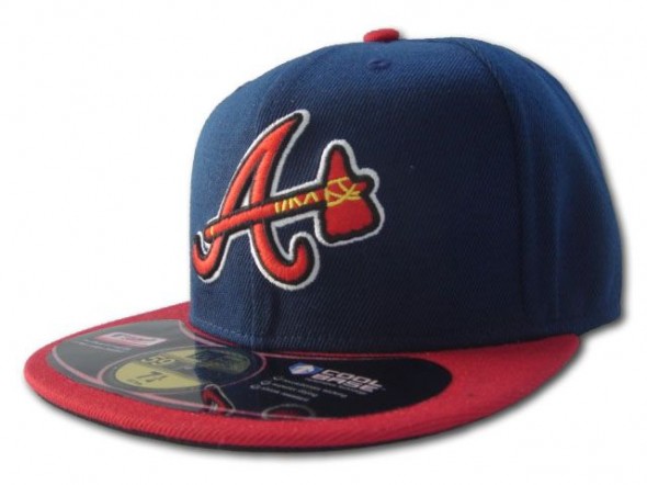
The simple fact of the matter, in my observation, is that the Braves organization read a couple articles from pro and amateur writers, all white, who were getting themselves some cheap readership mileage out of stomping their little feet and complaining about the logo. Self-entitled, unintelligent, hipster wannabes pouring out their white guilt all over their blogs about how offended someone somewhere should be about the logo the Braves actually used in the past. People whose writings can’t be respected as long as they continue to bitch and cry about teams having historical caps or shirts.
The facts are clear. The Braves hunted down the commentary, looked to see what people were saying, and have apparently decided they’d rather placate the tiny percentage of those indignant, rather than honor their own franchise’s past and serve up a cap a vast majority of people wanted, liked, and didn’t find in poor taste at all.
At some point, this article (like the previous), will be shared amongst the small community of those who have calculated that they would like to take offense to any imagery using Native American names or faces. And I’m sure the comments will fill. Last time, I felt badly for only giving my opinion, and not balancing the article with the other viewpoint. The facts are; previous to writing the article, I had seen a couple news items and blog posts who tried to tell me that I should be ashamed for liking the cap, that I should accept their mantel of outrage. My article was written to them to address those writers’ mock concern.
But then our article’s comment section was filled with very interesting debate about the use of Native American imagery. A camp was against its use at all. Several folks claimed (very likely accurately) that they were Native Americans and they were offended. Several other posters said they were also Native but weren’t offended. The one thing that these folks had in common, was when I reached out to them and asked them to help me put out a new article, with balancing viewpoints, they didn’t respond. Perhaps they were busy or used a fake email when they commented. Perhaps their blog contact email was so rife with junk mail, they didn’t see my earnest request for help in furthering the discussion. Maybe they didn’t believe me and didn’t want to put their words on our news section. Or, perhaps they knew they didn’t have a leg to stand on, and their taking offense was purely out of their own need for indignation, their subconscious desire to punish themselves. I don’t know which. But in 40 emails I sent, ONE person replied and said they would be willing to help. Hardly enough to create a round table of opinions on the matter.
The Braves have insulted me as a person with a brain. As a person who knows full well that they are lying to our faces. Through their teeth. Lying to pretend that they didn’t kowtow to the couple of voices saying the logo was wrong. I feel they have attempted to spin the story to be, “But we never decided on a design!”
The Braves need a new spin doctor. Just don’t put him on a cap, six random people with a blog somewhere might whine. And maybe even a doctor or two.

