Here at the Worldwide Sports Logos Headquarters, we have many leather-bound books full of league logos and our conference room smells of rich mahogany. Sometimes, in between heated discussions over the merits of new logos, or how far into the depth of sport we are willing to go, tracking new alt uniforms, we page through the books and notice interesting things about the leagues’ logos.
For starters, do you know the percentages of sports per league who include their sports’ equipment in their primary logo? You could page through for hours on our Logos Database pages. Or, you could stay right here and I, Inspector Logo, will tell you all about it.
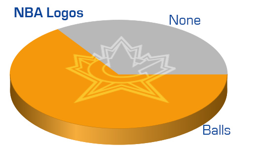
The NBA is far and away the biggest “user” in this category.
A whopping 20 teams out of the 30 use a ball in their logo in some way. Its almost become required to include a ball, as it seems almost every recent logo includes one.
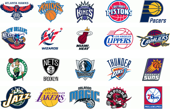
Quite a few feature the ball as a primary visualization, such as the Lakers.
The most equipment-heavy logo in all of the major leagues is for the Miami heat. It pictures a netless rim, with a ball on fire going through it. All items save the flames are game equipment! And we totally get why they didn’t picture the net. Why advertise for another franchise in your logo?
I suppose when you are an abstract concept like “heat” the tools to play your game would come into play almost by necessity. This does not explain, however, why so many teams feel it is necessary to show us the ball from their game. Almost obsessive like the Canadian franchise’s need to display a maple leaf.
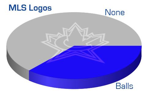
Balls are often features, as the MLS shows us. We would have liked to also show you the stats from the soccer league easily considered the top level in the world, but they don’t like to see their logos on this site, so we aren’t giving them the pleasure. Besides, the other leagues we are covering are North American, so we will go with the North American feature league.
The MLS teams aren’t shy to remind us they kick a 32-paneled ball. In fact 6 teams show us this immediately in their logos.
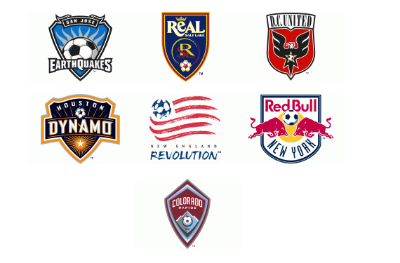
The largest inclusion is in the San Jose Earthquakes. Almost clip-art quality, their giant black and white ball is very traditional in appearance.
Less traditional is the New England Revolution who includes an artistic representation of a ball as the field of stars in their flag-based logo.
Not included in the above chart, but arguably including a delicate reference to the pentagons of a soccer ball is the crown/maple leaf/gift-bow top to the Toronto FC logo
The shape is a bit esoteric, so we didn’t include it. Do you think we should have?
Perhaps the NHL franchises need some help figuring out how best to include their gear in logos. For a sport with quite a few distinctive items, skates, goals, sticks, gloves, helmets, pads, pucks… they don’t use as many as you might think.
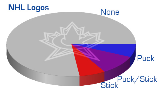
NHL logos don’t get redesigned very often, and when they do, they don’t throw in a ton of gear from the sport. Sticks are the most common over the history of the sport, but the stick/puck combo is more prevalent today.
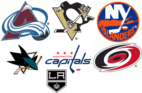
The Avalanche are the only team to explicitly use just a puck, in full 3D. Interestingly, most of the other sports include the item-which-scores in much larger frequency. In our historical research, this was the only puck-only logo we could find in the NHL (as you can see above, the Islanders who include a sick and puck and the Capitals who have a stick-L and a morse-code dash one assumes is a puck.) The Carolina Hurricanes get into the puck category because I lost the conference-room debate to Das Logo Führer, who insisted this was a puck, despite its disturbing lack of depth at that angle. I say if its a puck its an air hockey puck. We also toyed with including the Flyers as a puck-haver, but I stood firm on the “not every circle is a puck, dude” side of the argument. So, Hurricanes, in. Flyers, out. I believe that covers it. Then again, by the time we got to hockey the conference room crystal was empty of its bourbon, so we probably didn’t look at every page. Any hockey fans want to correct this?
The San Jose Sharks have an interesting inclusion of gear in their logo… with their mascot destroying a stick by chomping it in half. Are there other examples of gear being ruined? Not that we could find in the major leagues at first glance, but we shall look into it more.
The Kings were a late addition, as apparently my old man eyesight is failing me more than my Differential Equations prof at Tech and my handy-dandy magnifying glass only helps if I have on the eye black. They have crossed sticks at the very top of their crown.
The Penguins include a lot of gear, which we weren’t sure how to note. So, we called them a stick/puck combo. They have a stick, skates, and gloves. I’m surprised there aren’t more skates in logos, the metal shape would lend to some cool designs.
The Canucks had a skate as their primary logo from 1978 to 1997 but have left it in the dust bin. Vancouver also used to sport one of the only all-gear logos, when they had their stick-on-a-rink logo from 1970 to 1978. I object to this being called a rink due to the stick/rink scale being way off, but the intent was there.

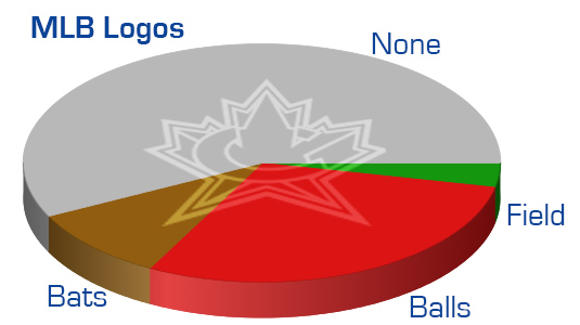
I’m also surprised there aren’t more bats in baseball logos. Shouldn’t they work just like sticks in hockey? But, only three teams use a bat, and even then, one of those uses a ball as well.
Several more teams use a ball in the MLB, though not quite at NBA levels. There are quite a few, however. Only 1 uses a field. If we had done this in 2011, we’d have been able to include the Padres use of home plate, which was amazingly unique.
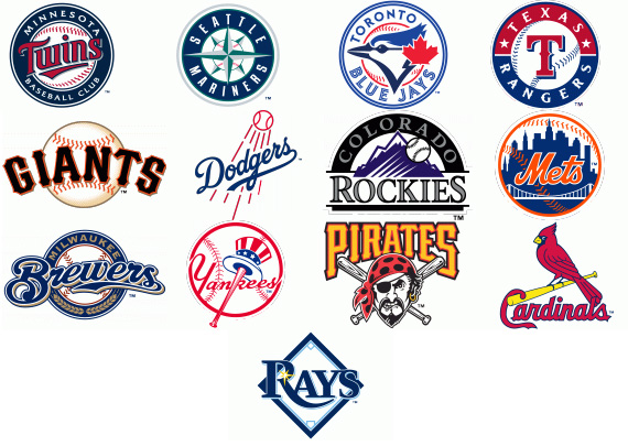
MLB has a roundel problem. Its an addiction, really. The volume of round logos, many around a baseball, has gotten ridiculous. Its as if Nike is doing MLB logos, and their template is a roundel with a ball or logo in the center, and heaven forbid any franchise deviate.
Baseballs are everywhere. The Yankees are the only franchise to use both a ball and a bat, though they are way out of scale to one another. Seems like if you use both, they should be in relatable size. The Pirates current logo (Scheduled to be replaced for the 2014 season) uses two bats; Something you can’t do in a real baseball game. The Rays are the only ones to feature the diamond.
One of the smallest inclusions of a ball is the Mariners. Several folks I spoke with about logos didn’t even recall the ball in their logo. But, its there!
Hidden behind the NSEW of the compass rose, the baseball is hard to see, because its so small and obscured.
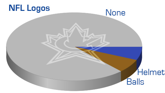
Small inclusions of gear are the NFL’s hallmark. Very few use gear at all, and of those that do, none of the logos have a huge, obvious inclusion of gear. They are all small.
Two each of the ball and of the helmet. No goal posts, no pylons, no fields, not cleats… not even any facemasks.
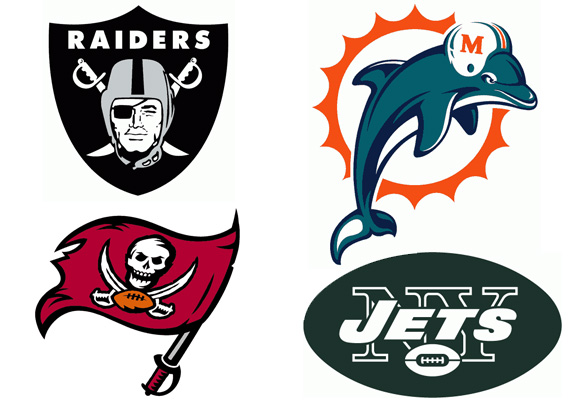
This may be the last year we can include the Dolphins, since he isn’t wearing a chin strap and the helmet is likely to fall off during the conversion to the new logo they are releasing next year. The Jets football even looks more like an Australian Rules Ball than an American. Why are football teams so reluctant to include their sport’s gear? Maybe because they largely use helmet logos as their primary, without all the crest and wordmark pieces.
One we left off this list is what we have listed as the Browns primary logo.

The Browns don’t really HAVE a logo, they are the team without. They have a helmet which is orange, and they use a rendering of that helmet some times, and others they use their wordmark. I, personally, don’t consider that their logo. If their logo was their “helmet without a logo on it,” then it would be a lame logo. I far prefer to think of their logo and being non-existent.
Logos, when they exist, are incredibly interesting. That’s why you visit here, and I am employed here. I can, and often do, look at them all day.
This was fun. What do you think about next week, we extend this study to historical logos as well? Hee haw!
Inspector Logo will be a series of articles that aren’t exactly news, aren’t really editorials, but give you more insight into the logos we see on the field, on the ice, and between the lines. If you have an idea for Inspector Logos, let us know in the comments.

