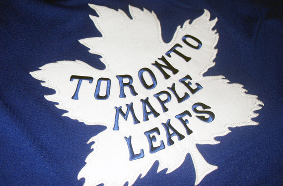
Was the 2013 Toronto Maple Leafs Winter Classic jersey design leaked earlier this month by an eBay auction? Either the answer is “yes”, or that’s a mighty impressive fake the seller put together.
We first heard and reported on this being the 2013 design back way back in August, and this only puts us even more firmly in the camp of it being an authentic design (on a replica jersey, it should be noted) proposed at the very least, to be worn in the 2013 Winter Classic in Michigan. There’s just too much evidence that points to the Leafs having settled on using this logo and at least seriously considering (or flat out approving) the use of this jersey.
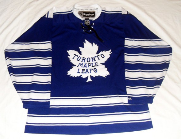
It is of the build of the new Reebok Edge jerseys, so it isn’t an old leftover replica from when the Leafs wore these jerseys as an alternate in 1996-97; they featured pretty tripped out numbers back then, and one of the few times in the last 35 years a team didn’t wear names on the back of the jersey.

The Leafs have never worn this jersey design in the Reebok Edge era (2007-).
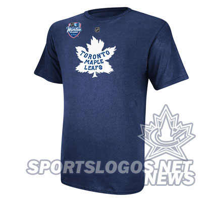
Phantom 2013 Winter Classic merchandise featuring the classic Leafs logo originally used from 1927-1938, shown on this jersey, had been spotted on various online shops dating back to December. Just yesterday a new line of UnderArmor gear featuring merchandise in either the current Leafs logo or the ’27-’38 logo was spotted for sale at the Air Canada Centre; a staff member was overheard saying the retro logo’d items “are probably for the Winter Classic”.

The Maple Leafs primarily used one coloured jersey style with this logo and you’ve been lookin’ at it, a white “clash kit” version was also part of the set, introduced for use in games against the New York Rangers (the only other blue team of the era) and a slightly modified version with fewer stripes was used for the final season with this logo in 1938.
TheHockeyJersey.co, the company who sold the jersey on the eBay auction told us that they believe the jerseys to be samples sent out for approval, which would explain the slightly askew NHL logo on the collar, they are a company which takes great pride in the authenticity of their jerseys – a quick perusing of their inventory backs that claim up.
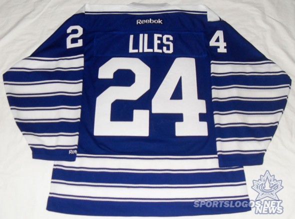
On the back of the jersey lettering for the name and numbers were similar to the current Leafs style however slightly rounded, a new look for the club. According to TheHockeyJersey.co the name and number were both made of the vintage felt-like material we’ve seen other recent Winter Classic teams use.
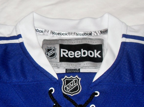
When reached for confirmation of whether the jersey was legit the Maple Leafs responded to SportsLogos.Net with “It’s hard to tell from the photo but we do not believe this jersey to be authentic”, upon seeking clarification if they meant the design or the jersey itself they said it was the design that was not authentic and that we should be looking out for the 2014 Winter Classic design to be unveiled this Fall.
So, yeah, one of three things going on there…
a. the Leafs had another design (a white version?) featuring this logo and what we’re seeing is a proposed-yet-ultimately-rejected design
b. the comment was made by someone who hadn’t actually seen the uniform, or…
c. they’re just simply trying to keep the leak from having any credibility
Who knows what the right answer is, but I’m leaning toward a combination of b. and c.
We’ll find out come the Fall whether the Leafs intend on carrying over this design to the 2014 game, which has yet to be announced but judging on that earlier comment from the Leafs I’d say it’s happening. Overall, a nice look, as a Leafs fan I’m glad to see they’re honouring this frequently forgotten era in team history.
—
Credit where credit is due, we first learned of this latest leak from the Icethetics blog, also Howard Berger originally posted about this being the Winter Classic jersey in August.

