Embossing the Space Needle, introducing a black secondary kit and showing off a mosaic of colors highlighted Day 3 of the MLS and adidas uniform Reveal Week. And that was just for the Seattle Sounders.
In a day that proved the most prolific so far, with five teams unveiling six different looks, there was a range from fun to classic to stodgy, to be certain. Day 1 saw the start of historic nods full of embossing and Day 2 continued the trend quite heavily (anyone for a maple leaf?). Day 3 didn’t disappoint on either front, but also added in some incredibly clean looks (here’s looking at you, Vancouver) to the mix.
Seattle Sounders
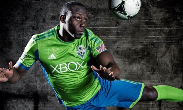
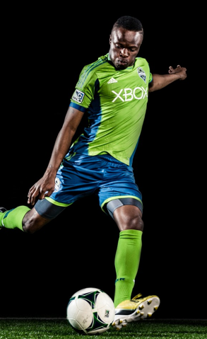
There’s so much Space Needle here, you can’t but help realize that Seattle is in love with its city. Gone are the embarrassing grayish stripes to nowhere from last year’s looks, as Seattle updated both is primary and secondary kits. Embossing of the beloved Space Needle was in order.
Seattle “cleaned” off the stripes while keeping its well-known rave green primary top with blue shorts. But to add some intrigue to the look, Seattle offered a silhouette of the needle embossed vertically on the right shoulder of the new primary kit. The change is more than ideal, removing stripes that meant nothing and adding a subtle nod to not only the team’s logo, but also a powerful regional tie.
“The primary jersey is a step back to a more traditional pretty basic one,” says adidas product manager Mike Walker. “But it’s really clean. Rave green and capital blue. It has an embossed Space Needle motif on it and then it has the Space Needle on the back That’s about it. It’s pretty clean.”
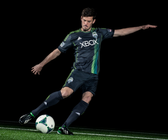
The secondary kits gets a bit funkier, offering up quite a bit of black—the Sounders call it “cascade shale,” which does sound like a nifty color—with a mosaic pattern mixing plenty of rave green with some blue in a vertical stripe off-set on the front of the jersey, said to “emphasize the team’s unique and diverse fan base.” The adidas stripes remain in rave green.
“We’ve taken the green and blue and mixed them together with the soundwave design to give the traditional look a modern twist,” Walker says about the stripe on the secondary black kit.
“Rave green has become an integral part of the team’s identity,” says Sounders FC owner Joe Roth. “The new kits feature unique designs and detailings that will further link the team to the supporter and the city of Seattle.”
The “super cyan” alternate remains in the Sounders’ wardrobe, available for friendlies and tournament matches to differentiate between MLS contests.
Sporting KC
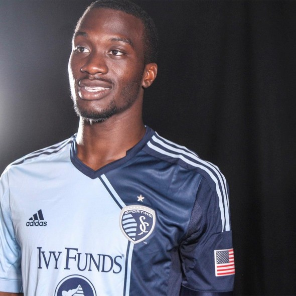
Delayed a day by snow, the release of Sporting KC’s new primary kit features a two-tone asymmetrical front that features a strong stripe said to represent the Kansas-Missouri state line.
The main portion of the jersey retains the light “Sporting Blue,” that gets set off by a thin dark indigo line that eventually gives way to a full darkness on the left side of the jersey. The adidas stripes on the shoulders are in opposite blues.
“With the club it’s all about that state line and the connection,” says Walker. “On their inaugural jersey we had an embroidery line that kind of represented that and this time we’ve gone a little bit bolder with it and we have a color block.”
The Sporting KC shield on the front straddles the state boundary line, while Ivy Funds and its logo debut as the new jersey sponsor.
The back of the uniform, in light blue, has the logo of the team’s parent brand, Sporting Club.
Sporting KC will unveil a new third kit at a future date.
Vancouver Whitecaps
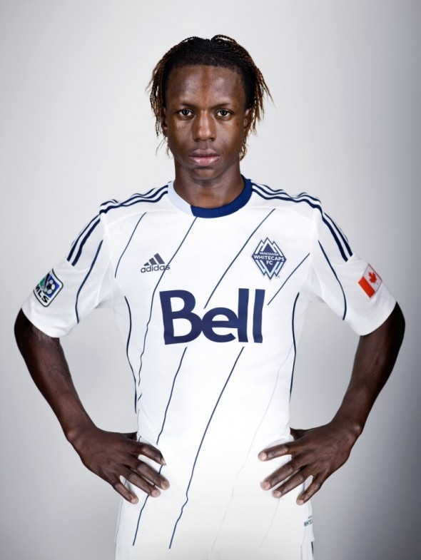
After trotting out a brown third kit last year to go along with the beautiful blue and white looks of its primary and secondary kits, Vancouver didn’t need to do much to stay classy. The new primary kit remains glacier white, but offers deep “sea blue” and “sky blue” accents within the curved, diagonal striping—reminiscent, but still a change, from last season’s thinly hooped stripes—that highlight the team’s colored crest.
The stripes connect to the two-toned collar, said to represent the continuum from sea to sky. The phrase “Since 1974” gets the back neckline treatment with silver accents, playing off nearby glaciers.
“The primary kit and its unique design speaks to the club, the environment within which we play, and pays tribute to the long and deep rooted history Whitecaps FC has in Vancouver,” says Whitecaps’ captain Jay DeMerit.
The secondary kit remains blue, speaking to the sea and sky, while the “arbutus brown” third kit returns to mimic the forests of British Columbia.
Montreal Impact
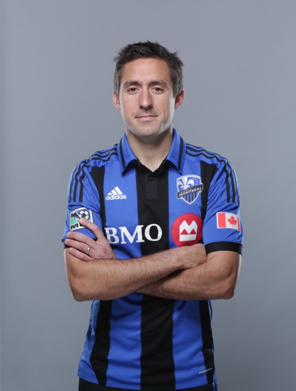
The third kit for Montreal contains plenty of local heritage, as has been the theme with the MLS third kits so far this week. The black and blue stripes with a complete collar offer twists on soccer designs of old (especially the Montreal look of 1993), all while the numerals “1993-2013” showcase 20 years of Impact soccer.
“In talking with the ownership, they had a very strong opinion that they wanted to make a reference back to their championship-winning team in ’98,” says Walker.
The buttons on the collar certainly speak to an age of the past. And a collared look certainly doesn’t scream “modern.”
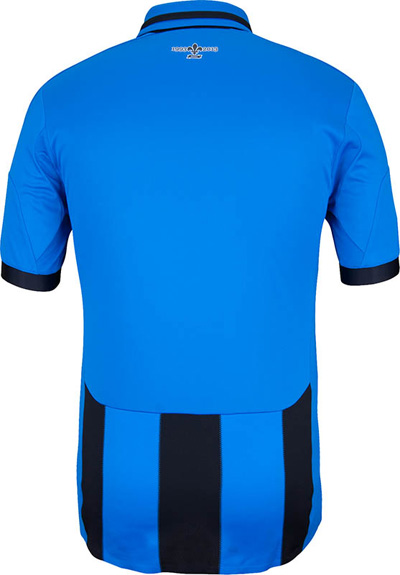
As with any French-inspired uniform, the fleur-de-lis symbol takes center stage on the back neckline, as it does in Montreal’s logo. Also on the back of the uniform, along the bottom third of the jersey, is a continuation of the stripes from the front.
LA Galaxy
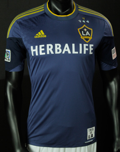
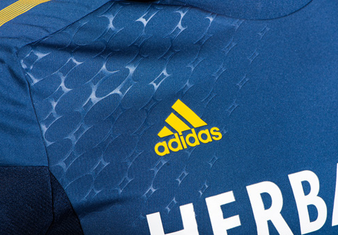
The front of the defending MLS Cup winners’ new secondary kit includes three silver championship stars to honor past titles and a gold star to signify a win in 2012.
Embossed—yes, more embossing—quasar art highlights the right shoulder and left hem, educating the public on what the “Galaxy” name really means by offering the space-themed look and keeping the uniform in line with the embossing trend of 2013.
“We’ve got the embossed pattern of that quasar that kind of runs through their home primary on the sash, but now it’s embossed on the away up on the right shoulder and also on the left hem,” says Walker.
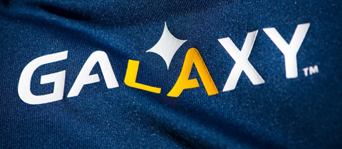
Fan-inspired “This is LA” wording on the jock tag serves as the new kit’s nod to the locals who have gone to chanting that phrase during games. On the back neckline the Galaxy wordmark highlights the “LA” of “GALAXY” in yellow.
The LA Galaxy will unveil a new third kit at a future date.
Reveal Week continues on Thursday with Portland offering a new primary green jersey and a secondary look that features a rose and thorns. Friday includes a subtly striped secondary kit from Chivas USA.
___________________________________________
Keep up with all the changes
Day 1 Story
Colorado Rapids – Primary
Colorado Rapids – Secondary
Houston Dynamo – Primary
Houston Dynamo – Secondary
New York Red Bulls – Primary
Day 2 Story
Toronto FC – Primary
Philadelphia Union – Tertiary
Day 3 Story
Seattle Sounders – Primary
Seattle Sounders – Secondary
Sporting KC – Primary
Vancouver Whitecaps – Primary
Montreal Impact – Tertiary
LA Galaxy – Secondary
Day 4 Story
Portland Timbers – Primary
Portland Timbers – Secondary
Day 5 Story
Chivas USA – Secondary

