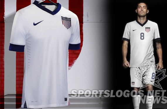
The US Soccer Federation turns 100 this year and to celebrate, have released a new kit, inspired by the earliest US teams. The jersey is white, with a large sewn crest at the player’s left chest, reminiscent of the large central patch on the 1916 team uniforms.
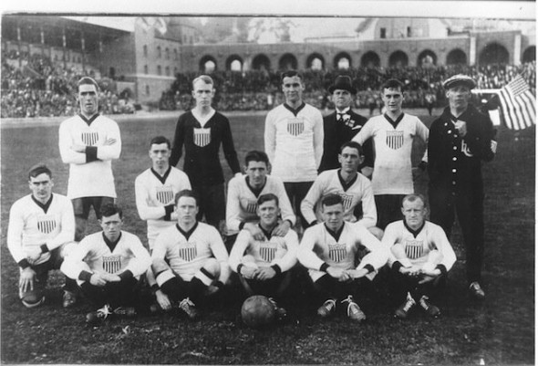
The bold, thick navy V neck and thick cuffs also represented from the old squad. The remaining details are all new.
This is a design that can grow on the observer. At first very plain, there are more details than are first noticable, and with the call back to US Soccer’s past, it becomes almost impossible not to like.
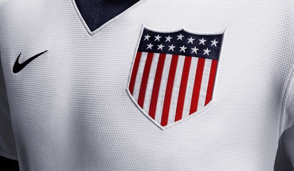
The shield patch is huge. But the detail and 13 stars and 13 stripes can’t help but bring out a sense of pride for the Americans who wear or see it. The jersey is, of course, lighter and wicks sweat better than anything before. Interestingly, it is made from largely recycled poly, an individual jersey can contain up to… you guessed it… 13 bottles worth.
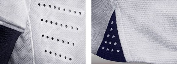
Under the arms, ventilation holes allow the moisture and heat to release. At the bottom hem, one side shows blue with 13 white stars.
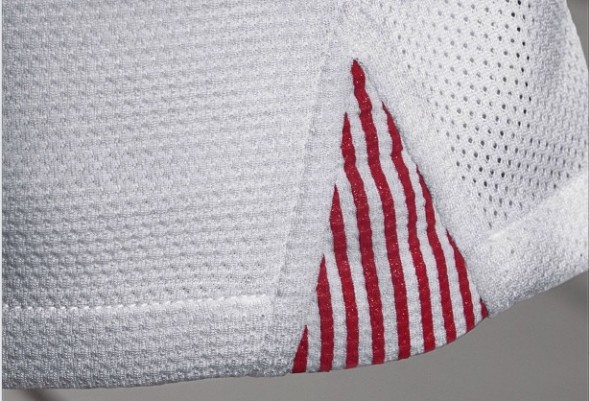
At the other side, 13 stripes in red and white balance the flag inspiration.
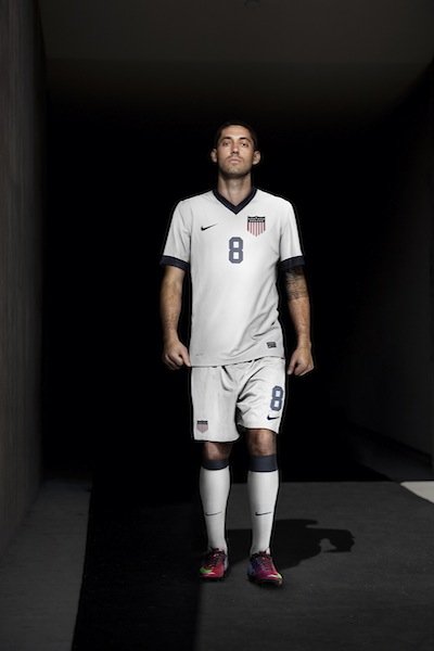
Unfortunately worn in an all-white kit with white shorts sporting a shield and navy number and white socks with a navy band, the team will look a bit monotone. Shame they didn’t go with the navy shorts of their forebears. Apparently the inspiration could only go so far.
Equally strangely, the women’s team has their own version, despite the women’s game only having been associated with the US federation in 1985.

This author finds it impossible to find fault with Alex Morgan when it comes to appearance, so of course, the unis look great. Notable is the inclusion of their two stars above the shield, as is the tradition to represent their two World Cup victories. Seems like a bit of a non-sequitor above a hundred-year-old shield but when one has two Cups, they should always show them proudly.
If you like it, you can buy it today at the US Team Store
The look is clean, and honors their 100 year history (at least of the men’s team.) But the question begs to be asked;
What is US Soccer’s visual identity?
The answer is not easy. And when one looks at the uniforms worn in the team’s past it becomes absolutely impossible to answer. But the question is easy for soccer fans when asked about different countries. What is Argentina? Brazil? Hell, do you know anything about Croatia OTHER than their red checkered soccer jerseys? The Netherlands is the best example here; We all know they are orange. Always. Its not even in their flag, but they ARE orange in soccer. What is US Soccer? I mean, other than gimmicky and ever-changing?
This uniform doesn’t help resolve this question. M Willis has delved deeply into this subject and has some brilliant observations. Even better, he has a simply perfect solution, with beautiful kits that would give the US the look they need. Highly recommended.
Nike does their best work for US Soccer. I know, being damned with feint praise and all that. Nike has absolutely destroyed sports int he past with templated garbage. But this uniform is clean and solid. Normally not used to describe Nike creations. They really put good looks into their home country’s soccer team. But they really need to stop. Settle on something. Tweak it, craft it, get it perfect. They change too much for the good of the team.
But this uniform is nice. Its just not in line with giving the US a distinctive, consistent look.
How does this kit strike you? Does it look like US Soccer? Is it OK to relinquish your grasp on identity to pay tribute to teams from your past?

