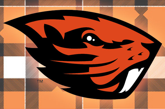
The Oregon State Beavers officially debuted their new logo last night confirming the leak SportsLogos.Net reported on early last month.
Nike was responsible for the new logo unveiled by the club, part of a two-year rebranding process the company stated in a press release. The new mark represents a “contemporary” evolution of the beaver logo used by the school.
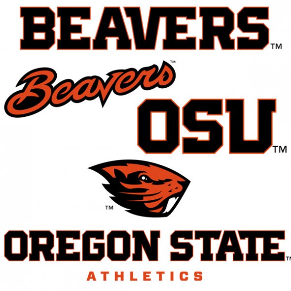
“Oregon State Athletics has undergone a tremendous transformation in the last 15 years and our new brand identity is another sign that the Beavers continue to confidently move forward. The ultimate goal for the rebrand is to attract high-caliber student-athletes to a contemporary brand, while respecting our heritage.” – OSU Director of Athletics Bob De Carolis
As part of the new logo package came the news of the retirement of the interlocking “OS” logo, at least amongst the athletic programs at Oregon State. The orange, black, and white colour scheme will remain however a metallic bronze secondary colour has been added to the palette, on a limited basis, which “represents strength and integrity and draws inspiration from the well-used machinery utilized in the timber industry”.

“Nike has a long-standing relationship with Oregon State Athletics and it has been an honour to work with them on their new brand identity. This new update respects OSU’s history and represents their future while creating separation and distinction in college sports.” – Nike VP and Creative Director (Football/Baseball) Todd Van Horne
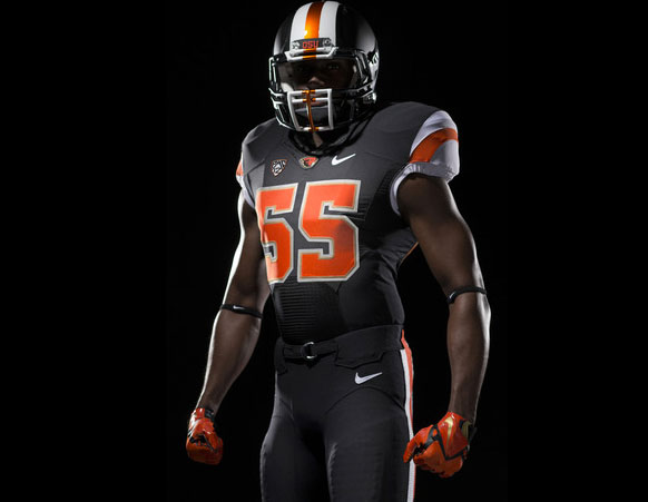
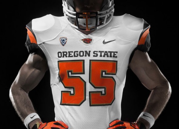
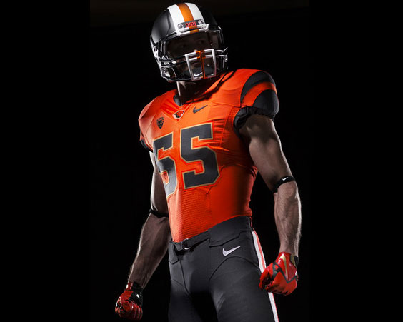
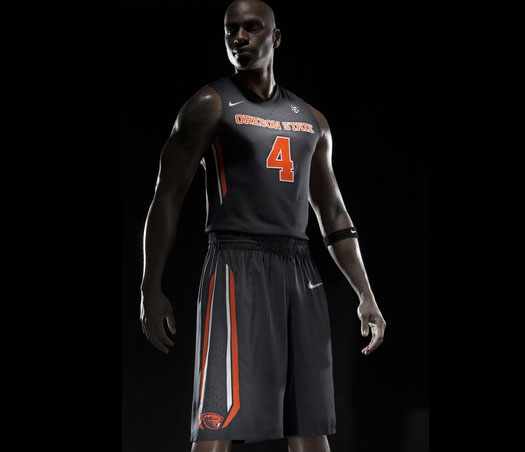
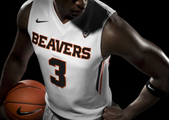
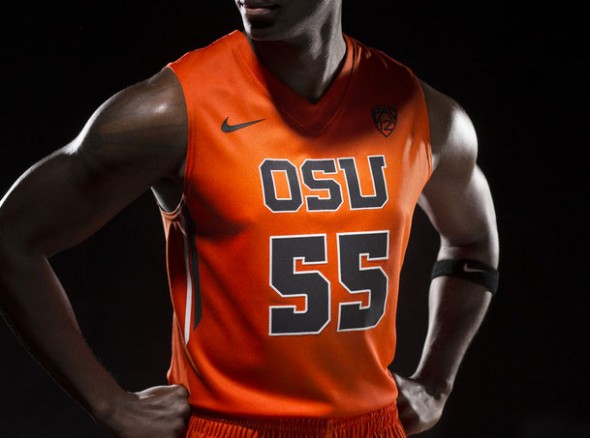
Also unveiled were some of the new team uniforms to go with this new logo package, photos of these new uniforms can be found below:
New team merchandise can be purchased on the official Beavers online shop, also you can check out all the new Oregon State Beavers logos on our Beavers logo page. Love ’em? Hate ’em? Just don’t forget to rate ’em!

