MLB13: The Show for the Sony PlayStation 3 was released in North America earlier this week, a game which prides itself, and almost always delivers, in its high-levels of authenticity.
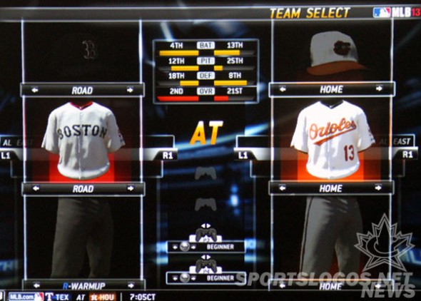
One of the features in the game is the ability to choose one of several uniform designs for any given team in any given game, this includes retro and batting practice uniforms, essentially allowing the player to hold a Turn Back the Clock game if he or she so desires.
Mixing-and-matching is also an available option, allowing any available cap to be used with any available jersey and any available pants.
We’re going to take a look through all the special uniforms the game makes available for MLB teams on a division-by-division basis. First up, the American League East.
BALTIMORE ORIOLES
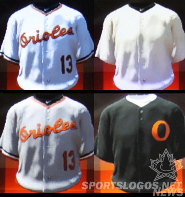
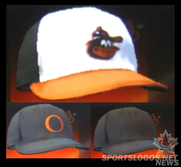
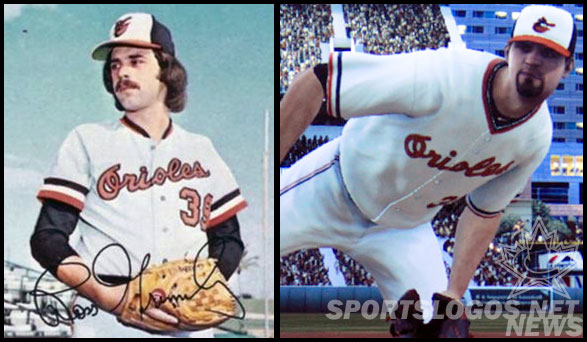
In addition to their regular set, the Baltimore Orioles have a home and road throwback set based off of their 1970s look as well as a 1901 set worn by the original MLB Baltimore Orioles, a team that eventually became today’s New York Yankees.
The 1970s caps, very similar to the home cap the club presently wears, but there is a slight difference on the bird logo that appears on the front. The two caps on the bottom of the below graphic are meant to be paired with the 1901 uniform set.
Game designers did a decent enough job of getting the look of the ’70s uniform right, the old-fashioned collar look on the left in the picture below likely wasn’t realistic to include in the video game completely spot-on, but they added the striping around the neck.
If we want to get picky, and we sure can, the stripes on the end of the sleeves aren’t quite thick enough as well as the black outline on the Orioles script and player number. That cap logo should probably be larger as well.
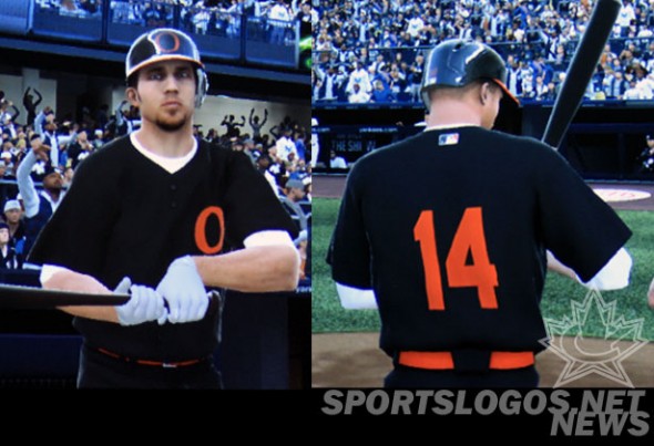
The 1901 road uniform comes complete with black pants and no names on the back. That MLB tag really shouldn’t be there, but it’s a passable offence. The home uniform in this set, also available in the game, is a blank white jersey with a blank black cap, not at all exciting but still spot-on accurate.
BOSTON RED SOX
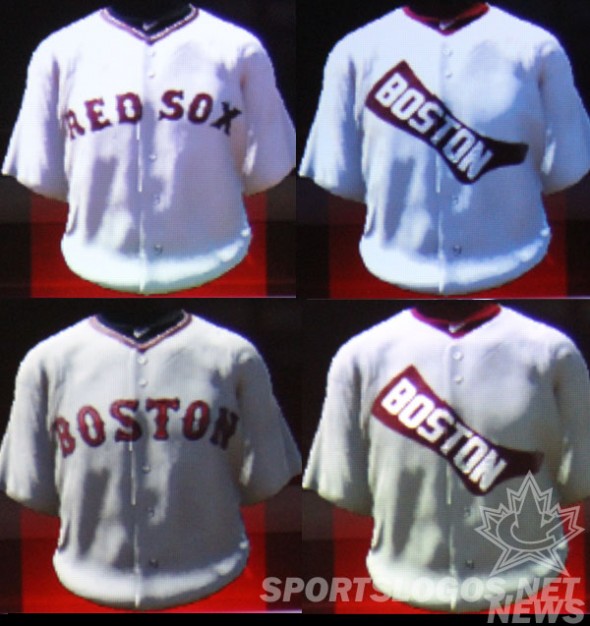
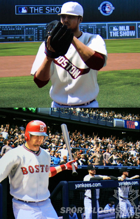
Like the Orioles, and most other teams in this game, the Boston Red Sox have four throwback options to choose from – their “throwback” set on the left column based off those worn in the mid-1970s, and their “throwback old” set on the right which was worn by the team in 1908 – the first season they were known as the “Red Sox”.
Yes, the Red Sox 70s uniforms should be pullover and not button-up… this is a problem that occurs throughout the game.
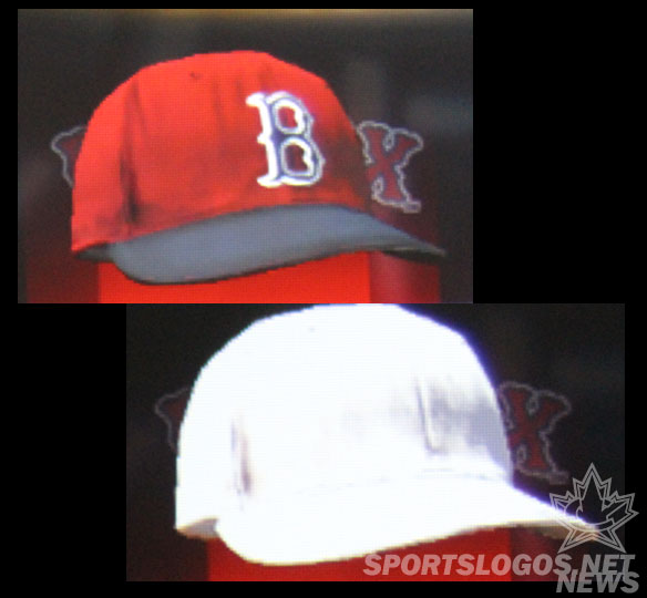
Boston’s throwback caps, red with blue bill for their ’70s set and the plain white one for 1908. We’re two teams into this preview and we already have two blank caps and one blank jersey.
In that photo on the bottom you see the red helmet being worn with the 1977 road uniform despite the players wearing the navy blue caps in the dugout. I had decided to match the current BoSox cap with the throwback jersey hoping to create a uniform similar to the World Series winning teams of the mid ’00s, however it appears helmet designs are attached to the jersey. Too bad.
NEW YORK YANKEES
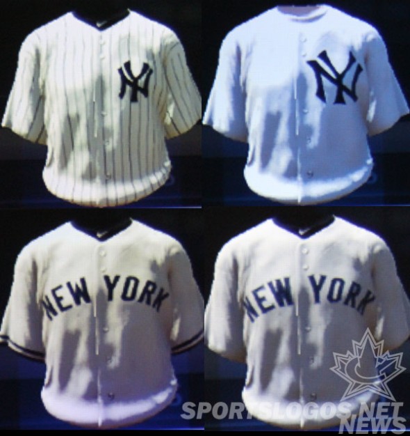
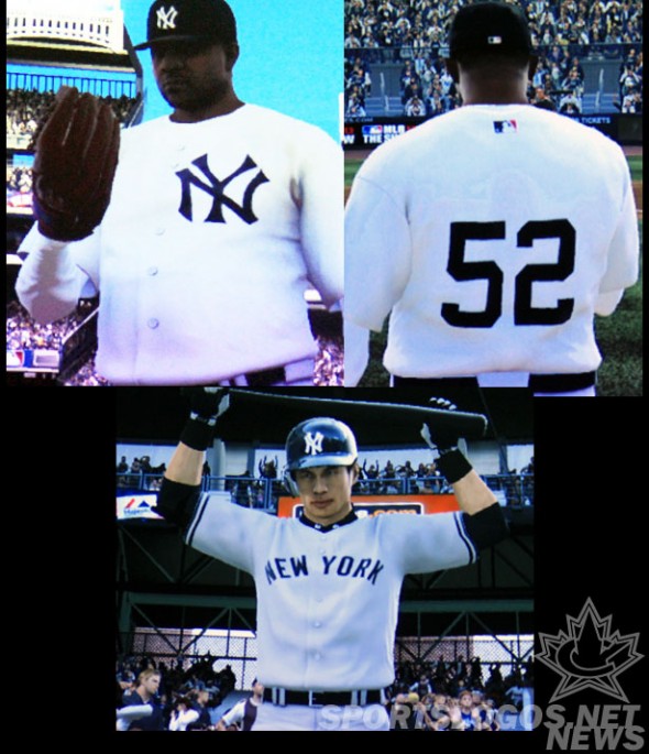
The New York Yankees do tradition well, their uniforms have stood the test of time for decades. While we appreciate this attribute of the team, it just doesn’t lend itself to a very exciting selection of throwbacks.
Seriously, those are your throwback options for the Yankees… basically you got your current set with either pinstripes removed or a thin white outline removed.
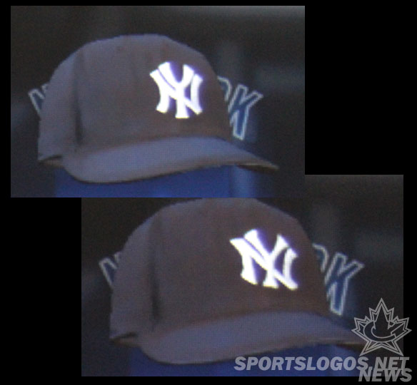
Of course, you can’t fault the game for this – it’s just the way things are with the Yankees. Perhaps they could have at least spiced it up a little with the grey-crowned “NY” cap the team wore in their 1912 throwback game last April at Fenway? Ah well, moving on to a team with a much more colourful (yet way shorter) past…
TAMPA BAY RAYS
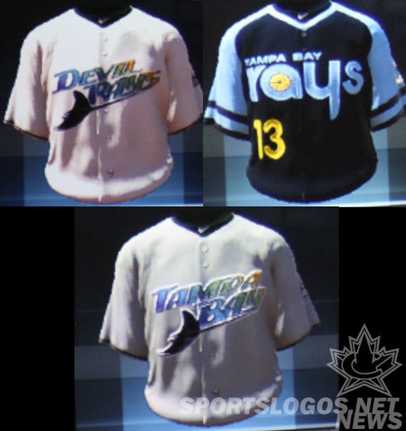
Normally I’d award the MLB13 people about 300 bonus points for including the Tampa Bay Rays “fauxback” as a throwback but they are actually considered an alternate uniform by the Rays for the 2013 season and are labelled as such in the game, sorry guys… no bonus points this time.
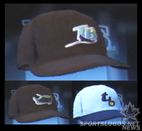
The Devil Rays get their home and road cap from 1998-2000 in there as well as a nice surprise, the cap the club was originally going to wear as their home cap in their first season before the “TB” one up top replaced it! The devil ray on its own was eventually worn as an alternate for a few games in that first season.
Something amiss about that fauxback cap though…
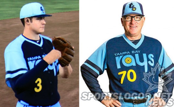
Ooops, that’s ‘sposda be navy blue up top with only the front panel in powder blue. In theory I think I would have preferred that cap with all powder blue as seen on virtual Longoria to the left… but when presented in front of me, Maddon’s real-life front panel prevails.
Also, buttons on a pullover!
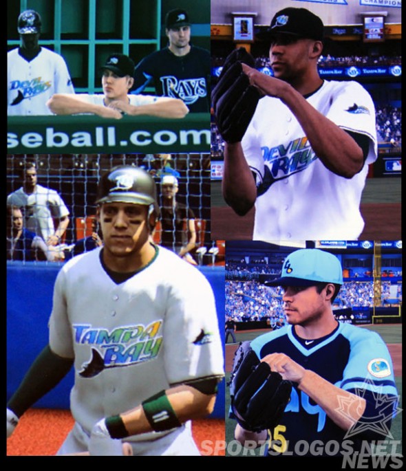
The original Devil Rays set looks pretty solid here, a nit-picky observation would be that the D-Rays wore black accessories with that set, not green. Note on the “fauxback” they even included the “City of St Petersburg” seal on the sleeve, nice touch!
TORONTO BLUE JAYS
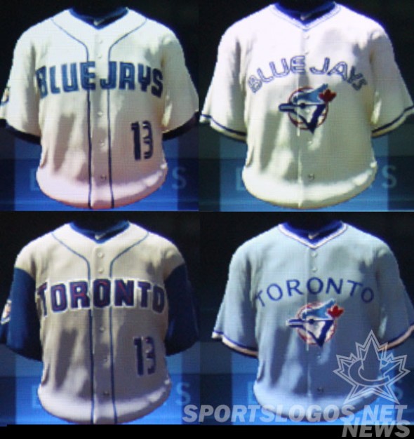
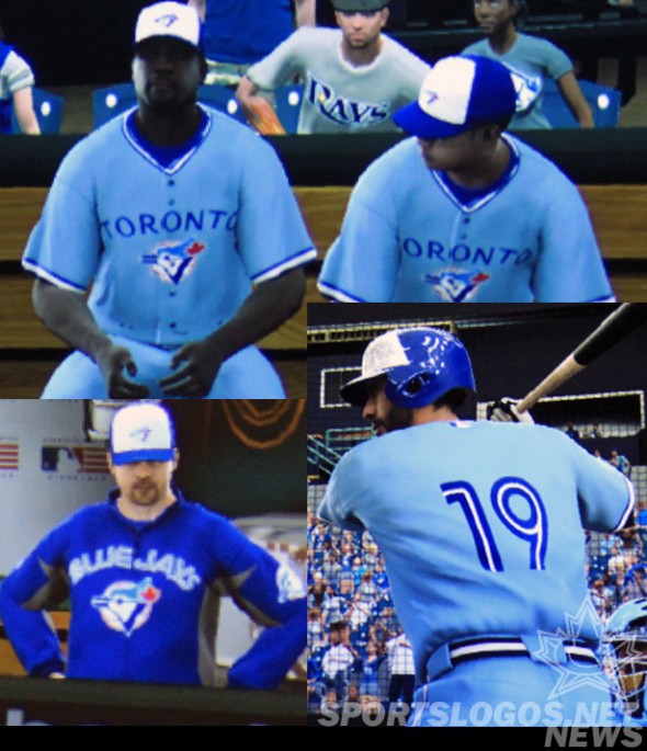
Now this was a pleasant surprise for this Toronto Blue Jays fan, what I consider to be the most underrated uniform set in team history gets included as a throwback along with the original first-season look. Unfortunately there’s a few problems with both the throwback sets chosen for the game and if there’s one team I’ll always be crazy about details on, it’s the Blue Jays.
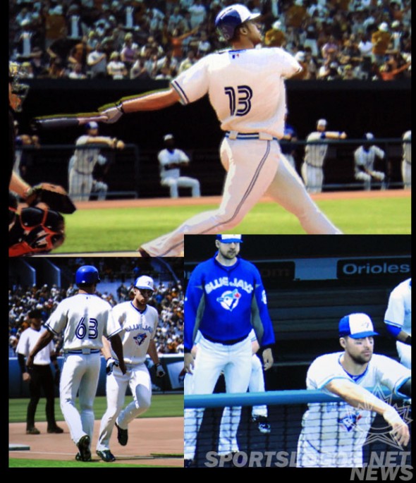
The most glaring issue right off the bat… BUTTONS! The Jays never, ever wore buttons on those 1977 uniforms and it looks terribly silly when the logo is right in the middle. I’m sure there’s some sort of technical reason why all these pullover uniforms are not designed as such in the game, but, it’s just such a bummer to see.
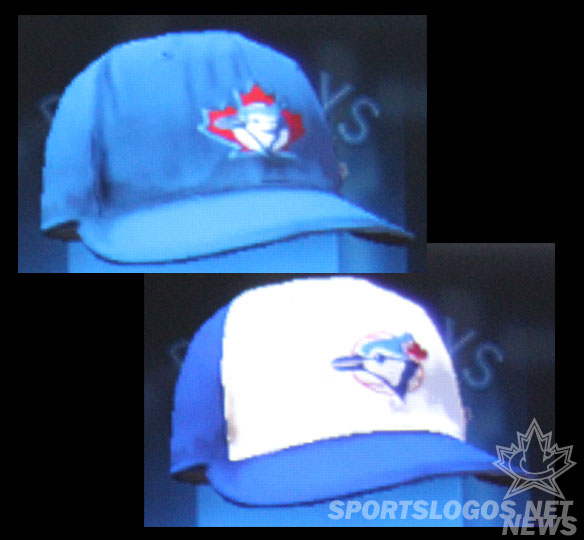
On the caps, this is a design mistake EA Sports used to make all the time in their Triple Play series – the logo for the 1997-2002 cap – it did not have a baseball on it, just the bird and the leaf… this little error actually keeps me from wanting to wear this set in the game, well that and this other mistake:
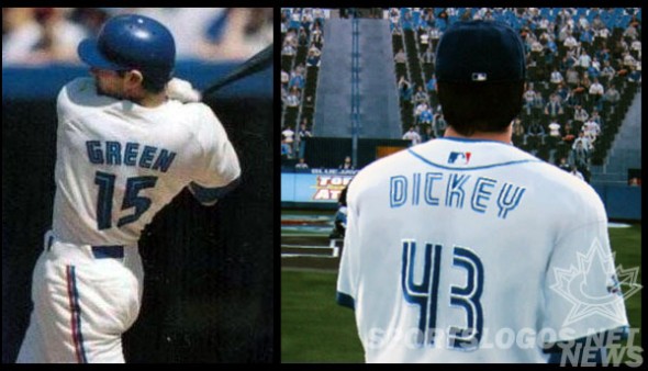
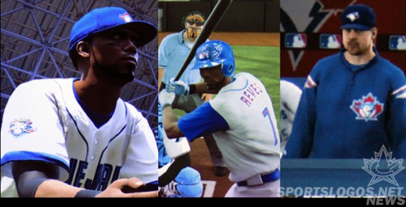
White on the inside of the split lettering, it should be light blue as shown by Shawn Green on the left… seems like such a minor miss, but really impacts the appearance of the uniforms. They did get it spot-on with the road uniforms, shown on Jose Reyes in the middle image of the photo below:
A couple of nice touches, including the American League 100th anniversary patch – making this a 2001-only set (although missing the Blue Jays 25th Anniversary patch that should be on the other sleeve), and the actual jackets the club used to wear back in this era for coaches in the dugout. Nicely done!
I’ll wrap up the Jays 2001 set review with one last mistake, the striping at the end of the home jersey sleeves, should be a very thin stripe, similar to the piping seen going down the front of Reyes’ jersey on the image on the left, and should also be off the end of the sleeve by an inch or so, not pushed right against it.
Aside from the aforementioned issues with it being designed as a button-up instead of a pullover – not to mention it being worn with a belt instead of elastic waist, both the 1977 home and road uniforms look good. And yessir, that’s another retro dugout jacket you see with this set, that isn’t something you see across the board in this game (check one of the Rays throwback pics earlier in this article)
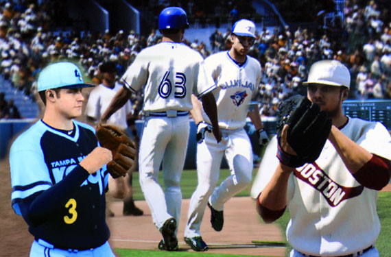
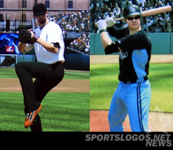
As we mentioned earlier in the article you can mix-and-match uniform elements to create uniforms which transcend eras or maybe just wear a road cap with a home uniform, anything you really like… a couple of photos here of an example of what you can do:
That’s the Baltimore Orioles 1901 blank black home cap and blank white home jersey with their 1901 black road pants, making for a surprisingly interesting look. Also kinda reminiscent of what I used to wear every day in high school.
On the right that’s the Tampa Bay Rays road batting practice jersey (with powder blue side panel) paired with the 1979 “fauxback” powder blue pants. I like it! The possibilities are endless.
So there’s your American League East preview, we’ll try to get to the other divisions in the coming days so stay tuned!
And just a heads up, despite the uniforms errors I pointed out above, MLB13: The Show is still by far the most enjoyable baseball video gaming experience I’ve ever had the pleasure to have, uh, experienced, and most definitely worth a purchase.

