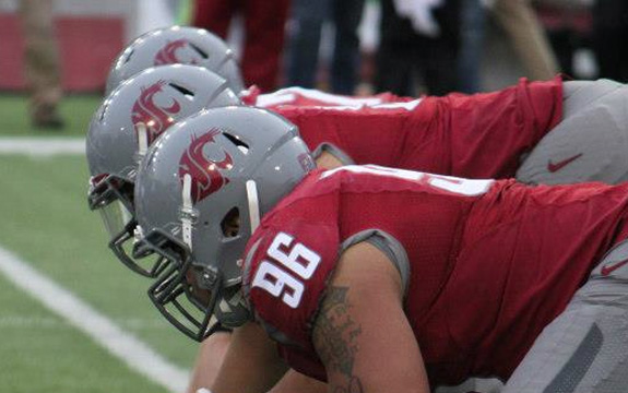
There’s crimson. And then there’s Cougar-blood crimson. There’s a difference.
Bill Moos, the athletic director at Washington State, also the former AD at the University of Oregon who led the changeover away from a Disney-styled Donald Duck as the mascot and introduced the world to the lightning yellow football uniform, knows a thing or two about rebranding a university. He’s done it twice.
While interviewing Moos in the past, he recounted a story of how Washington State University, in Pullman, chose the final crimson for its color scheme, a story that shows just how personal university redesigns can get.
While going through the rebranding, Moos, who played at WSU and had “been a Cougar since I was old enough to know what one was” says that getting the colors right proved a vital piece in the 2011 Nike-led rebrand. The school had countless shades of crimson and gray. Differing colors adorned varying team uniforms, school letterhead and much more. Even the football team had gone away from gray, opting for silver. Moos wanted WSU cohesive and that meant returning to gray and it certainly necessitated finding the right shade of crimson.
“I’ve watched the Cougars in all sports since I was 5 years old, but when I laid out all the crimsons, I was struggling with them,” he says. Nike designers offered up all the crimson they could find, but it wasn’t a pile of color samples that inspired Moos. He wanted to find a “rich” crimson, something similar to what he saw in his old yearbooks and letterman’s jackets. That’s when inspiration struck him. Or, actually, pricked him.
In the routine of daily living, Moos had to undergo a physical for a life insurance policy in his office. “It was a pretty detailed physical,” he says. “Right at the end, they were going to draw a little bit of blood. (The nurse) put the syringe in and drew a bit. I opened my drawer, got the swatches out and matched the crimson with the blood of a Cougar.”
Sure, it took dripping blood to finish the process, but “Cougar Crimson” turned into 69W at Nike.


