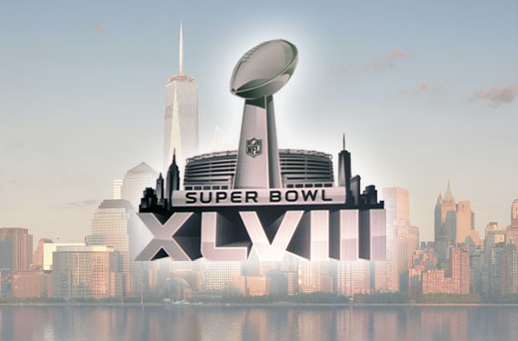
The National Football League unveiled the logo for Super Bowl XLVIII, to be held in the New York City area next February, at a gathering of merchandise licensees earlier this week.
Continuing with their Super Bowl logo program now for the 4th consecutive season, the logo once again features the Vince Lombardi Trophy front and centre with the roman numerals below in silver. There are some differences this year, however.

First up, the “localized” logo will contain more than just the host stadium, now flanking either side of MetLife Stadium is the Manhattan skyline (including the new World Trade Center, a nice touch). Is this a case of both New Jersey and New York wanting representation? Is this a case of trying to fill in the extra space created by a longer Roman numeral? Who knows, either way I’ll just enjoy that there’s something else there and keep my fingers crossed that they keep it up as long as this system is in place.
Also new, and admittedly less exciting, is that this localized logo will now be the one used on merchandise, in media, and hopefully even on the field during the game – whereas previous years it was the “national” logo (the one without the host stadium in the background) that was used everywhere.
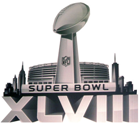
While some hate and others love the new standardized logos, i think there’s one thing we can all agree on — this one is the best of that bunch. It keeps the template which seems to be a necessity but also allows for more incorporating of elements of the host. Either way, I can’t imagine we’ll be seeing too many more of these logos – Super Bowl 50 (let’s be honest, there’s no way they’re calling it Super Bowl L) is approaching fast and they’re bound to do something special for that anniversary.

