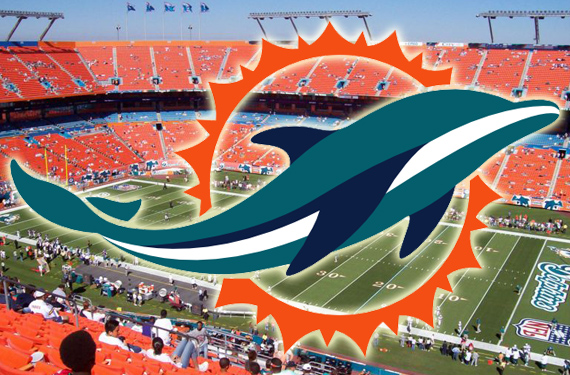
UPDATE Mar 21/13: SportsLogos.Net can confirm based on our always reliable sources that the Dolphins logo shown on the jersey in the photo below is indeed the new team logo for the 2013 season.
And now onto the original article:
It must be tough, in the age of the internet, immediate dissemination of info, world-wide reach, cell phone cameras in everyone’s pocket… to be a team trying to hype up and release a new logo. You set a date to release it, that works well with your marketing plan, your team’s schedule. Then, in the months, weeks, days leading up to your release you are so excited about, the internet blabs your business, your new look, all over the place. It must make marketing departments sad.
But us logo and design fans, we love it. We get to see stuff early, and feel special. We get to see what teams are thinking, and get to casually mention it around our friend who don’t follow all the right accounts to get to see this stuff early. Aren’t you glad you are here?
A photo has been making its rounds, through several channels, eventually finding its way onto the @UniWatch twitter feed, of the new Miami Dolphins logo, on the shoulder of a Nike jersey. It seems like a massaged, improved version of the logo we saw several weeks ago. Everything about it looks official.
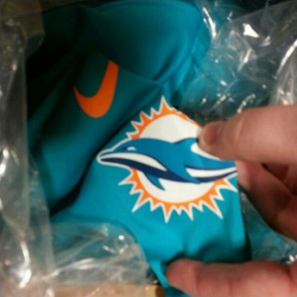
Improvements include; Fixed lighting on the fins, making them teal with navy shadows, a refined sunburst, and now, an eye!
Seems legit. Now, where on earth did it come from? Well, that’s a little more difficult to ascertain. Paul Lukas was nice enough to share with us that he came across it from one of his readers, who tweeted it to him, after finding it on the instagram account of a user named “sneaker_pimp_simmons” (Didja follow that?))
One assumes Mr Sneaker is associated with the Sneaker Pimps sneaker and street art show. Though, few references to the people behind the show were forthcoming, so this is just an unfounded assumption.
So, if we can’t validate thew person who posted the image (and we aren’t even sure he was the one who originated the photo, he could have just shared it) how can we validate the logo?
New Dolphin Dustin Keller has updated his Twitter page to indicate his new team. Guess what logo he used?
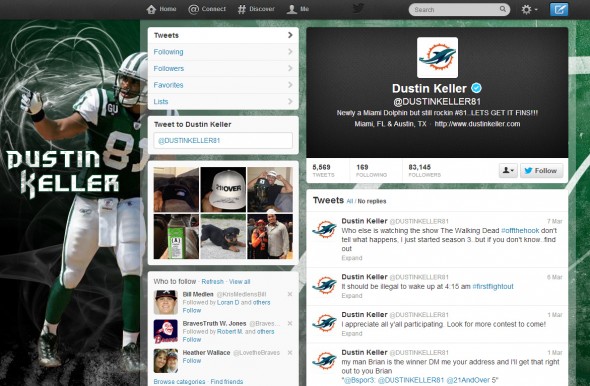
Sure, he could have just searched Google for the new logo just like anyone, but one might imagine that he had some sort of knowledge on the subject.
Why didn’t he use the currently official logo?

So, like any good reporter or news organization, you call other sources to verify. We did. And the answer we got was only given under complete anonymity. But that person said the one “floating around” was legit. So, we feel that we have a solid hook, set in the mouth of this fish. (Not the dolphin, its not a fish. Just a tortured metaphor.)
How about you? Do you believe this is the logo? Does the jersey picture seal the deal for you, as it did most of us sitting around the large, oval mahogany conference table here at World Sports Logos Headquarters and Command Center?
Or are you waiting for the official release, April 18th, to make that decision?
Knowing that most accurate leaks come from apparel companys’ employees taking secret photos, this one seems 100% to your author.
(EDIT: Added description, pointing out the differences between the original leak and the version appearing on the jersey. Thanks to several readers for pointing out those needed mentioned)

