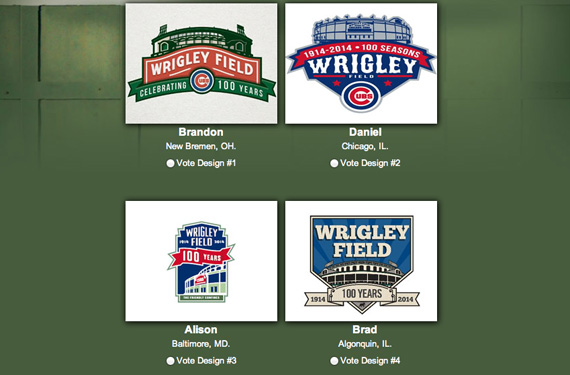
With its own Final Four in the works, the Chicago Cubs have turned to the Internet masses to choose a winner in the Wrigley Field Turns 100 logo contest.
Over 1,200 fans submitted designs in the February contest, a fan-centered promotion designed to “help create a commemorative logo worthy of this historic venue.” A panel of judges whittled away all but four, leaving the final winning design to the will of the people.
You can vote once per day between now and April 23 for your favorite design here.
The winning design won’t be announced until later in the season and will then get featured throughout a host of Wrigley Field promotions during the 2014 season, including a likely appearance as a patch on the Cubs’ home white uniform.
While Cubs-led, the four finalists certainly subverted the Chicago Cubs, instead playing up the Wrigley Field façade, as per the contest’s guidelines. Here’s a glance at all four:
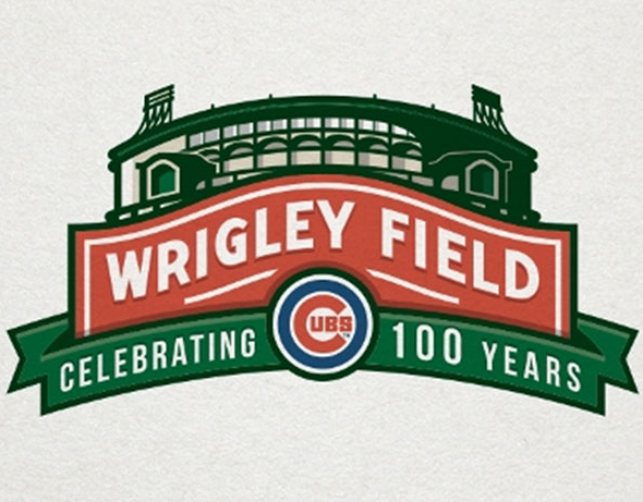
Brandon, New Bremen, Ohio
Full of green, Brandon utilized the Wrigley Field marquee more than any other designer. With the words “Wrigley Field” in white standing off the red background, the majority of the rest of the logo falls into a green background highlighted by the field’s façade. This is one of two of the four logos to prominently display the Cubs’ logo.
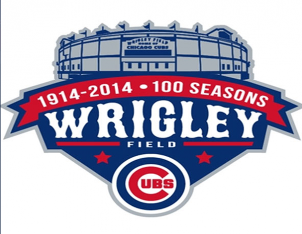
Daniel, Chicago
With the stadium in a blue-gray combination, the design certainly employs a traditional look. The Cubs’ logo is most prominent in this design that has a slight resemblance of a home plate shape. The most unique aspect of this design has it playing the word Wrigley—in white over a blue background—much more dominant than Field and certainly more prominent than any of the other designs that give equal treatment to the full name.
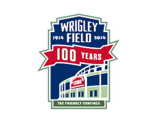
Alison, Baltimore
There’s little tradition here, with a taller rectangle design flying in the face of the other more horizontal or square shapes. “The friendly confines” slogan gets some play on the bottom of the rectangle and the only mention of the Cubs—there’s no Cubs logo—is the word Cubs on the red marquee adorning the more modern take of the stadium’s façade. With the “100 years” banner and “Wrigley Field” both in prominence, there’s really no dominating feature.
Brad, Algonquin, Illinois
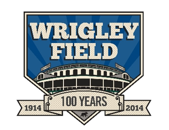
Heavy on blue and beige, this home plate-esque design features the façade of the stadium below the largest Wrigley Field wordmark treatment of the four. Other than the required 100 years banner, there’s not much else, save for the only flick to the baseball team, a small cub on the bottom tip of the logo.

