Just a few days after the Miami Dolphins identity was leaked all over the Internets, we’re getting ourselves all set for round two thanks to an anonymous tipster.
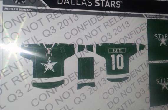
In what looks like to be an screenshot of an official 2013-14 NHL stylesheet we’re getting ourselves our first look at the new “simplified and traditional” Dallas Stars graphics.
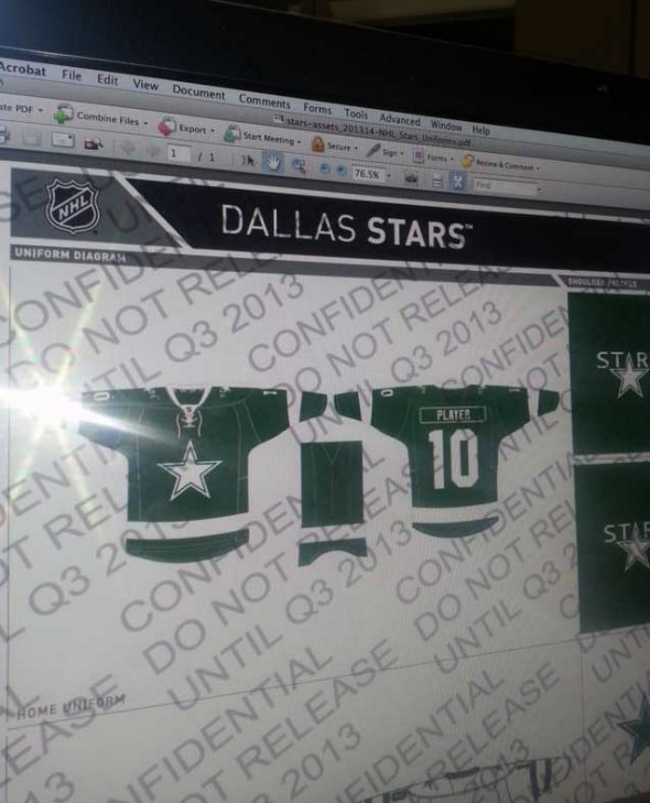
On first glance, huzzah that green is still very prominent – there were fears they were going red, white, and blue – and I’m also personally happy to see that the wordmark/front-number basketball jersey design style of the last half-decade has been shelved for good (although we don’t get to see the road uniform on this image).
A few other things to note… isn’t that the Dallas Cowboys logo? Sure looks like it to me, now re-coloured in green and white instead of blue and white, also it appears the little notch on the top of the star (where the “A” was in the old identity) is present. The Stars primary logo since their move from Minnesota in 1993 looks to also be sticking around as a shoulder patch, however now no longer in italics and also just in green and white.
I’m sure we’ll get more details in the coming days, naturally we’ll keep you posted. The image itself suggests we’ll see this unveiled to the public in “Q3 2013”, which is fancy business speak for anytime in between July and September, (or right around draft time!)… so look at your calendar and start counting down the days. Let’s see, it’s April 1st now, so that leaves only however many days… well, you can figure it out.
UPDATE (Apr 1/13 12:25pm ET): Happy April Fool’s Day, everyone!


