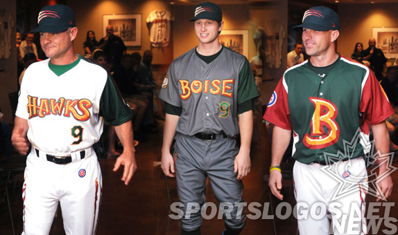
The Boise Hawks of the Northwest League announced today their new uniforms and caps created by Brandiose.
The Las Vegas design firm first redesigned the Hawks in 2007, when they changed the team colors and created the bold scripts seen on the front of the jerseys.
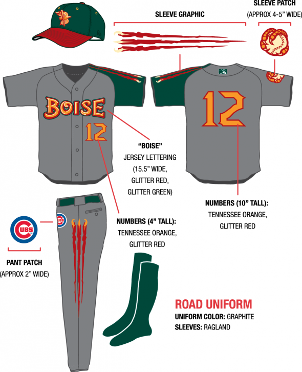
New, however, is the one-color-shoulder look, the graphite uniform, the huge B-front jersey, and… the glitter!
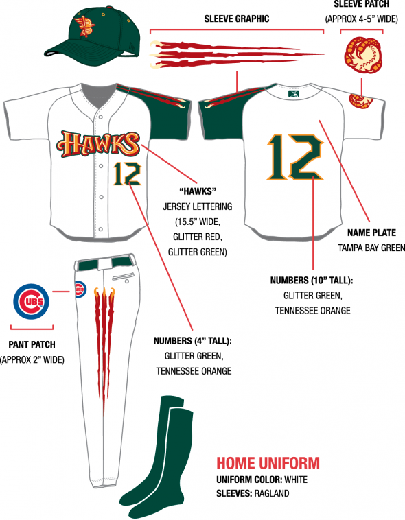
Also new is the “Scratch” logo/mark/look that appears on the caps, shoulder, and leg of the new uniform pieces.
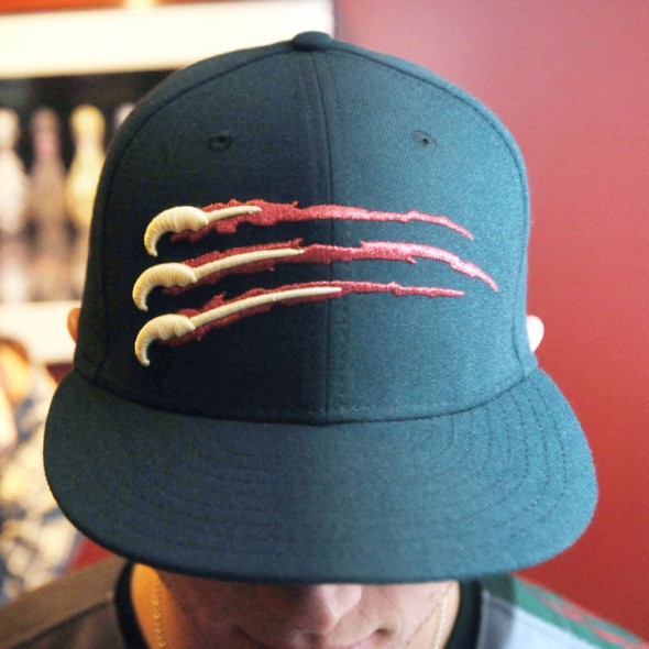
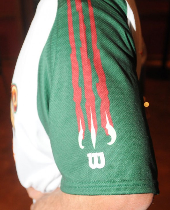
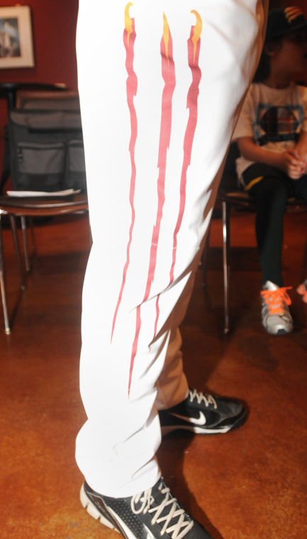
The scratch effect terminates with a peek-a-boo of Hawks claws, as if tearing through from the inside of the garment.
The scratch and ball-claw graphics, on opposite sleeves of the jersey, are sublimated. The nameplate on the front and the numbers are sewn. The announcement made it a point to drive home that the green and red thread used for the patches is “glitter.” We’ve seen metallic thread used before, like the Pensacola Wahoos, but that was a silver, so a “glitter red and glitter green” might be quite distinct. None of the pictures we’ve found really show us in much detail what “glitter” really means, so we are imagining a metallic look, almost tinsel-like.
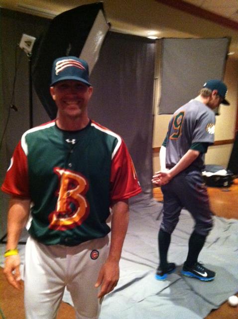
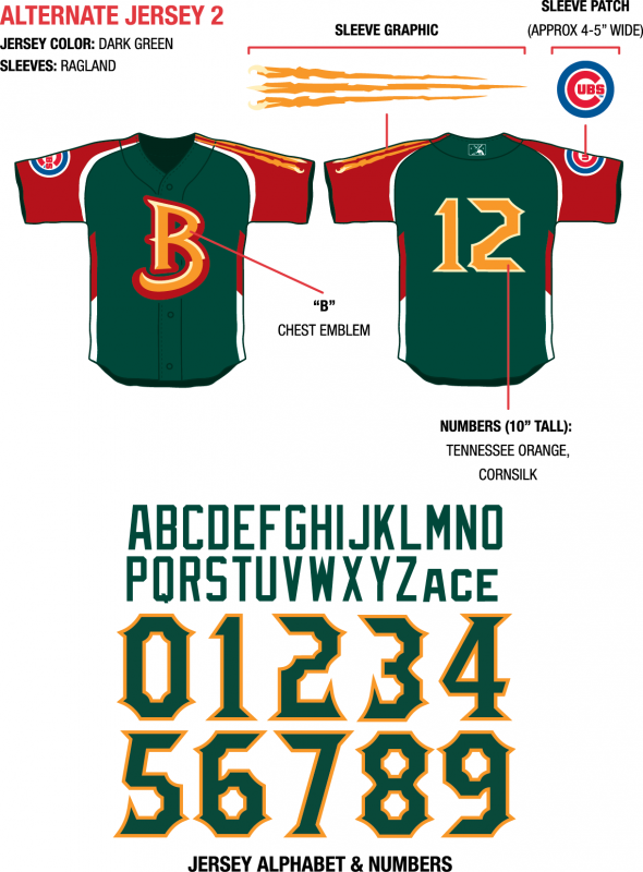
Officially called “Alternate Jersey 2” the BP jerseys are quite a minor-league look. A huge B for Boise on the front, red raglan sleeves on a green base, with scratch marks down the sleeve. Combining a challenging color palate with bold sizes and imagery, its tough to imagine how this could have possibly been accomplished in a tasteful way.
Facebook and twitter comments from fans have called this an “arena football look,” and have asked why “traditional uniforms and colors” were abandoned. Once gives additional leeway to a minor-league team, always looking for ways to entertain and engage their fan base. But what was the impetus for the redesign?
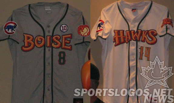
The uniforms worn by the team over the past 5 years featured the bold branding but on a more standard baseball uniform template.
A call to the team shop to inquire about a sales comparison was not returned.
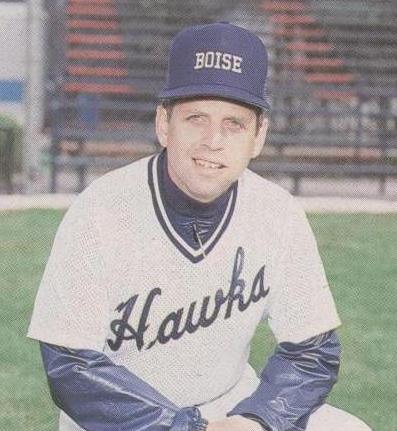
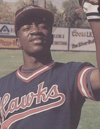
Where were the Hawks previous to the redesign in 2007? Far more staid, traditional, even templatey.
Here are the style sheets put out by the club.
What do you think? Is this a cool look? Did they improve their uniforms? Are you one who likes their minor-league teams big, bold, and crazy? Or do you prefer your teams to look like they are all grown up?

