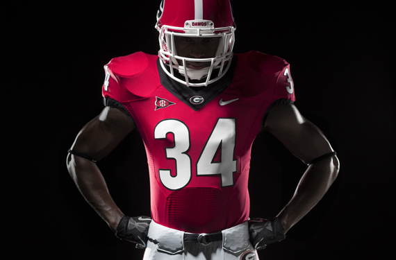
Don’t claim it a complete overhaul. Call it an update. The newly fashioned looks for the University of Georgia athletic department clean up a disjointed brand, offering new custom fonts and numerals and unifying the logos across all sports. They also give the football team an updated, modern look, albeit without any substantial changes.
The 15-month collaboration between the school and apparel provider Nike resulted in new uniforms across the athletic department, including a streamlined look for the football team that largely kept its familiar, traditional color scheme (though it is said by the University and Nike that the colors were “tweaked,”) but overlaid onto a sleeker cut.
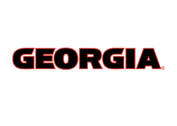
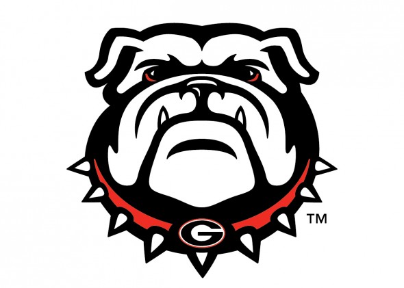
The power “G” logo (“borrowed” from the Green Bay Packers,) remains as the primary mark for the school, but graphic “GEORGIA” and “BULLDOGS” wordmarks serve as main visual symbols on many of the uniforms, while an updated bulldog secondary logo adds to the mix.
Greg McGarity, Georgia athletic director, says the new looks will reach across not only uniforms, but also to field markings and throughout the entire department.
The initial wave of the redesign includes the football team, men’s basketball team and the track and field squad. All other teams get their new looks phased in over the course of the next two years.
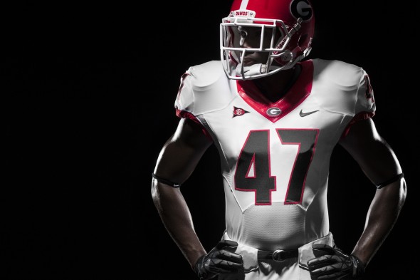
For football, expect the lovers of classic looks to rejoice but with hesitation from traditional Georgia fans, due to the “modernization” of the number font. The basic colors remain, with a solid color—red and white were shown, although black is a relatively common third jersey for the Bulldogs—dominating the uniform and a contrasting color reaching the hemlines and collars. The third color is used to outline the numerals.
The simple, classic look gets a more modern feel with the uniquely shaped cut of the jersey, but the only true visual change is found in the numeral font on the front and back of the jersey.
The Georgia color palette of red, black, white and silver remains in the same basic set up it was before, with the silver relegated to a pant option, first seen at George in 1939. The silver “britches” fell from favor at Georgia in 1964, but returned in 1980 (the year of their only National Championship) and has stayed ever since. Yet, silver hasn’t made its way north of the beltline in the update.
The red helmet with the “G” logo doesn’t change. First used in 1964, the logo will get even more play across all sports. One might expect the number decals on the back of the helmet to match the jersey, but that wasn’t explicitly stated.
But Georgia’s secondary mark did get a freshening. Named the Bulldogs in 1920, the new logo was, according to Nike, “refined in order to reflect the strong, iconic characteristics of the animal itself.”
The Bulldogs have used several different secondary logos, all renderings of a bulldog. The one most familiar with fans, dedicated and casual alike is the one that has been with the team since 1964

UGA has attempted to use another bulldog rendering in the past, as well, which did not earn the love of the fan base.

This “taller” bulldog appeared for years, in new waves, but never really caught on. One wonders what the success will be for this new one.
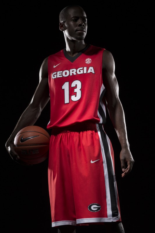
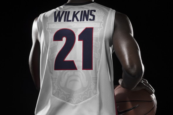
Where fans will see the biggest change—and by big, we mean small—comes on the hardwood, as the custom-design typography offers a new visual. Nike claims the letterforms prove “sturdy and powerful,” with inspiration drawn from the bulldog itself and the North Campus fixture The Arch, a cast-iron structure.
The basketball uniforms will come in red, white and black, featuring the bulldog logo amongst many other graphical pieces on the back of the jersey in the “aerographic” portion of the uniform.
The women’s basketball uniform will continue to display their current arched wordmark, rather than using the new one.
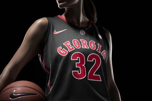
This is one of the programs that had a current look it wanted to keep.
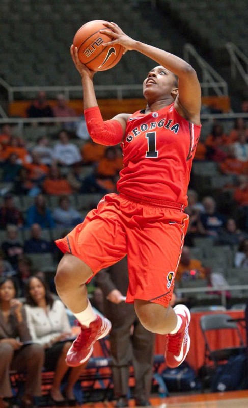
The men’s team has used a couple different wordmarks on their cheat, the latest show below from 2012

It has been reported by those with insider information within either Nike or the University that there was a full alternate uniform designed and presented to the school’s athletic department. This look was “cut” from the package being released. No word on what that design entailed.
Do you like the look? Is it in keeping with the style that the University of Georgia has become associated with?
Edit: Updated at 10:10pm EST, 04/02/2013 by JR Francis
Edit: Grambling error corrected

