The UConn, nee University of Connecticut, Huskies have partnered with Nike to develop a new primary logo and uniform standards program for the school’s athletic programs.
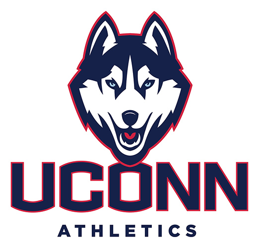
As we reported last month, the logo is head-on, aggressive without being overly menacing, and maintains the navy and white with touches of red look the school has used.
The schools’ different athletic programs all had their own ID, the football team had developed the block ‘C,’ men’s basketball wore an intertwined ‘UC,’ women’s basketball had a ‘C’ around a basketball ball, and soccer and volleyball were reportedly developing hybrids from those. Only five of the 24 sport programs were using the Husky dog logo on their current uniform.
Now, all sports will use the new Husky and the UConn name.
Most of the new uniforms wont be released until the fall, according the school, but the new Husky will begin to appear on campus immediately.
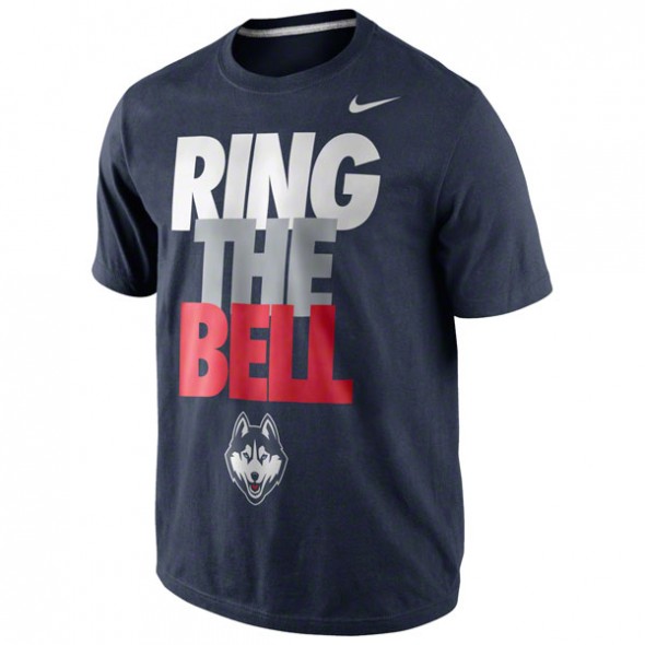
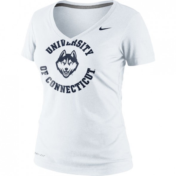
Several apparel outlets had begun to show the new logo earlier today. Several different treatments were shown. interestingly, none of the apparel we saw included the red outline on the logo like the official release. So, apparently, that will be used only on occasion.
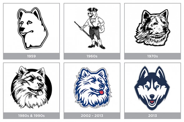
The logo, affectionately known as “Jonathan” has undergone a couple of revisions throughout his history. This is certainly the most aggressive.
We are reminded of the unused Quebec Nordiques logo.

Though, now that we look at it, it really isn’t that similar.
How do you like the new husky? Do you find it sharp and clean? Or is it too forced aggressive, or as we’ve heard around our offices, a little “generic?” Let us know how you feel.

