Over the last few weeks, on the Chris Creamer Sports Logo Community and elsewhere, we have been taking lists, allowing you, the Logocast listener, to have a say in our new power rankings. And today, we’re releasing the results. For an example, look at our NHL Power Rankings from February. For this list, we are using the crowdsourced tabulation. For just the Logocast 3 and one where the crowd is a single entity next to ours, be sure to look at the bottom of the page for the infographics.
| RANK | TEAM | MIKE W | MIKE T | GREG | CROWD |
|---|---|---|---|---|---|
| 1 |  | 3 | 3 | 4 | 2 |
GREG: Perfect. An all-time classic. The Celtics uniforms are the blue pinstriped suit of basketball. Styles come and go but the blue pinstriped suit has never gone out of style. Like the blue pinstriped suit, the Celtics look is pure class, and class never goes out of style.
| RANK | TEAM | MIKE W | MIKE T | GREG | CROWD |
|---|---|---|---|---|---|
| 2 |  | 1 | 18 | 3 | 1 |
MIKE T: Probably the most outdated logo in basketball. It could be SO much better with a facelift, but now it looks like a sad old man.
| RANK | TEAM | MIKE W | MIKE T | GREG | CROWD |
|---|---|---|---|---|---|
| 3 |  | 5 | 7 | 9 | 3 |
MIKE W: The Lakers, despite their terrible primary logo, have a great uniform set. They’ve managed to update classics worn since the ’60s, and do it well. Their white alternates, a relatively new addition, manage to add to the look with a great change of pace at home.
| RANK | TEAM | MIKE W | MIKE T | GREG | CROWD |
|---|---|---|---|---|---|
| 4 |  | 4 | 2 | 1 | 5 |
GREG: Great color scheme, perfect incorporation of their logo, no “font for font’s sake.” A clean, classic look that will work forever. Another example of my “blue pinstriped suit” philosophy on uniforms. I was a little surprised that the Spurs ended up at the top of my rankings. Going in, I figured either the Bulls or Celtics would top my list. I knew the Spurs would be in my top ten, but It wasn’t until I had all 30 NBA uniforms on my screen that I realized that I liked the Spurs look better than all the others.
| RANK | TEAM | MIKE W | MIKE T | GREG | CROWD |
|---|---|---|---|---|---|
| 5 |  | 2 | 1 | 23 | 4 |
MIKE W: A modern look that flat out looks great. Their font works, the home, road, and alternates all work for the team, and although they do go way overboard on one-offs and things like White Hot Heat, that still doesn’t detract from an overall great looking team.
| RANK | TEAM | MIKE W | MIKE T | GREG | CROWD |
|---|---|---|---|---|---|
| 6 |  | 19 | 5 | 15 | 6 |
MIKE T: First I was’t a fan of the black-less update, but it looks really nice and classic now.
| RANK | TEAM | MIKE W | MIKE T | GREG | CROWD |
|---|---|---|---|---|---|
| 7 |  | 10 | 26 | 5 | 7 |
GREG: Before the “homer pick” stuff starts, let me remind everyone that I’ve been a Lakers fan since 1979. Anyway…The Cavs have a great color scheme and I love the simplicity of their uniforms. The font is modern without being gaudy and the striping looks great. Of their many looks over the years, this current Cavs uniform may not be the best of the lot, but it’s certainly better than a lot of them.
| RANK | TEAM | MIKE W | MIKE T | GREG | CROWD |
|---|---|---|---|---|---|
| 8 |  | 6 | 4 | 14 | 8 |
MIKE W: The Nuggets were one of the first NBA teams that really attached itself to the double blue color scheme, and perhaps that’s what’s helped it endure and age so much better than some of it’s contemporaries. You combine that with the best alternate in basketball and you have a great set.
| RANK | TEAM | MIKE W | MIKE T | GREG | CROWD |
|---|---|---|---|---|---|
| 9 |  | 20 | 12 | 7 | 9 |
MIKE T: The pinwheel logo is so simple and really can’t be improved upon. The sashes also have a great history in PDX.
| RANK | TEAM | MIKE W | MIKE T | GREG | CROWD |
|---|---|---|---|---|---|
| 10 |  | 21 | 16 | 2 | 10 |
GREG: The perfect example of a “modern” basketball uniform. A “modern” font that won’t look dated in 5 years and great use of an overused color scheme. This one will stand the test of time; and in this era of “The more bells and whistles the better”, that ain’t no small feat.
| RANK | TEAM | MIKE W | MIKE T | GREG | CROWD |
|---|---|---|---|---|---|
| 11 |  | 7 | 10 | 13 | 11 |
MIKE W: The Nets certainly look clean, and the look has grown on me over the year. Some really great small details, like herringbone in the trim matching the court, helps to bring this set up, especially considering I didn’t care for the logos when initially introduced.
| RANK | TEAM | MIKE W | MIKE T | GREG | CROWD |
|---|---|---|---|---|---|
| 12 |  | 8 | 8 | 6 | 13 |
MIKE T: I think this team finally found an identity. This recoloring is the best yet with the unique colors.
| RANK | TEAM | MIKE W | MIKE T | GREG | CROWD |
|---|---|---|---|---|---|
| 13 |  | 9 | 24 | 17 | 15 |
MIKE T: Meh. Just boring and nothing eye catching.
| RANK | TEAM | MIKE W | MIKE T | GREG | CROWD |
|---|---|---|---|---|---|
| 14 |  | 13 | 11 | 8 | 16 |
GREG: A great update of a classic look. The Sixers are a heritage team and they finally decided to start looking the part again. My only gripe is I wish they’d gone with blue instead of red as their primary road look, but that’s a very minor nitpick. This is a great looking basketball uniform. Their neighbors in D.C. would have done well to give the Sixers a call to get advice on how to update an old look.
| RANK | TEAM | MIKE W | MIKE T | GREG | CROWD |
|---|---|---|---|---|---|
| 15 |  | 12 | 23 | 30 | 12 |
MIKE W: The Magic don’t look as good as they did in the 1990s, when they made pinstripes on basketball uniforms awesome, but it’s not a bad update. The black alternate in particular looks great.
| RANK | TEAM | MIKE W | MIKE T | GREG | CROWD |
|---|---|---|---|---|---|
| 16 |  | 16 | 17 | 20 | 15 |
MIKE T: The primary logo is clean, but the jerseys need work. Too many outlines. If only Lob City got a Lebron-style rebrand before they became contenders.
| RANK | TEAM | MIKE W | MIKE T | GREG | CROWD |
|---|---|---|---|---|---|
| 17 |  | 14 | 19 | 11 | 21 |
MIKE W: The Bucks, after spending a too long messing around with purple and green, are back in their rightful colors. The home and road uniforms are good, and the retro-styled alternate with the script Milwaukee is great.
| RANK | TEAM | MIKE W | MIKE T | GREG | CROWD |
|---|---|---|---|---|---|
| 18 |  | 17 | 27 | 12 | 17 |
GREG: I’ll give them an A for effort in their attempt to incorporate the past into a new look. I like the idea, but the execution fell a little short. There’s a lot to like here – the logo on the jersey, incorporating the numbers into the logo – but there’s just a little too much going on and everything looks a little too small. The result is all the elements get lost in the shuffle. Not bad, but could have been so much better.
| RANK | TEAM | MIKE W | MIKE T | GREG | CROWD |
|---|---|---|---|---|---|
| 19 |  | 15 | 9 | 16 | 22 |
MIKE W: The Wizards had a great idea when they modernized. They just fumbled the execution a little. The silver around the numbers makes it too hard to see on the jerseys, and doesn’t give them the pop a white outline would. This is still a extraordinary upgrade over their gold, black and blue nightmares.
| RANK | TEAM | MIKE W | MIKE T | GREG | CROWD |
|---|---|---|---|---|---|
| 20 |  | 23 | 13 | 18 | 20 |
GREG: There is nothing terrible about these uniforms. But there’s nothing great about them either. The Hawks have a perfectly generic look to go with a perfectly generic color scheme. While these are certainly a huge upgrade over those awful giant bird jerseys of the 90’s, they don’t come close to the Dominique Wilkins era uniforms or what I consider their all-time best look, the Pete Maravich era green and blue uniforms. Do an update of the Maravich era uniforms and we’re in business.
| RANK | TEAM | MIKE W | MIKE T | GREG | CROWD |
|---|---|---|---|---|---|
| 21 |  | 11 | 21 | 29 | 19 |
MIKE T: One of the best logo sets in the league brought down by gaudy pinstripes and side panels.
| RANK | TEAM | MIKE W | MIKE T | GREG | CROWD |
|---|---|---|---|---|---|
| 22 |  | 22 | 29 | 19 | 18 |
GREG: This uniform can’t seem to decide what it wants to be. The stripes are kind of cool but the font looks more Flintstones than it does Redstone. (Redstone is a rocket for those who may be wondering) Not terrible, not great. An average NBA uniform.
| RANK | TEAM | MIKE W | MIKE T | GREG | CROWD |
|---|---|---|---|---|---|
| 23 |  | 26 | 6 | 27 | 23 |
MIKE T: So under appreciated. The bear is rendered great with good secondaries, and jerseys that get the job done.
| RANK | TEAM | MIKE W | MIKE T | GREG | CROWD |
|---|---|---|---|---|---|
| 24 |  | 25 | 22 | 24 | 24 |
MIKE W: The Mavericks have looked out of place ever since they went to double blue. Their uniforms template feels extremely dated, the fonts are hokey, and while the logos are well rendered, there is nothing else good about this set.
| RANK | TEAM | MIKE W | MIKE T | GREG | CROWD |
|---|---|---|---|---|---|
| 25 |  | 27 | 14 | 21 | 26 |
MIKE T: The T-wolves would be higher if they had the green in the jersey like their last set, but the primary was a great update to the KG-era look.
| RANK | TEAM | MIKE W | MIKE T | GREG | CROWD |
|---|---|---|---|---|---|
| 26 |  | 28 | 15 | 28 | 25 |
GREG: The bright side? Well, there isn’t some stupid looking cartoon dinosaur on the jersey any more. Umm…what else? OK, that’s about it. Bland color scheme + bland modern font = bland basketball uniform. Anyone else wonder if this team would like to take a mulligan on their choice of a name for this team? A perfect example of why, when you want to brand your team, it’s probably a bad idea to chase whatever is “hot” at the time. If there is a team in professional sports more in need of a rebrand, it’s the Charlotte Bobcats, but the Raptors are second in line.
| RANK | TEAM | MIKE W | MIKE T | GREG | CROWD |
|---|---|---|---|---|---|
| 27 |  | 18 | 25 | 26 | 27 |
MIKE W: The Kings aren’t that bad. Their template is nice, and while they seem to have sewn their home numbers on their road jerseys and vice versa, they are another team that has an alternate that is far better than their every day set.
| RANK | TEAM | MIKE W | MIKE T | GREG | CROWD |
|---|---|---|---|---|---|
| 28 |  | 30 | 28 | 22 | 28 |
MIKE W: The Suns are the worst looking team in basketball. Whatever they go to this offseason will have to be an upgrade, if only because all indications are the gray heavy features of their set will be gone. Whoever decided to mix the names Suns with the color gray made a terrible decision.
| RANK | TEAM | MIKE W | MIKE T | GREG | CROWD |
|---|---|---|---|---|---|
| 29 |  | 24 | 20 | 10 | 29 |
GREG: I ranked the Thunder in the perfect spot to catch hell in both directions. I’ll either have them way too high or not high enough. I really like their color scheme, they took a dumb name and did the best they could with it, and they have a killer alt. Yeah, their logo is stupid but the uniforms look pretty damned good. It’s a clean and classic look that’s not in danger of looking dated in two years.
| RANK | TEAM | MIKE W | MIKE T | GREG | CROWD |
|---|---|---|---|---|---|
| 30 |  | 29 | 30 | 25 | 30 |
MIKE T: The latest edition in the saga that is the Bobcats took all the personality out of the previous sets with the orange cat. I don’t mind the logos themselves, but just get the colors right.
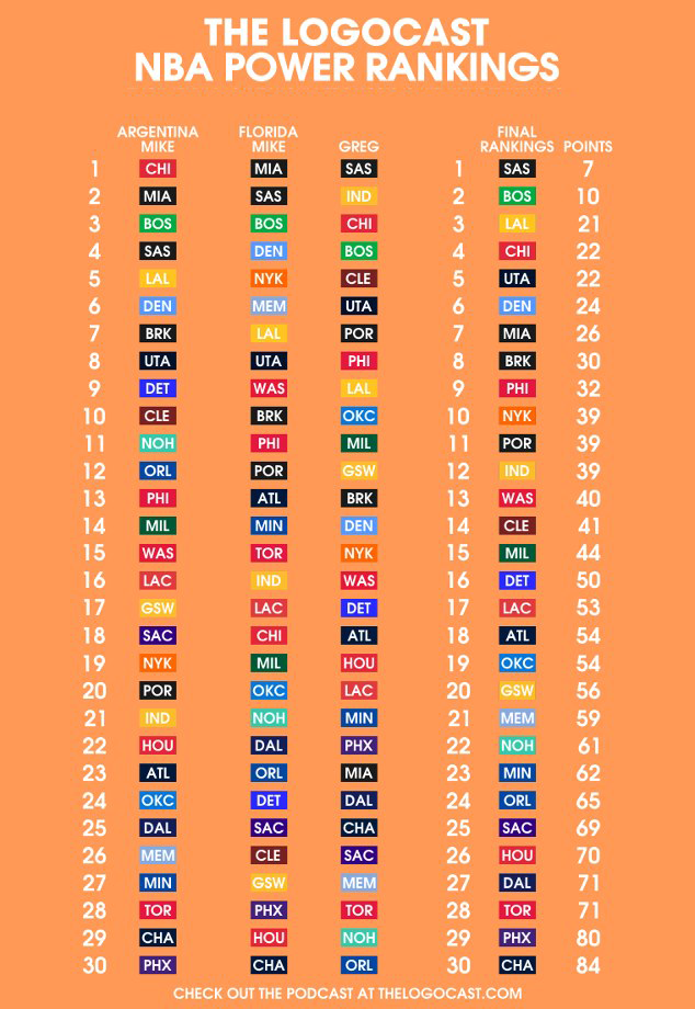
Here is an infographic of just the way the hosts vote.
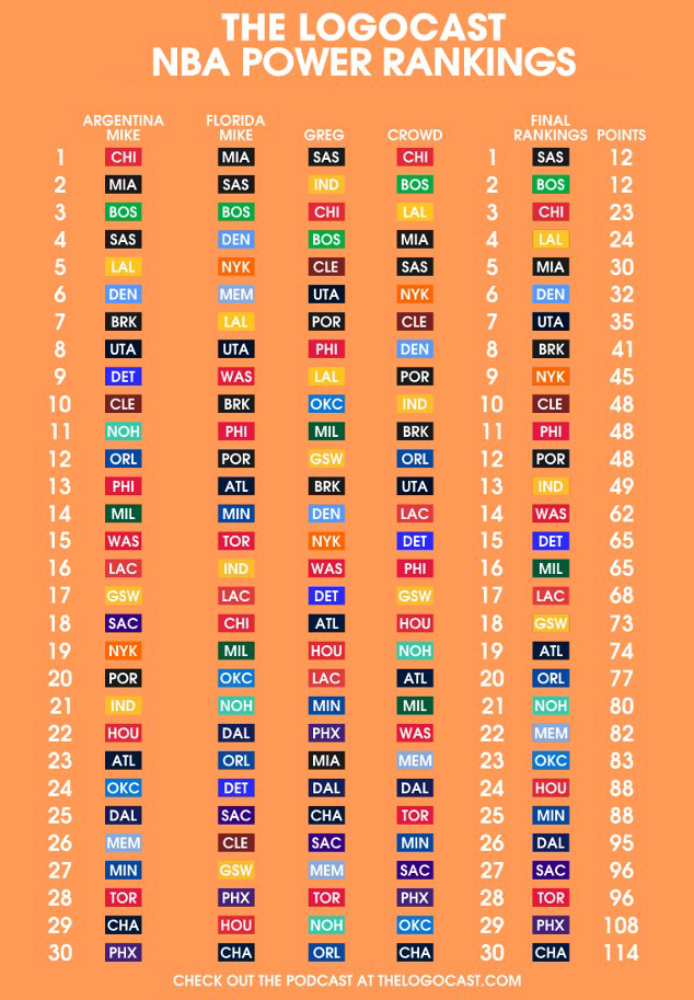
And here is a graphic if we take all of the crowdsourced votes and consolidated them into one voice.

