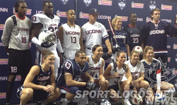
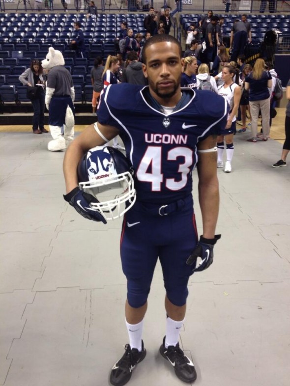
UConn announced last week that they had a new logo. Today, they showed the unified uniform themes across all sports. Pretty consistent all the way around. Navy or white, with the bold UConn mark across the chest, standardized number font, UConn colors. Johnathan doesn’t appear too much, only sublimated on the soccer goalie’s chest and one other place…
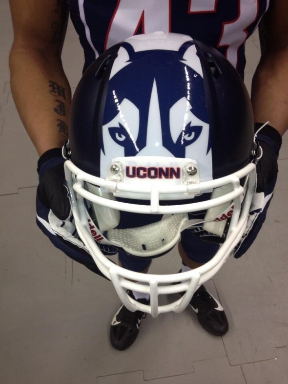
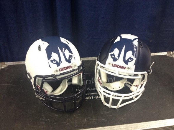
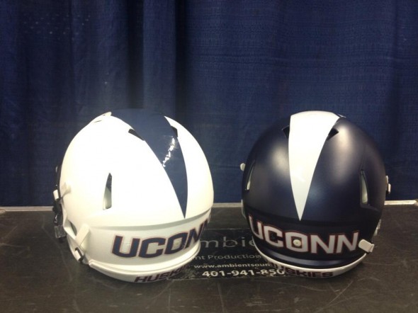
The football team now has two helmets, one white, one flat navy. They both have a giant stripe over the top, starting very wide at the front, narrowing to a point at the back, and featuring the peering eyes of their primary logo, Jonathan.
The blue doesn’t match between the navy helmet shell, the decal color, and the white helmet’s blue facemask. Which is a terrible execution. There is no logo on the side of the helmet at all. The center stripe/logo thing stops before it gets all the way to the back, where the team’s UConn wordmark is presented huge and bold.
Already, the worst reasoning of all time is being thrown out as an excuse for this strange design; The players like it. At this rate, games will be shown only on instagram and game tape will be watched in Harlem Shake format. The point is, things that 18-22 year olds like is mercurial at best, and stupid as worst. What an awful arbiter of what your institute of higher learning should wear when playing sports.
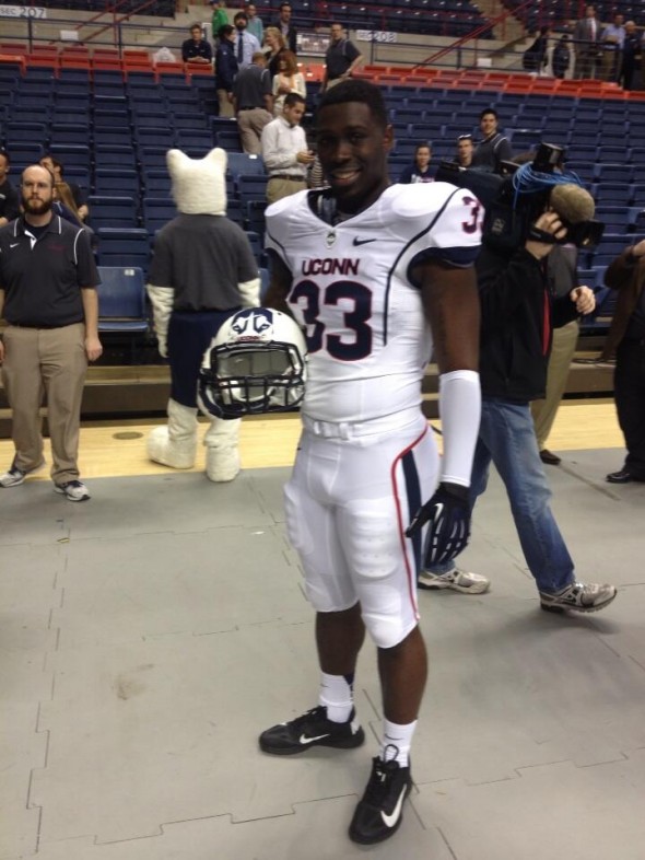
At least the rest of the teams for the school seem tastefully designed. Even the remainder of the football design (jerseys and pants) seem to be fairly reasonable, disregarding the randomly starting and stopping piping that abounds. Remember when odd piping was the biggest travesties we covered?
If only they would swap the pants and helmets between these two sets to create contrast, at least they wouldn’t look like ballerinas or molded army men.
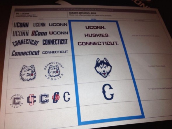
The logos used to me many and now have been significantly narrowed down. Apparently the baseball team gets to keep their C
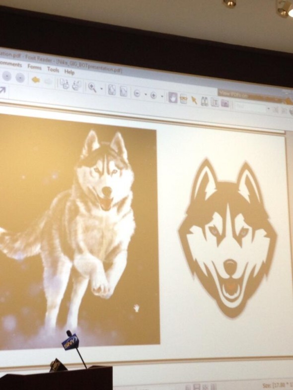
The inspiration behind the new husky logo was also shown and it really makes perfect sense.
So, now UConn has released their new logo, uniforms across sports, and their crazy football helmet design. At least the uniforms looks good.
Unless we just haven’t yet seen the little dog tail on the back of the pants.

