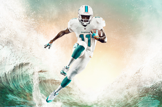
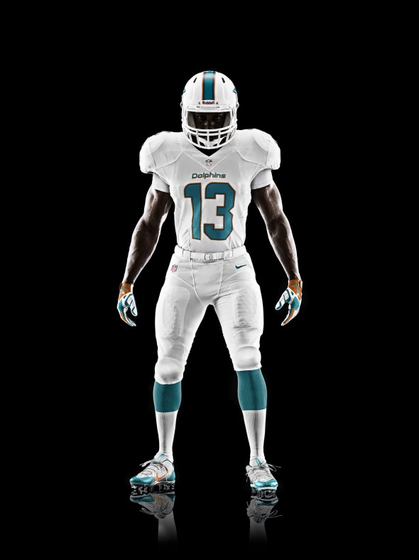
White. That’s what you see when you first look at the new—dare we say retro?—Dolphins’ threads.
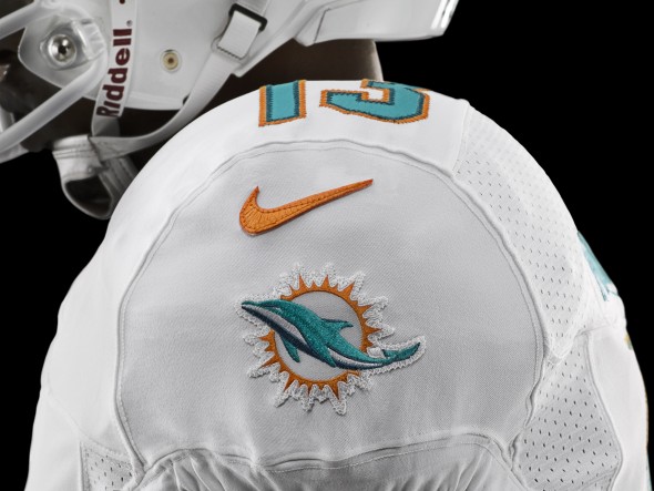
The redesigned uniform, done in conjunction with a new Miami Dolphins logo that has a brighter sunburst and modernized dolphin, “has a lot of influences from the past, the team’s history and when they first came to Miami and created a culture,” says Nike’s football design director Todd Van Horne.
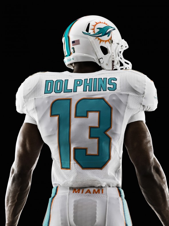
The design, especially the wordmark, reaches into the design esthetic of the 60s, when Miami was a city where the stars flocked.
“They had unique colors and used white,” Van Horne says. The new uniform embraces that past, returning Miami to a predominance of teal (a tweak of the color brings that tone closer to where it was in the ‘60s than in 2012), representing Miami’s water, less reliance on its newly updated sun-like orange and a full embracing of white, a play off the beaches of Miami.
“I just like the idea of the use of white,” Van Horne says. “It is whiter than white.”
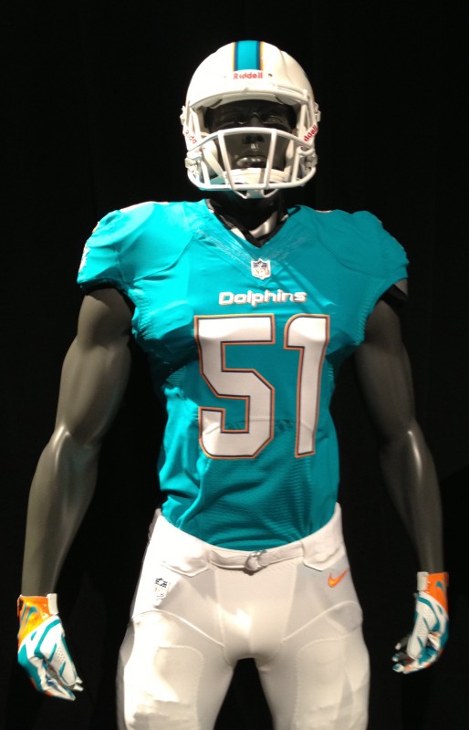
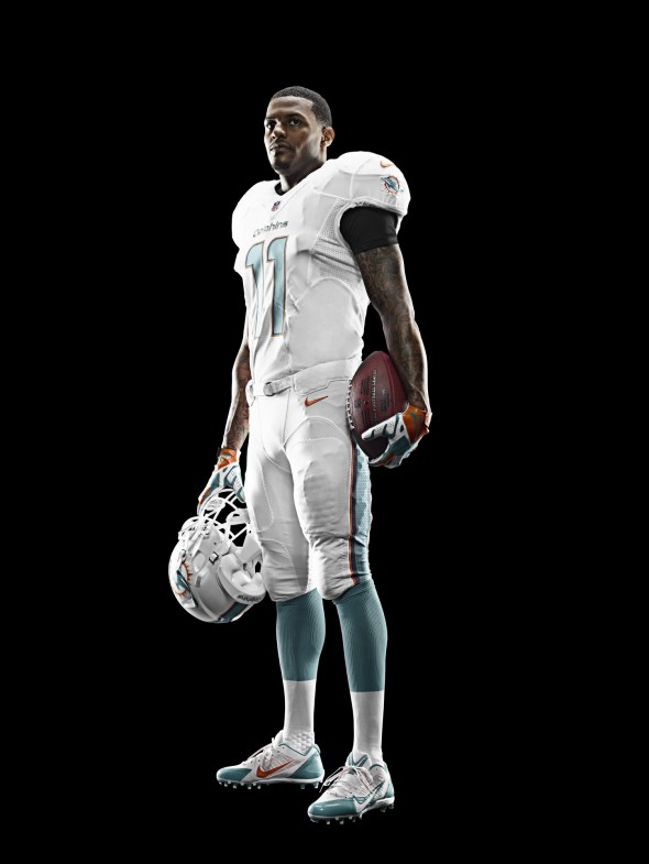
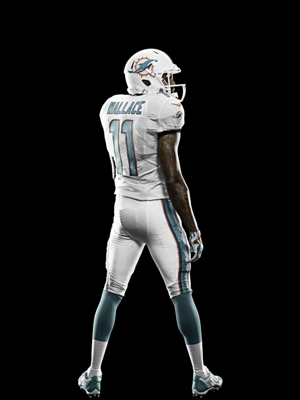
The Dolphins showed off two variations for 2013, both with white helmets and white pants. They will don either an all-white ensemble or mix in a teal jersey. And in all cases, Miami becomes only the second team in the NFL to have an all-white facemask (Kansas City is the other).
Miami wide receiver Mike Wallace says he loves the tight fit of the all-white uniform. “When you put on that uniform on game day your whole mentality changes,” he says. “It is business time. You turn into a superhero, like Batman or Superman putting on that cape.”
On the helmet, the white facemask and white background play dominant. The new logo offers a sleeker, less cartoony feel and the wide teal stripe adds to the retro look. The orange plays as an accent on the lid, a concept that flows throughout the uniform.
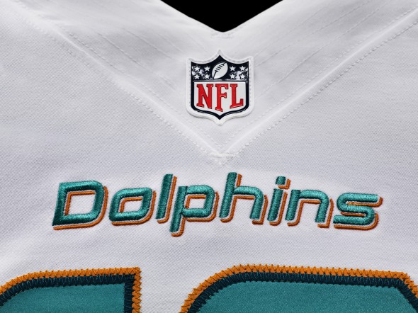
The white jersey, which appears to be Miami’s color of choice, based off early promotional material, offers the “Dolphins” wordmark in teal, with a orange drop shadow, above the teal numerals. The numbers themselves mimic the helmet stripe, with the dominant teal outlines in both darker blue and orange. In fact, the striping and 3 color use is very consistent, with the exception of the wordmark.
The power of white continues with a no-color collar and limited color elsewhere on the jersey. Including the first Dolphins jersey we can find with no attempt to include the sleeve striping so prominent in their early days.
When Miami does opt for the teal top, expect to see the numerals and wordmark to go white, still with a blue, then orange, outline.
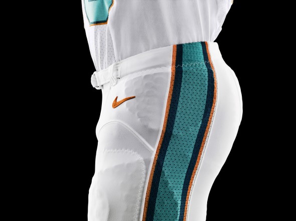
The all-white pants, the only option the Dolphins have offered to the public so far, include a stripe that follow the pattern of the uniform, with teal as the main color and a darker blue edge leading to a final orange outline. The wordmark “Miami” is on the rear beltline, actually in orange.
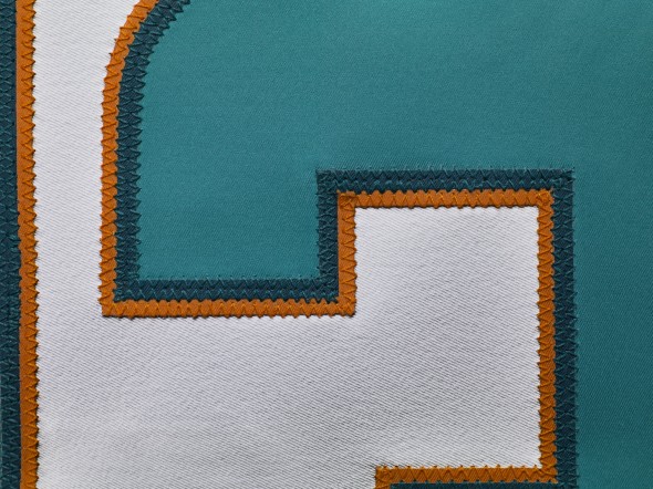
Expect plenty of teal from the socks and the shoes too.
Now that three teams have joined Seattle in giving at least some sort of substantial, Nike-based update to their look for the upcoming season—teams can only upgrade uniform designs every five years, as per NFL rules—Van Horne hopes more will join in, opening up the opportunities of design.
After all, as Wallace—like so many of his colleagues—pointed out: “If you look good, you feel good.”
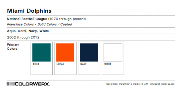
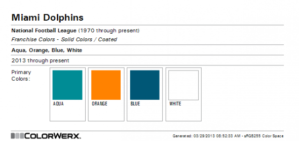
While the outlines appear navy, or even black in some of these photos, the detailed pictures, and the team’s official Pantone colors, assure us that this is a deeper shade, in this case, called “blue.” Courtesy Donovan Moore of the invaluable colorwerx.us we have his incredibly helpful chart for the Dolphins old vs new color palate.
As you can see, thanks to Donovan’s hard work, that the entire set has gotten lighter. Navy has become blue, coral to orange, and aqua to… a lighter aqua.
Pants striping is thick, like the top of the helmet, and lacks any fancy termination. It simply stops when it hits the top of the pants.
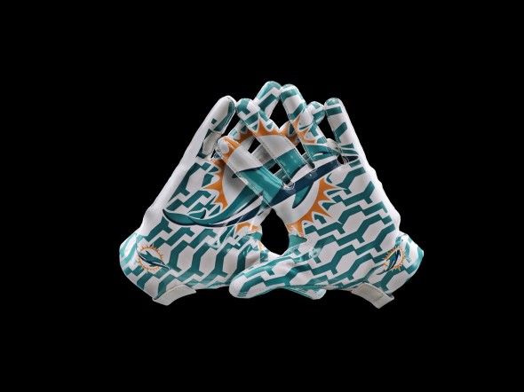
The pattern shown here is on all teams’ gloves, rendered in team colors. We have seen the exact same for the Jaguars
The real question is, here; Did the Dolphins upgrade their jerseys? Let’s look to answer that, by showing the past.
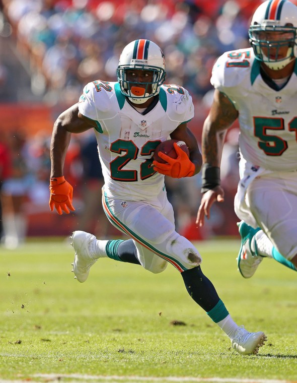
Last year, the Dolphins had the Nike template, complete with the awful “press-conference-dress-shirt-under-jersey” teal collar. Differences are numerous, starting with the two color stripe on the helmet, with white providing a border to the center orange stripe, teal on the outside. The pants striping matched the helmet, and terminated at the top of the pants, as it does now. The numbers were a standard “athletic font” with outsides and a drop shadow. Gone is the shadow, replaced with the three-color number, in their distinct font.
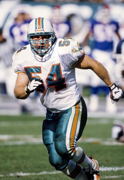
Back in 1996, the Dolphins didn’t have the drop shadow. Or use much of a darker color anywhere. Ahh, the strange placement of the Wilson logo is delicious.
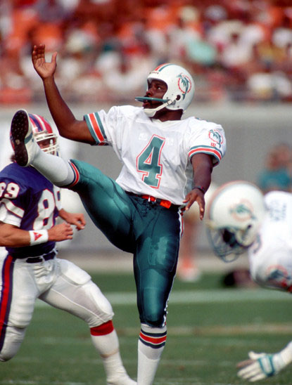
1989 is the first time we can find the Dolphins wearing teal pants. The 87 team started a number of years with aqua numbers outlined in orange with a white padding, this lasting until ’94.
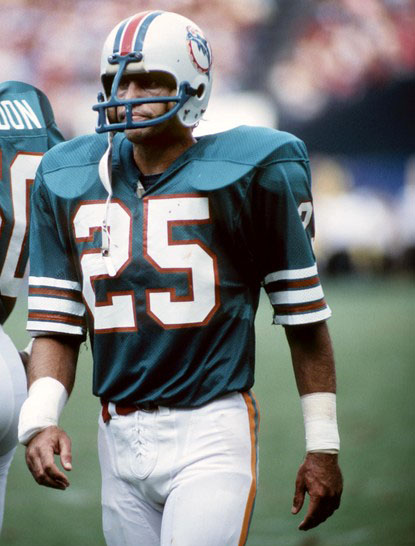
The Dolphins have tweaked their main aqua/teal color officially only 3 times, including the uniforms released today. But, several years, the jersey just seemed slightly darker, closer to blue, or whatnot. And sleeves, glorious sleeves. Gaze upon their many-striped wonder.
In 1980 the darker, bluer jerseys were first accompanied with matching aqua facemasks. This tradition marks 2012 as its last appearance, having been replaced by white.
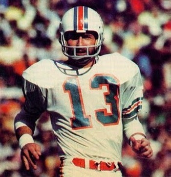
In the 1970’s the Dolphins didn’t look much different. Teal numbers outlined in orange. Helmet strip with white spacing. More simple sleeve striping.
So, all-in-all, the history of the Miami Dolphins is not exactly rife with changes. These qualify as rather substantial. Especially for this team, having played since 1966 in largely the same look.
But, are you a fan? Tell us how you feel about the new look Dolphins.
JR Francis contributed with Tim Newcomb on this article.
UPDATE:
So, what else was there, or IS there to expect? After a tweet from alert reader Evan Hoffmeier, we went back and watched the Nike release video for the Miami uniforms again. We saw something we didn’t catch the first time.
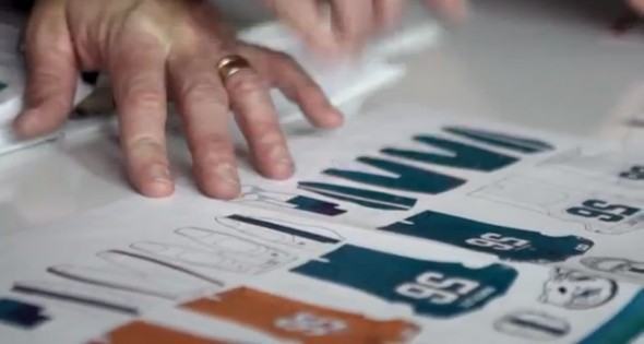
The Dolphins talked about going “white.” But, here we see aqua pants (later pictured during their modeling.) They showed their white jersey and almost acted like they didn’t even WANT to have a teal jersey. But here, we see teal and an orange alternate.
Admittedly, these are simply papers being shuffled on a desk in a promo video. They are only on-screen for less than a second.
But, every other thing we saw in this video was announced. The numbers, the wordmark, the whites, the aqua… everything else was production-quality renderings of things that came to life.
Could these orange jerseys be real?
Exciting possibility. I bet you have an opinion about it, don’t you?

