For those who thought Nike couldn’t do anything but radical and futuristic, behold the new uniforms for your 2013 Minnesota Vikings.
Fresh off their unveiling of the new “next-generation” Jacksonville Jaguars uniform design earlier in the week, the new and more traditional uniforms of the Minnesota Vikings were shown to the press on the heels on tonight’s NFL Draft.

The Vikings new uniforms clean up what was previously an unnecessarily cluttered look, one the team had been using since 2006. Thankfully gone is that mess that used to run up either side of the jersey, up the back and down around the sleeves. What we’re left with in the latest look for the club is basically a modernization of their design prior to that ’06-’12 mess – I like to think the team has gone back and righted the course of their uniform ship putting it back on a more appropriate path. Well done boys.

New is the number font, a customized design to more closely resemble the Vikings brand (which you can only really see on the 2 in the photos we received).
Also new is the jersey sleeve striping, a gold and white stripe near each cuff, the gold staying straight while the white angles itself up near the back as seen in the photo below:

Pant striping has also been updated, in another modernized nod to the past the club has kept it simple with a straight no non-sense design. Very much in contrast to last years “wave design” which had been intended to mimic the horn logo worn on the helmet.
Speaking of the helmet, just like last year it’s a matte-purple with a black facemask.
Striping is as follows, thin purple, thick yellow, gigantic purple – what appears to be thin, darker purple lines on either side of the stripes is merely a change in fabric to affix the striping material to the pant leg:

“The fine details make this uniform special, the threading in the collar, just the subtle little things that are going to make people say, ‘That’s our Vikings uniform as we know it.’ To the fan who is really a Minnesota Vikings fan true to its core, they’re going to love this uniform.” – Vikings linebacker Chad Greenway
The new road uniform is a simple inverse of the home design, what was purple is now white and vise-versa:

You’ll notice the white pants are shown with both the home and road uniforms — there is a purple set of pants also available should the club want to go head-to-toe purple (just, please don’t do this too often guys):

“These uniforms embrace the strong tradition of the Vikings but add a contemporary feel that speaks to the future of this organization… We believe Vikings fans will be extremely proud of the new uniforms.” – Vikings Owner/President Mark Wilf.

Here’s a look at last year’s design…

…and it’s painfully clear to me that this new look for 2013 is an overwhelming improvement over this.
What do you think, reader? Is this a great upgrade or the greatest upgrade of this NFL uniform off-season?
Related stories:
 Minnesota Vikings To Honor Legendary Coach Bud Grant With Uniform Patch, Helmet Decal
  Minnesota Vikings Unveil Purple People Eaters-Era Throwback Uniforms
 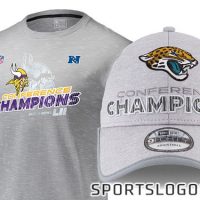 Phantom Merch: Jaguars, Vikings 2017 Conference Champs
  What’s the deal with these Minnesota Vikings helmet designs?
  The Bucs and Rams unveil final set of NFL Color Rush uniforms
  U. Of Minnesota Requests Washington Redskins Wear Logo-Less Throwbacks
  NFL Halts Sale of Darren Sharper Jerseys
  Dolphins, Vikings New Uniforms Leaked