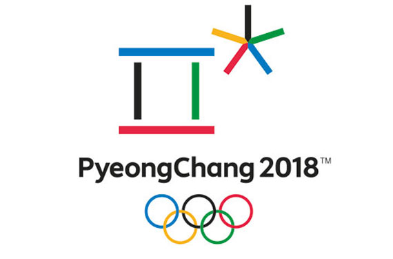
Last Friday the International Olympic Committee unveiled the logo to be used for the 2018 Winter Olympics, to be held in PyeongChang, South Korea.
The explanation behind the design of the logo, according to the official release:
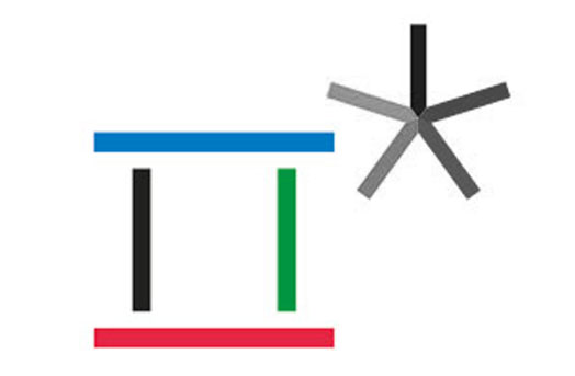
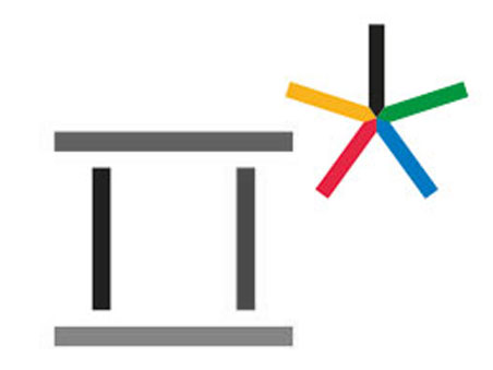
The emblem’s design has its roots in Hangul, with the shapes that form the logo stemming from the first consonants of each syllable in the word “PyeongChang” when it is written in Hangul.
The first character (above, in colour) in the emblem represents a gathering place where the three elements of Cheon-ji-in – heaven, earth, and human – are in harmony.
The second character (above, in colour) symbolises snow and ice, as well as the athletes’ stellar performances
PyeongChang 2018’s new emblem symbolises a grand gathering of people from all around the world in celebration of Olympic winter sports, which is taking place in the harmonious land of PyeongChang – “A square where the earth meets the sky, and where athletes excel in snow or on ice – that’s where everyone will celebrate the world’s biggest winter festival in 2018.”
Or as our own JR Francis described it to me, “it’s a Roman numeral 2 with an asterisk.” Eh, you’re both right.
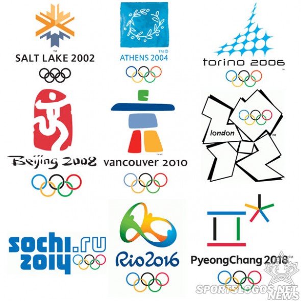
Let’s just see how it stacks up against the other Olympic games logos from the few years preceding this one:
Yes, you’re absolutely correct, it really hasn’t been a good century so far for Olympic logos.
The XXIII Olympic Winter Games are scheduled to begin in Pyeongchang, South Korea on Friday, February 9, 2018 with the closing ceremonies a couple of weeks later on February 25th.


