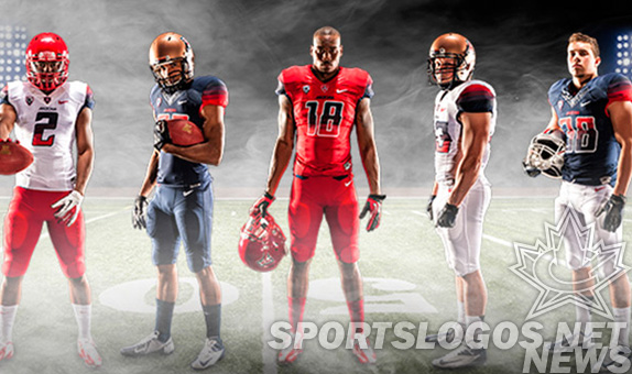
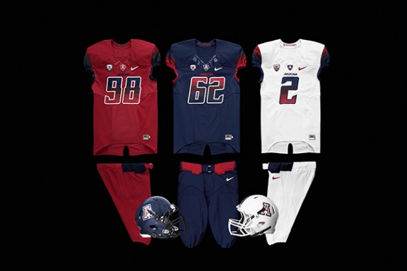
The University of Arizona Wildcats football team announced their new 2013 uniforms this week, complete with unique shoulder and number gradients.
The Nike-designed uniforms come in a full compliment of school colors, with three jerseys, three pants, and four helmet colors. All jerseys feature not just shoulders but numbers with a blue-to-red gradient. While they work relatively well on the white, the numbers fade a bit into the jersey color on red and navy and are saved by their contrast outline.
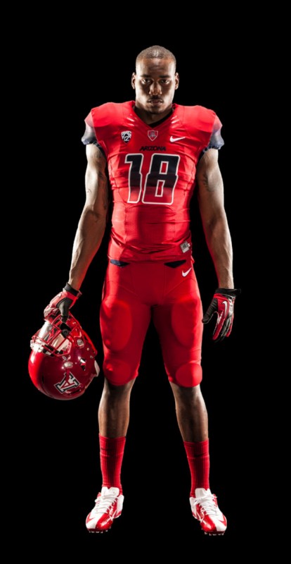
The NCAA recently passed a rule that says the number color must contrast the jersey color, starting in 2014. How will these uniforms pass muster? Well, according to a UniWatch article, their reader tells them that Arizona requested and was granted a waiver, since the uniforms had already been produced.
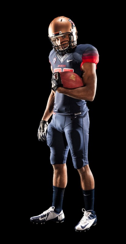
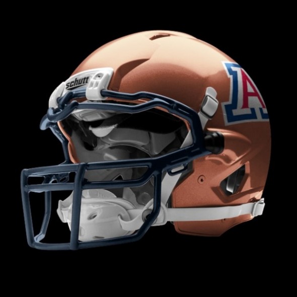
The team had debuted copper helmets in 2012, and they will carry over, bringing the helmet total, along with the red, blue, and white versions, to 4.
The white jerseys have the most traditional, legible look. The gradient not including white allows these to really contrast, and show off the school colors.
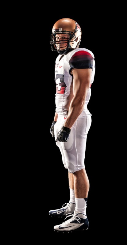
The ballet leotard, mechanic’s coveralls look isn’t the only one available, as the Wildcats will mix and match.
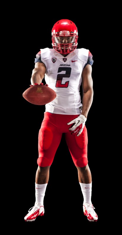
The possible combinations are huge, and as much as most of us around the big oval mahogany table here in the main conference room of Sports Logos Net Command Center, Headquarters, and Luncheonette despise the one-color pants/jersey look, we’d like mis-matching helmet, jersey, pants even less. So, here is hoping the team keeps at least two items in sync each game, though we wouldn’t wager our dessert money on it.
The Arizona Football team posted a youtube video of the uniform announcement
Two things strike us after watching the video.
One, the “Arizona Football” wordmark reminds us a LOT of the Arena Football wordmark, which as dear leader Chris Creamer pointed out, might have been inspiration for the uniform look.
B. Why does it look like there is a silver helmet in the video? At :13 you see the white, with a bold center stripe. Then, at :37 the player with white pants and white jersey looks like his helmet is silver, especially standing next to the guy in the copper helmet. AT :45, it looks like the all-navy guy has on the silver. Based on the photos, this is likely just a lighting issue that makes the copper lose some of its saturation, but its quite curious to see, nonetheless.
So, loyal fans, how does this uniform set strike you? A cool twist to be distinctive, or more evidence that uniform design is not only in the toilet, but circling into the drainpipe of 18-year-old-design-led, Nike-destroyed-history, design disasters?

