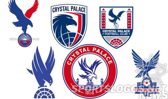
About a year ago, Crystal Palace FC put up 6 new logo designs up for public vote. They said they would take the winning design and make it their primary crest. For a year, fans voted between the six options below.
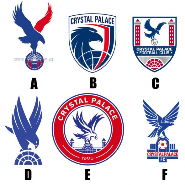
Which is your favorite? Each has their own draw, some more than others. After careful consideration and taking many, many months to deeply debate each designs’ merit, we here at sportslogos headquarters placed our votes.
Finally, the winner as been announced! Which do you think won? D? B? No matter which you guess, you are wrong.
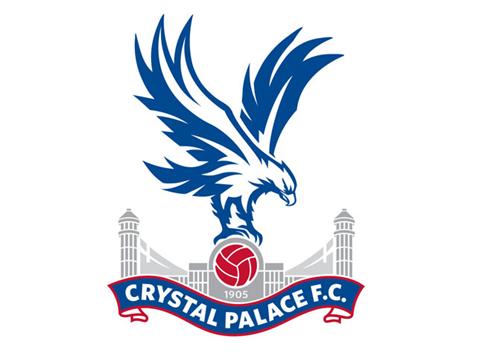
So, wait. Which one was that? Its relatively like the eagle from E, but with their older logo at the bottom… so, after voting, we got… a different design?
Apparently unable to actually commit to their word, Crystal Palace had a new, heretofore unseen logo. It is a bit of a combination of their last two logos, moreso the logo before last, but with a bolder look. And not exactly the eagle from the vote, several changes that seem to make the eagle look a touch more “aggressive.”
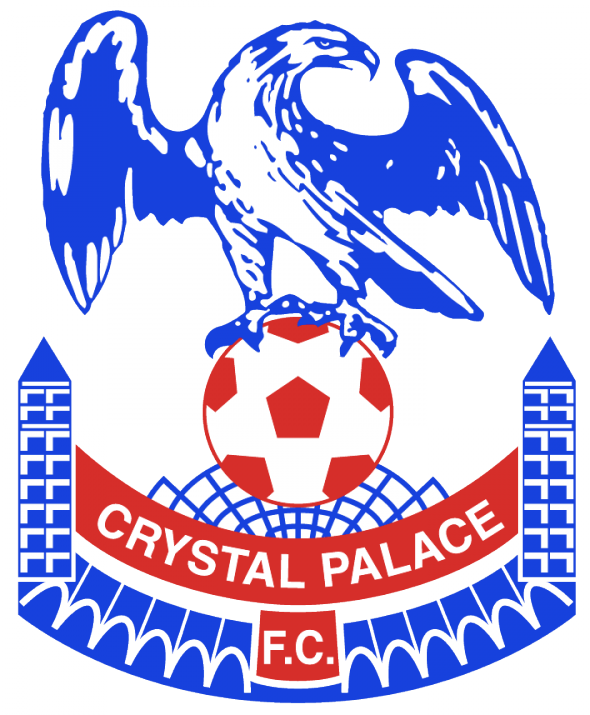
Not a lot of their 1994 logo seen in the new, however…
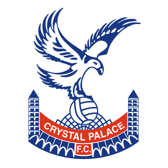
Their 1987 logo seems to almost be their sole inspiration. Almost just a freshening and cleaner version.Adding grey and cleaning up the lines essentially.
This makes for the 9th logo in the team’s 108 years.
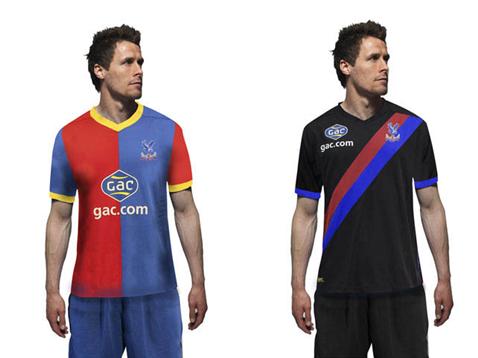
Also announced were new kits.
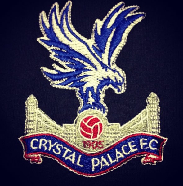
The badge in embroidery form loses a bit of its cleanliness.
Did Crystal Palace upgrade by bring the past modern? Or in bringing back their “phoenix-looking” eagle back did they downgrade?

