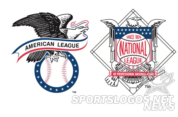
Although rarely used these days, the primary logos of the American and National Leagues of Professional Baseball Clubs both received a minor updatin’ during this past off-season.
The reason? The Houston Astros.
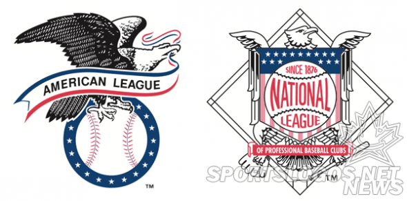
Both league logos contain stars, each star represents a team in the league and over time, as teams come and go, the logos have been updated to reflect this – much like how the flag of the United States changes with the addition of every new state into the union. With the Astros shift from the NL into the AL last November both league logos now contain 15 stars, the NL dropping one and the AL adding one.
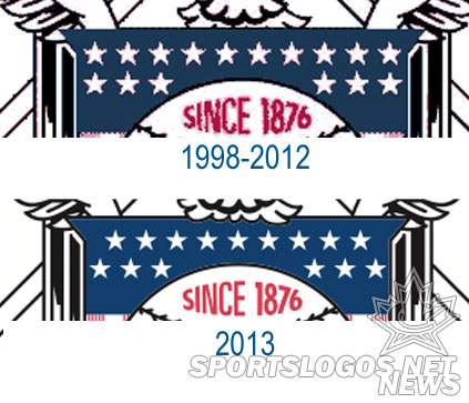
It’s a little tricky to spot the differences in the American League logo aside from actually counting them however the National League logo is much easier – the top row of stars no longer lines up with the bottom, like so:
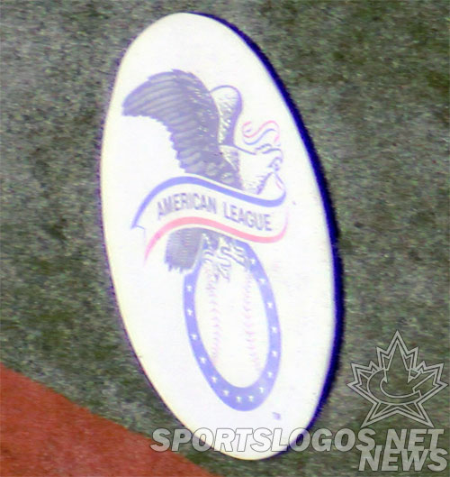
Good luck seeing the new logos in actual use, the only place I’ve been able to see either of the new logos has been on the on-deck circle of the Rogers Centre in Toronto where I snapped this pic of the 15-star AL logo in use last month:
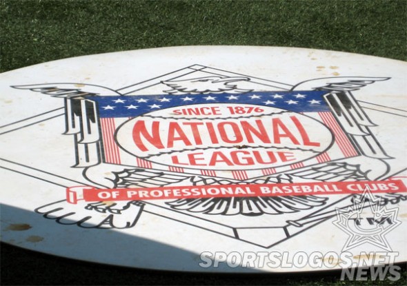
And a good friend of mine got this photo of the new National League logo while the Giants were in town this week:
Interestingly, the Chicago Cubs do wear the NL logo on their sleeves but despite their official team style guide being updated to reflect the new 15-star patch for 2013, they continue to wear the 16-star patch on the field, perhaps just using up the leftover jerseys from last season:

The earliest you’ll find use of either league logo is in the first half of the 1970s, there they began appearing on LCS ticket stubs, and the annual league preview guides known as Red Book (AL) and Green Book (NL) from there they’d regularly appear on on-deck circles, championship merchandise, or anything related to the All-Star Game. With the introduction of the “simplified-version” alternate league logos in 1998 the use of the primary logos with all the stars have been largely eliminated.
Those first league logos (circa 1972) each contained 12 stars, at the time the most recent expansion having taken place in 1969:
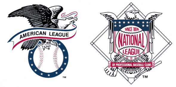
In 1977 the American League increased to 14 teams when they added expansion franchises in Seattle and Toronto, two stars were added only to their logo. Since the AL remained at 14 teams until the Astros joined in 2013 this would be the last update to the league logo until this season:
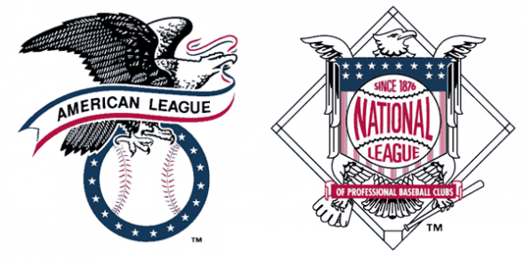
The National League joined the 14-star party 16 years later after their expansion put teams in Denver and Miami for the 1993 season:
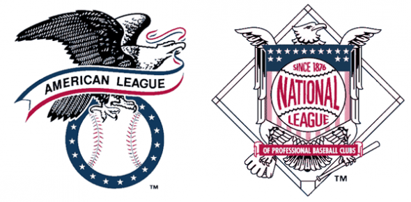
In 1998 a series of expansion teams (Phoenix NL, Tampa Bay AL) and league-swapping (Milwaukee AL->NL) increased the National League’s total to 16 teams and left the American League at 14:

Finally in 2013 the Houston Astros jumped from the NL to the AL bringing both leagues to 15 teams, the first time either league had an odd number of clubs:
Has anyone out there been able to spot any other places these new league logos are actually being used? I’d love to hear about it and see photos if you have. Leave a link in the comments.

