Skip to content
Wednesday, November 10, 2021
  • Logos
  • News
  • Forum
  • Facebook
  • Instagram
  • Twitter
  • Youtube
SportsLogos.Net News

SportsLogos.Net News

News and blog on new sports logos and uniforms, rumours, concepts, and history in baseball, basketball, hockey, football, soccer and NCAA at Chris Creamer's Sports Logos Page SportsLogos.Net

  • Logos
  • Forums
  • Baseball
  • Football
  • Hockey
  • Basketball
  • College
  • Contact
College Football NCAA

San Diego State University Shows Tweaked Logo, New Uniforms; Little Consistency

Friday, May 17, 2013Friday, May 17, 20134 min read JR Francis

featured - SDSU New Logo New Uniforms San Diego State Aztecs

Count the looks! Collect all the styles! The San Diego State University Aztecs announced a slightly tweaked logo and new uniforms across all sports. Unfortunately, rather than take the opportunity to unify their athletics terms, wordmarks, stripes and colors, they went with a myriad collection of assorted appearance.
football - SDSU New Logo New Uniforms San Diego State Aztecs
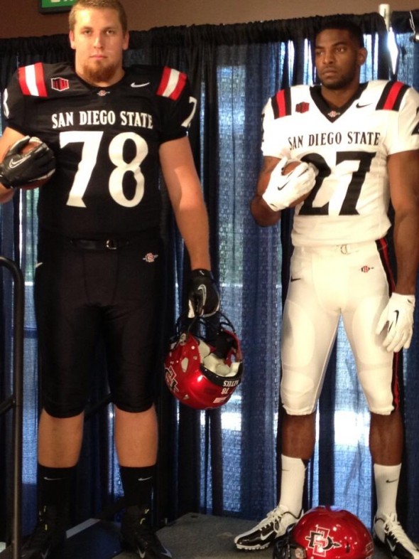
Home and away football uniforms

In football, the Aztecs took a refreshing step by having TWO uniforms, and ONE helmet! Hooray! SDSU deserves an award for restraint and taste based on this decision alone. If they’d only swap pants to avoid the prison jumpsuit look, they’s be great. Or, preferably, red pants to match their helmet, that would be perfect.

The Aztecs football team will have “San Diego STate” across the front chest. A contrasting neck band, the abbreviated shoulder stripes made de rigur by the vanished sleeves of today’s football players, and a matching stripe on the side of the pants.
tennis football side stripes football - SDSU New Logo New Uniforms San Diego State Aztecs
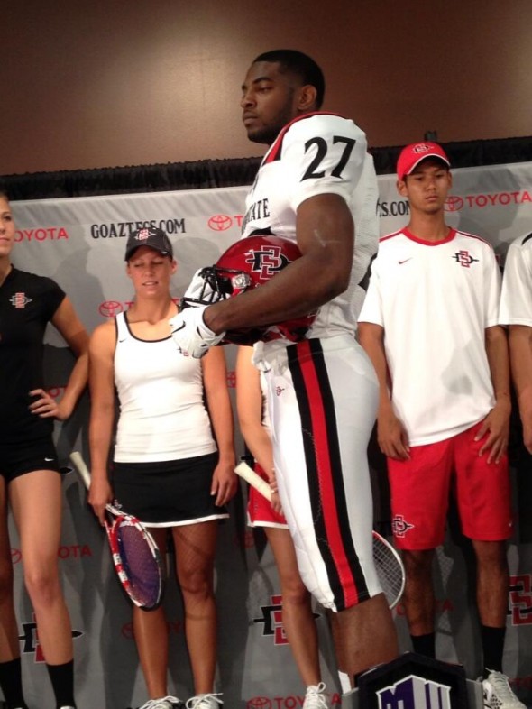
Football side stripes, and tennis teams’ uniforms

Here you can see the pant striping. Clean, simple, traditional football.

But you can also see the tennis uniforms. The women, white tops and black skirts, with the opposite color thin, even trim. The SDSU logo at the chest. The men, a white shirt with logo and singular black shoulder stripes that come to a point, red shorts also with the logo.
Men's Soccer - SDSU New Logo New Uniforms San Diego State Aztecs
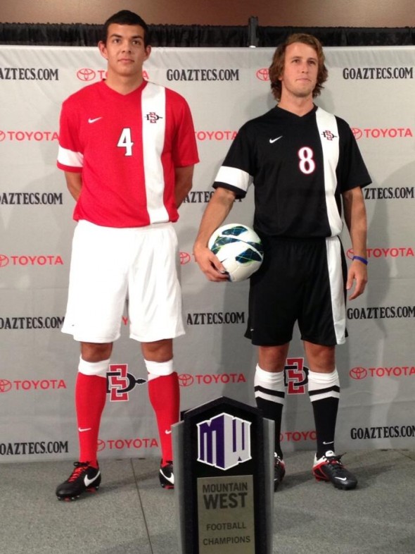
Men’s Soccer team look

The Men’s soccer team has a red and a black jersey. Both feature a wide vertical stripe on the left chest, a thick arm band on the right arm. The number is center chest, with the logo inside the stripe. Socks seem to have a diamond pointed stripe.
Women's Soccer - SDSU New Logo New Uniforms San Diego State Aztecs
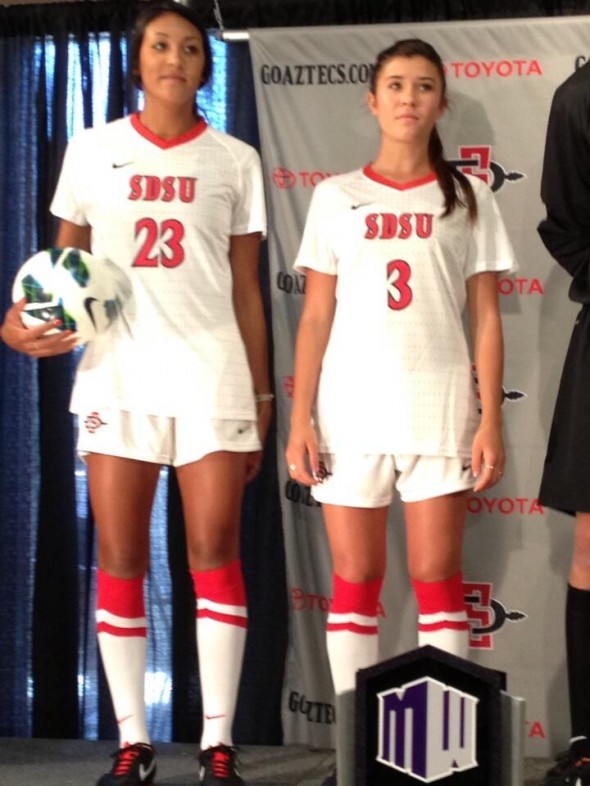
Women’s soccer uniforms

Surely we’d have a style match between the Men’s and Women’s soccer teams, right? Nope. They both have the pointed sock stripe, but thats where similarities end. The women’s jerseys have a feint horizontal striping which appears to be a pattern of some sort. They have SDSU across the chest, and no vertical stripe.
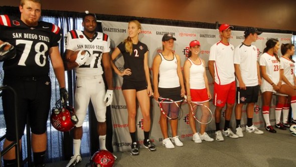
several sports - SDSU New Logo New Uniforms San Diego State Aztecs
Several different sports, several different looks

Women’s volleyball sports an all black, no stripe look, with a center number, and the logo at top left chest.

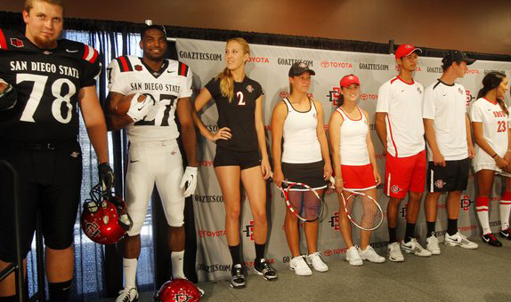
Looking at the group picture, one notices just how uneven the teams look. Rarely will they all be standing in a line such as this, but their athletics website will surely have photos of the athletes in action. This seems to use as a missed opportunity.

Recently, UConn released their new uniforms across all sports, and they came a lot closer to one unified look across sports. All with UConn at the chest, all in white or navy with thin red accents. Seems a shame SDSU didn’t go this way. Lots of factors at play, including clothing budgets, existing graphics, differing sport uniform considerations. But it doesn’t seem like it would have been too difficult to pick a tertiary color to be standard, or carry one of the striping styles across all sports.

What is different about the logo?
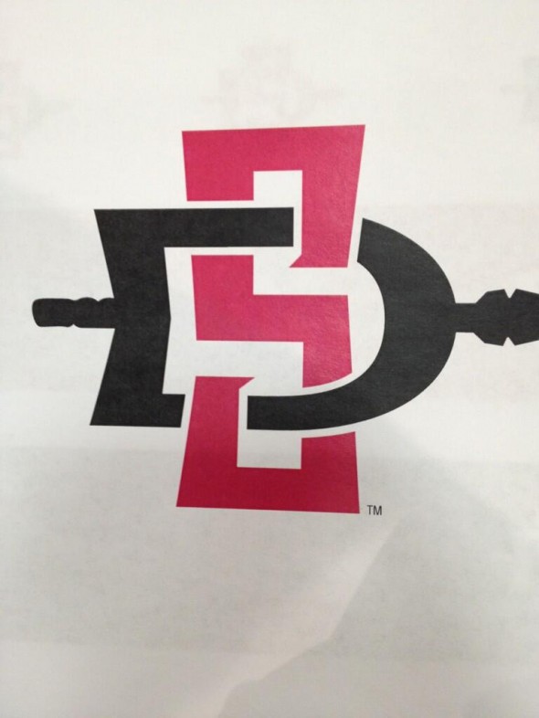
new tweaked logo - SDSU New Logo New Uniforms San Diego State Aztecs
2013 Tweaked SDSU Logo
SDSU 2012 Logo

The outline seems to be the most obvious change, and perhaps the default is without now, though they added the outline for its appearance on the helmet. Looks like the handle shortened, the spear has less “notches” and State seems to have disappeared. A massage, not really  a “new” logo.

We sat around the 14″ thick mahogany oval table here at SportsLogos Design Command Center and Bourbon Bar, and discussed that we thought of the look. Individually, each team seemed to upgrade.
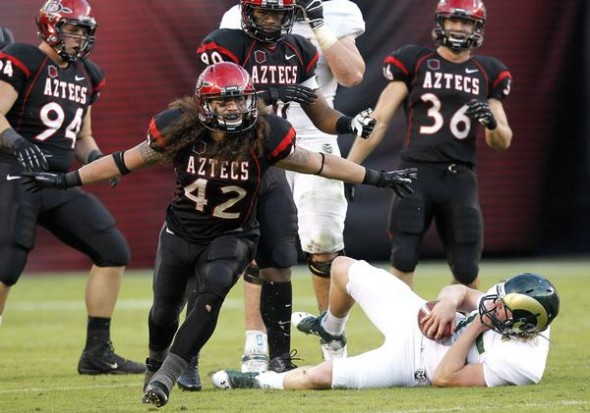
2012 - SDSU New Logo New Uniforms San Diego State Aztecs
The 2012 SDSU Aztecs uniforms

The football team gratefully abandoned the piping-heavy, modern-font look. They added very tasteful, traditional striping that is consistent from jersey to pants.

Its just a shame this constancy didn’t apply between sports.

What do you think about it? Is this mixed up look OK by you? Are the football uniforms too plain? Should the Aztecs win the 2013 college football best look award simply for having only one helmet?

aztecs, ncaa, new logo, new uniforms, San diego state, SDSU
Share
Facebook Twitter Pinterest Linkedin

Post navigation

Back to Green: Prince Albert Raiders Unveil New Look
NBA on the Path to Renaming Bobcats the Hornets

related stories

  • Hawai’i Rainbow Warriors To Wear Pearl Harbor-Themed Uniforms

    Saturday, November 6, 2021Saturday, November 6, 2021
  • Dallas Cowboys Add Red Stripe To Helmets To Honor Military, Medal Of Honor Recipients

    Wednesday, November 3, 2021
  • Bill Belichick Allegedly Hated New England Patriots Wearing Blue Jerseys Over Blue Pants

    Saturday, October 30, 2021Saturday, October 30, 2021


SportsLogos.Net may earn a small commission from the sales of any products linked to from this page, we thank you for your support

NHL: WHAT'S NEW IN '22


A recap of all the new logos and uniforms in the NHL for the 2021-22 season.


2021 NFL UNIFORM SCHEDULES


Check out the 2021 NFL Team Uniform Schedules

Search News Articles

Latest Logos News

  • PL Says ‘No’ to Charity Initiative Involving Away Kits on Boxing Day
  • French Football Clubs Pay Tribute to Fallen with ‘Bleuet’ Patches
  • ‘Blue Arsenal’? Tweet Purports to Show Leaked Charlotte FC Kit
  • Hawai’i Rainbow Warriors To Wear Pearl Harbor-Themed Uniforms
  • AHL: Firebirds Rise up Over Coachella Valley, Take the Ice in 2022-23
  • New England Revolution Puts the Crayons Away with Unveiling of New Crest
  • Puerto Rico’s Indios de Mayagüez rebrand features “Little Mango” character
  • Green Bay Booyah rebrand as Rockers
  • Dallas Cowboys Add Red Stripe To Helmets To Honor Military, Medal Of Honor Recipients
  • Threat of Legal Action Forces Welsh Soccer Club to Halt Sales of 2021-22 Third Kit
  • 💥POW!💥 Nike, Premier League Release Comics-Inspired High-Visibility Match Ball
  • New Hampshire Fisher Cats honor Chicken Tender heritage with promo
  • Every 2021-2022 NBA City Edition Uniform Explained
  • Bill Belichick Allegedly Hated New England Patriots Wearing Blue Jerseys Over Blue Pants
  • Auburn To Wear Orange Facemasks For First Time Since 1983 Season Against Ole Miss
  • LA Clippers Embrace San Diego Past with Leaked City Edition Jersey
  • Host Nations’ Indigenous Cultures Inspire FIFA Women’s World Cup 2023 Logo
  • Puma Releases Fashion Jerseys Based on ’90s Video Game
  • Return of ‘The King’: MLS Releases List of Top 25 Best-Selling Jerseys for 2021 Season
  • Manfred: Native American Community “Wholly Supportive” of Braves Name, Logo, and “The Chop”

Logos News Archive

Popular Topics

AHL Apparel/Shoes Arena Football Baseball Basketball CFL CHL Chris College ECHL European Featured FIFA FIFA World Cup Football Getting Blanked Hockey IIHF Jersey Logo Minor League Baseball Misc MLB MLS NBA NBA D-League NBA G-League NCAA NFL NHL OHL Olympics Other Sports Phantom Merchandise QMJHL Soccer SportsLogos.Net Studio Stories Super Bowl The Story Behind the Nickname Throwback Uniforms Uncategorized Uniform WHL WNBA
Chris Creamer's Sports Logos Page - SportsLogos.Net is your virtual museum dedicated to education of the history of sports logos and sports uniforms. All site design is Copyright ©1997-2021 Chris Creamer. The SportsLogos.Net "Leaf-Star" Logo is trademarked and property of this site. Please note: SportsLogos.Net does not own any of the team, league or event logos/uniforms depicted within this site, we do not have the power to grant usage rights to anyone. All team and league information, sports logos, sports uniforms and names contained within this site are properties of their respective leagues, teams, ownership groups and/or organizations. If you'd like to use any of the research from this site, please properly credit this site and provide a link back. This site is maintained for research, educational, and historical purposes only, do not abuse it.
Proudly powered by WordPress | Theme: Refined News by Candid Themes.