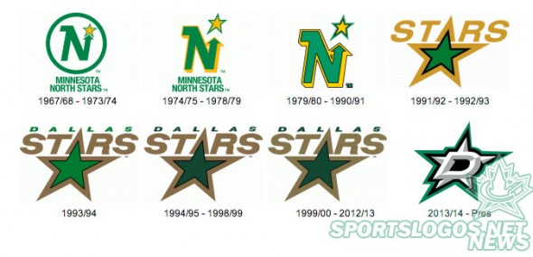
Overnight the new logos for the Dallas Stars have been leaked courtesy the team’s official iPhone app.
According to our amazing and always accurate sources, SportsLogos.Net can confirm that the new logos, which appear in the screenshots, are 100% accurate and will be used by the team in the 2013-14 NHL season. The leak was spotted and tweeted to us by @DamnOldNylon

The new look eliminates gold from the colour scheme, a colour which has been a part of the franchise identity (in various shades of yellow or gold) since their first game as the Minnesota North Stars way back in 1967. The colour followed the club from Minnesota to Texas in 1993. Silver (or gray) replaces the gold — totally expecting the club to say something lame like “the silver of the Stanley Cup is our gold medal” — while green and black are retained.
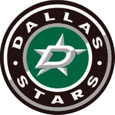
According to our sources the logo above is the primary and the roundel below (oh boy, another roundel logo) is the alternate:
No word on the new team uniforms, aside from the logo above reportedly being worn on the shoulders, but looking at the screenshot they do use a special font for the player name and numbers, could it be a preview of what they’ll end up using on the jerseys?

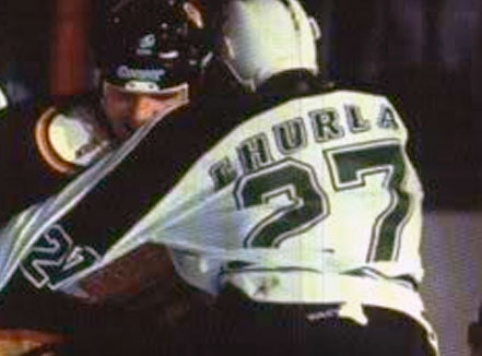
And I know this may be a stretch, but my genuine first thought after seeing that number colour and font in the photo above was the ever-so-briefly used name font which the Minnesota North Stars went with for the first few games during the 1991-92 season:
Stay tuned for more updates as they come in, the new look will officially be unveiled on June 4th at 6pm CT.
