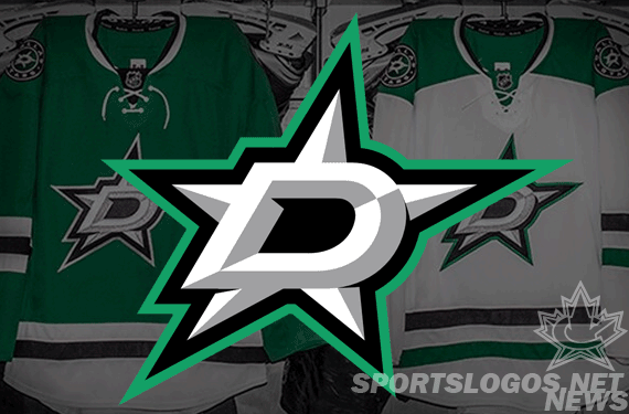
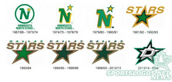
The Dallas Stars have unveiled their new logo and uniforms at a press event tonight in Dallas two weeks after their logo had leaked via an iPhone app. This marks the first drastic change in the Stars primary logo since 1991 during their days back in Minnesota giving the city their first “Made in Dallas” primary logo.
The new logo features a “Big D”, a common nickname for the city of Dallas, on a two-toned silver star with bevels. The star and D are outlined in both black and green.
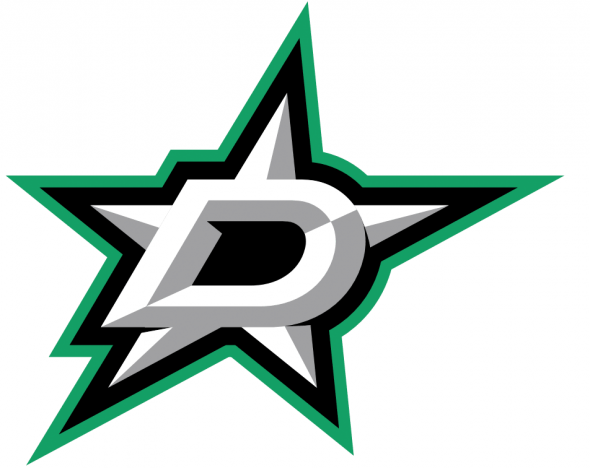
The new look eliminates gold from the colour scheme, a colour which has been a part of the franchise identity (in various shades of yellow or gold) since their first game as the Minnesota North Stars way back in 1967. The colour followed the club from Minnesota to Texas in 1993. Silver (or gray) replaces the gold. Gold was replaced for two reasons, the club said, one because they just couldn’t have the same shade match consistently across the board and because looking up at the night sky the stars appear silvery in colour, not gold.
“I’m excited. My hope is the logo is one that they’ll love, It’s one that is void of any word mark, but I think any fan will look at it and see a D and a Star. There’s only one Big D, so I feel the logo will be pretty easily recognizable. I love its simplicity.” – Stars owner Tom Gaglardi
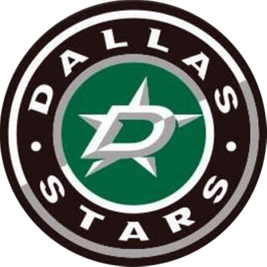
An alternate logo featuring the primary logo above in a circle with the team name around it was also unveiled, it will be placed on the shoulders of both of the new home and road Stars uniforms.
“I hope that they look at it and say it’s the Dallas Stars. This is who we are. It’s a D and a Star. We’re the Dallas Stars, in Big D, we looked at a variation of things that just seemed too cute. We just wanted it to be simple and classic with a modern look to it. I think that is exactly what we ended up with.” – Jason Walsh, Stars VP of Production and Entertainment.
As for the uniforms, the good news is that green is finally back as the home jersey base, Stars owner Tom Gaglardi made it quite clear during the event that he was not a fan of black as a primary colour and it shows in the new look:
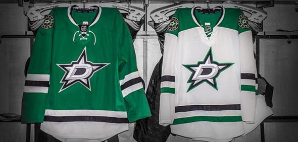
The new uniforms feature a unique to the NHL (but not the Minnesota North Stars) shade of green, it’s “Victory Green” as the club is calling it, “a mix between Kelly Green and Forest Green”.
“Instead of Kelly Green having that one shade yellow too much, we needed one more shade of blue in there to bring it back. And when we did a television test, it looked unbelievable on TV. It really popped. We’ve been so dark and drab for so many years, we want this to pop. And it does.”, Walsh told NHL.com
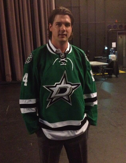
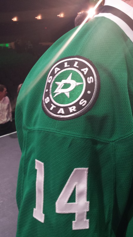
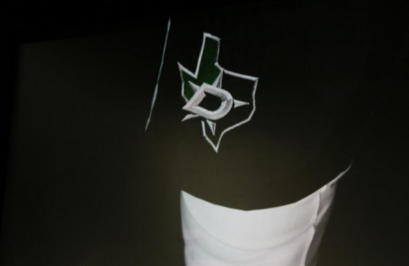

Both the new logo and uniforms were designed between the Dallas Stars, the NHL, and Reebok.

A brief look back at the uniform history of the Dallas Stars with the new look thrown in for you to compare:
The Dallas Stars website has a great run-down of the story and details that went into choosing the new look, I highly recommend you give it a read here.
We’ve also added the new Stars primary logo to the website, feel free to give it a rating and make your voice heard here.

