The American Hockey League today announced the relocation of the Peoria Rivermen, a franchise owned by the Vancouver Canucks, to Utica, NY where they will be known as the Utica Comets for the 2013-14 season. The relocation was unanimously approved by the AHL board of governors and announced by league president David Andrews.
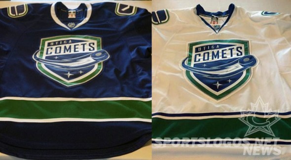
The new logo and uniforms are dominated in the blue, green, and white colours of the owner/parent NHL club Vancouver Canucks, and even includes the “C/hockey stick” logo shoulder patches. While the “C” represents “Canucks” in the original usage we can pretend it means “Comets” for this application.
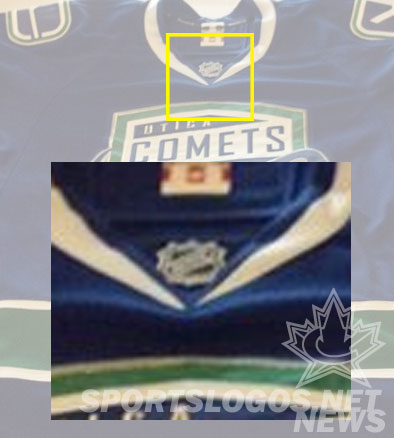
The uniform design is a direct clone of the big league club, and I mean that fairly literally, they didn’t even bother removing the NHL shield of the Canucks uniforms from the collar of the Comets ones they used at the unveiling:
The logo, while nicely designed, is fairly bland as a primary team logo – it looks more suitable as a shoulder patch in my opinion.
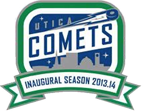
An inaugural season patch was also announced, it’s not known exactly where it will be worn on the uniforms:
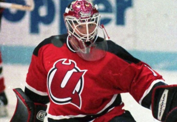
Utica was home to an AHL team previously when the New Jersey Devils had their farm club, the Utica Devils, play there from 1987-1993, and resulted in this fun adjustment to the NHL Devils primary mark as modelled by Martin Brodeur:
We’ve added the new Utica Comets logos to the site, you can give your rating on the primary logo here.

