
Todd Radom has designed so many sports logos, he can’t even talk about most of them. Sure, you’ve seen his work on countless Super Bowl marks, NBA All-Star games and in major sports leagues aplenty, but he can’t even take credit for most of them (check out a few of them on his website, though).
But even if Radom can’t boast of his major logo branding, instead resolving to simply show off the minor league-style work and a few older logos, it doesn’t mean that Radom isn’t one of the main go-to sports designers in the United States.
New York born and bred, Radom took a few minutes to chat with me for this SportsLogos.Net Designer Q&A. Here’s what Radom has to say about the state of sports logos.
Do you approach team logos for different sports in unique ways?
I think you have to. Each sport has its own individual culture, visually and otherwise, and that dynamic needs to be respected. The on-field needs of individual sports are different too; basketball uniforms primarily feature wordmarks, football graphics are mostly isolated in the context of the helmet. Those kinds of considerations are top priority to me. Retail marketability is huge but needs to follow as a close second.
What sports or leagues are the most progressive?
These things tend to ebb and flow. Right now a handful of the big apparel companies are the driving force in helping define the branded look of a couple of the leagues in a big way—really the tail wagging the dog in many ways, but that’s a whole different conversation. Progressive may not always be the best approach either, especially for a traditional franchise in a traditional market.
Does designing with a ball in the logo hamper or help?
It depends on what other elements need to be included within the mark. I am a believer in the fact that visual clichés are sometimes a good thing; they can help convey a message that might otherwise be difficult to deliver.
What are the key decades for logo design?
The 1960s witnessed the ascent of the NFL in American popular culture and this is when many of the most visible logos across all of sports came into being. There was experimentation going on in every aspect of life, and marketing and branding were no exception. I think that you can look at the era immediately following World War II as well, even if it doesn’t fit well within a defined decade. Americans suddenly had disposable income for the first time in many years and teams responded with unprecedented marketing efforts, which often included new logos. It’s no coincidence that the Yankees’ familiar top hat logo dates back to 1946.
How have sports logos evolved/devolved?
We’ve seen a definite simplification in sports identity design over the last eight to 10 years or so. This is the case for all kinds of identity design, simpler and more versatile marks are popping up all over the place and have been for a while. We are also in the midst of a retro revolution/devolution in which many franchises are reaching back into their individual pasts to reconnect with some core piece of their visual DNA. Sometimes it has involved a direct reconstitution of long-dormant logos, sometimes it has featured a new interpretation of those elements. Uncertain times make consumers want something comfortable and reliable.
What is the most recent trend?
Again, the most recent trend in sports logos is definitely one of devolution. We are still coming down from the era of the early ’90s to the mid ’00s, when technology helped give birth to a mini-generation of very involved identities. Sports logos are continually being stripped down these days; part of the reason for this is the fact that they need to survive and thrive on an unprecedented number of platforms today. I think it’s also fair to point out that consumers’ attention spans are greatly diminished, so the need to make a fast and strong impression is more critical than ever.
Are there logo designs that have set new benchmarks?
Some of the most timeless sports logo designs inspire imitators, some have helped launch trends that eventually faded and gave way to something else. Look at the “mean animal” logos that sprung forth in the early ’90s-a veritable zoo of aggressive symbols that seemed to eventually blend in with one another.
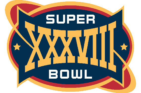
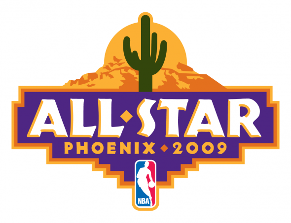
Where do you see event logos moving?
Event logos begin with a conversation about the current standardized Super Bowl logo. I have very strong (negative) feelings about it as the visual embodiment of the biggest one-day sporting event on the planet is now a shiny, soulless, stagnant, corporate illustration every single year, regardless of location. Contrary to the trend toward cleaner identities, event logos generally have to feature a busy look for a multitude of reasons. As has been the case for many years, I think that All-Star game marks will continue to visually embrace the community in which they are being played.
Every logo is different, but what are the dream parameters (design direction) for you?
Play to your strengths, dive on in, (and I always like hearing) “have fun.” I have yet to hear “we have an unlimited budget,” but hope springs eternal, right?